DxDrawer.Attributes Property
Specifies a collection of standard HTML attributes applied to the Drawer.
Namespace: DevExpress.Blazor
Assembly: DevExpress.Blazor.v26.1.dll
Declaration
[Parameter(CaptureUnmatchedValues = true)]
public IReadOnlyDictionary<string, object> Attributes { get; set; }
Property Value
| Type | Description |
|---|---|
| IReadOnlyDictionary<String, Object> | A collection of attributes. |
Remarks
To apply a standard HTML attribute to the Drawer, specify the attribute’s name and its value among Drawer properties in the markup. If the specified name does not match an existing Drawer property name, the component passes the specified value to the Attributes collection.
You can use the Attributes collection to add Drawer attributes at runtime.
If you specify CSS classes with both the CssClass property and the class attribute, the Drawer combines them in the rendered HTML element.
<DxDrawer IsOpen="true"
          data-priority="1">
    <BodyTemplate>
        <DxMenu Orientation="Orientation.Vertical">
            <Items>
                <DxMenuItem NavigateUrl="/" Text="Home" />
                <DxMenuItem NavigateUrl="/counter" Text="Counter" />
                <DxMenuItem NavigateUrl="/weather" Text="Forecast" />
            </Items>
        </DxMenu>
    </BodyTemplate>
    <TargetContent>
        @* ... *@
    </TargetContent>
</DxDrawer>
Important
Do not set the Attributes property and inline HTML attributes for the same component instance since this causes the following runtime exception: “The property ‘Attributes’ on component type ‘DevExpress.Blazor.DxDrawer’ cannot be set explicitly when also used to capture unmatched values.”
Attribute Passthrough
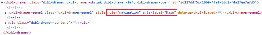
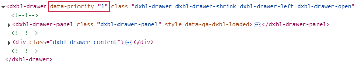
The DxDrawer component renders its two main parts (the drawer panel and the target content area) inside <dxbl-drawer> container element.
- Standard HTML attributes (
class,id,style, and so on) and custom attributes are applied to the component’s container element. This allows you to use CSS or target it with JavaScript. Accessibility attributes (aria-* and role) are applied to the Drawer panel’s root element (
<dxbl-drawer-panel>). It ensures the Drawer correctly communicates its state and function to screen readers and other assistive technologies.<DxDrawer IsOpen="true" role="navigation" aria-label="Main"> <BodyTemplate> <DxMenu Orientation="Orientation.Vertical"> <Items> <DxMenuItem NavigateUrl="/" Text="Home" /> <DxMenuItem NavigateUrl="/counter" Text="Counter" /> <DxMenuItem NavigateUrl="/weather" Text="Forecast" /> </Items> </DxMenu> </BodyTemplate> <TargetContent> @* ... *@ </TargetContent> </DxDrawer>