DxSchedulerDeleteAppointmentButton.RenderStyle Property
Specifies the button’s predefined style.
Namespace: DevExpress.Blazor
Assembly: DevExpress.Blazor.v26.1.dll
Declaration
[Parameter]
public override ButtonRenderStyle RenderStyle { get; set; }
Property Value
| Type | Description |
|---|---|
| ButtonRenderStyle | An enumeration value. |
Available values:
| Name | Description |
|---|---|
| None | Resets the button’s style. |
| Primary | Applies the primary style to the button. |
| Secondary | Applies the secondary style to the button. |
| Info | Applies the info style to the button. |
| Link | Applies the link style to the button. |
| Success | Applies the success style to the button. |
| Warning | Applies the warning style to the button. |
| Danger | Applies the danger style to the button. |
| Dark | Applies the dark style to the button. |
| Light | Applies the light style to the button. |
Remarks
The following example applies the Primary render style to the Delete Appointment button:
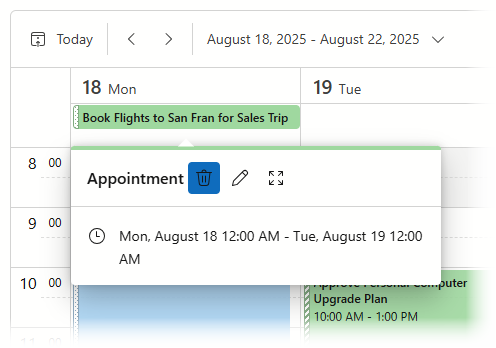
<DxScheduler StartDate="@DateTime.Today"
             DataStorage="@DataStorage">
    <Views>
        <DxSchedulerWorkWeekView VisibleTime="@(new DxSchedulerTimeSpanRange(TimeSpan.FromHours(8), TimeSpan.FromHours(19)))" />
    </Views>
    <AppointmentTooltipHeaderTemplate>
        <div>Appointment</div>
        <DxSchedulerDeleteAppointmentButton RenderStyle="ButtonRenderStyle.Primary" />
        <DxSchedulerShowAppointmentCompactFormButton />
        <DxSchedulerShowAppointmentEditFormButton />
    </AppointmentTooltipHeaderTemplate>
</DxScheduler>
See Also