DxComboBox<TData, TValue> Class
A text editor that allows users to select predefined items from the drop-down list or type custom values.
Namespace: DevExpress.Blazor
Assembly: DevExpress.Blazor.v26.1.dll
Declaration
public class DxComboBox<TData, TValue> :
    DxDropDownListEditorBase<TData, TValue>,
    IComboBoxComponent<TData, TValue>,
    IComboBox<TData, TValue>,
    IDropDownListEditorBase<TData, TValue>,
    IListEditorBase<TData, TValue>,
    IEditorBase,
    IDropDownOwner,
    IFocusableEditor,
    IComboBoxSelectionProviderOwner<TData, TValue>,
    IDropDownListEditorSelectionProviderOwner<TData, TValue>,
    IListEditorSelectionProviderOwner<TData, TValue>,
    IComboBoxAccessor<TData>,
    IDropDownListEditorAccessor<TData>,
    IListEditorAccessorBase<TData>
Type Parameters
| Name | Description |
|---|---|
| TData | The data item type. |
| TValue | The value type. |
Remarks
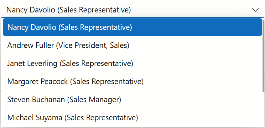
The DevExpress ComboBox for Blazor (<DxComboBox>) component displays a drop-down window with a list of items. Users can select an item from a list and type text in the editor to filter list items that contain the search string. Users can also use keyboard to navigate between items and select them. When a user presses and holds an arrow key, the editor’s window continuously navigates between items.
Add a ComboBox to a Project
Follow the steps below to add the ComboBox component to an application:
- Create a Blazor Server or Blazor WebAssembly application.
- Add the
<DxComboBox>…</DxComboBox>markup to a.razorfile. - Use the Data property to bind the ComboBox to data.
- Use the Value to specify the ComboBox’s selected value/item.
- Enable other features and capabilities).
API Reference
Refer to the following list for the component API reference: DxComboBox Members.
Static Render Mode Specifics
Blazor ComboBox does not support static render mode. Enable interactivity to use the component in your application. Refer to the following topic for more details: Enable Interactive Render Mode.
Features and Capabilities
For in-depth information about DevExpress ComboBox for Blazor, review the following articles:
- Data Binding
- Data Shaping
- Multiple Columns
- Buttons
- Appearance Customization
- Cascading Comboboxes
- Virtual Scrolling
- Keyboard Support
- Input Validation
- HTML Attributes
Troubleshooting
If a Blazor application throws unexpected exceptions, refer to the following help topic: Troubleshooting.