DxDropDownListEditorBase<TData, TValue>.DropDownWidthMode Property
Specifies the width of the drop-down list.
Namespace: DevExpress.Blazor.Base
Assembly: DevExpress.Blazor.v25.2.dll
NuGet Package: DevExpress.Blazor
Declaration
[DefaultValue(DropDownWidthMode.ContentOrEditorWidth)]
[Parameter]
public DropDownWidthMode DropDownWidthMode { get; set; }
Property Value
| Type | Default | Description |
|---|---|---|
| DropDownWidthMode | ContentOrEditorWidth | A DropDownWidthMode enumeration value. |
Available values:
| Name | Description |
|---|---|
| ContentOrEditorWidth | The list displays item text completely. The minimum list width matches the editor. |
| ContentWidth | The list width is equal to the width of the longest list item. |
| EditorWidth | The list width matches the editor. List items are cut if they do not fit. |
Remarks
Use the DropDownWidthMode property to specify the width of the drop-down list in ComboBox or TagBox component. The following values are available:
ContentOrEditorWidth (Default)
The list displays all the item text, and the minimum list width matches the editor. The maximum list width can not exceed the browser window width.
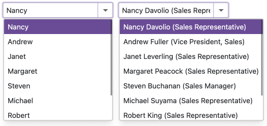
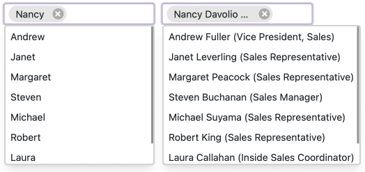
If the longest item exceeds the maximum width, the list displays a horizontal scroll.
For multi-column ComboBoxes/TagBoxes: When you set a column width and the item text does not fit cells, the text is trimmed, and an ellipsis is shown. The full text is shown when a user hovers over a cell. If you set a column width in relative units, these units are ignored in the ContentOrEditorWidth mode. The column width is calculated automatically based on the column content.
For virtual scrolling: In Virtual mode, the ComboBox/TagBox calculates the list width to fit the longest rendered item and fixes this width. If the user scrolls and encounters longer items, the list width remains unchanged, a horizontal scroll appears. For multi-column editors, when you do not specify column widths, the ComboBox/TagBox also calculates the column width based on the rendered content. The editor fixes this width and does not change it when the user scrolls through items.
ContentWidth
The list width is equal to the width of the longest list item. The maximum list width can not exceed the browser window width.
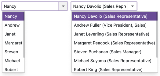
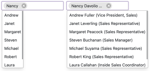
If the longest item exceeds the maximum width, the list displays a horizontal scroll.
For multi-column ComboBoxes/TagBoxes: When you set a column width and the item text does not fit cells, the text is trimmed, and an ellipsis is shown. The full text is shown when a user hovers over a cell. If you set a column width in relative units, these units are ignored in the ContentOrEditorWidth mode. The column width is calculated automatically based on the column content.
For virtual scrolling: In Virtual mode, the ComboBox/TagBox calculates the list width to fit the longest rendered item and fixes this width. If the user scrolls and encounters longer items, the list width remains unchanged, a horizontal scroll appears. For multi-column editors, when you do not specify column widths, the ComboBox/TagBox also calculates the column width based on the rendered content. The editor fixes this width and does not change it when the user scrolls through items.
EditorWidth
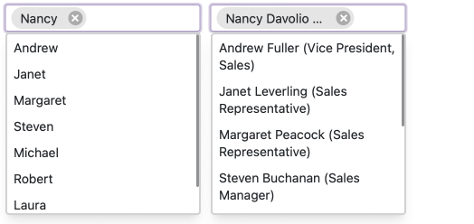
The list width matches the editor. If item text does not fit the editor width, item text is displayed across multiple lines.
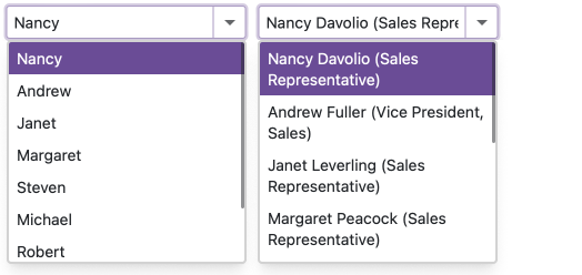
ComboBox Example
The following code sets the width of the drop-down list to the editor width.
@using BlazorApp.Data

<DxComboBox Data="@Staff.DataSource"
            @bind-Value="@Value"
            TextFieldName="@nameof(Person.Text)"
            DropDownWidthMode="DropDownWidthMode.EditorWidth">
</DxComboBox>

@code {
  Person Value { get; set; } = Staff.DataSource[0];
}
TagBox Example
The following code sets the width of the drop-down list to the editor’s width:
@using BlazorApp.Data

<DxTagBox Data="@Staff.DataSource"
          @bind-Values="@SelectedStaff"
          TextFieldName="@nameof(Person.Text)"
          DropDownWidthMode="DropDownWidthMode.EditorWidth">
</DxTagBox>

@code {
    IEnumerable<Person> SelectedStaff { get; set; }
}