DxDateEdit<T> Class
A date editor with a drop-down calendar.
Namespace: DevExpress.Blazor
Assembly: DevExpress.Blazor.v25.2.dll
NuGet Package: DevExpress.Blazor
Declaration
public class DxDateEdit<T> :
    DxMaskedInputBase<T>,
    IDropDownOwner,
    IFocusableEditor
Type Parameters
| Name | Description |
|---|---|
| T | The data type. Supported types: DateTime, DateTimeOffset, DateOnly, and their nullable instances. |
Remarks
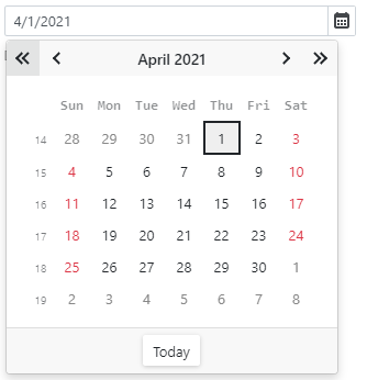
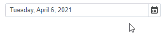
The DevExpress Date Edit for Blazor (<DxDateEdit>) displays a drop-down calendar that allows users to select a date.
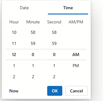
You can also add a time section to the component. This option allows users to select date-time values or enter them in the edit box.
Add a Date Edit to a Project
Follow the steps below to add the Date Edit component to an application:
- Create a Blazor Server or Blazor WebAssembly application.
- Add the
<DxDateEdit>…</DxDateEdit>markup to a.razorfile. - Configure the component: specify a selected date, apply a mask, and so on (see the sections below).
API Reference
Refer to the following list for the component API reference: DxDateEdit Members.
Static Render Mode Specifics
Blazor Date Edit does not support static render mode. Enable interactivity to use the component in your application. Refer to the following topic for more details: Enable Interactive Render Mode.
Edit Value
Use the Date property to specify the date that is selected in <DxDateEdit>. The date range is limited by the MinValue and MaxValue properties. Refer to the following section for details: Min/Max Dates.
You can use the @bind attribute to bind the Date property to a data field. Refer to the following topic for details:Two-Way Data Binding.
<DxDateEdit Date="DateTime.Today"></DxDateEdit>

<DxDateEdit @bind-Date="@DateTimeValue"></DxDateEdit>

@code {
    DateTime DateTimeValue { get; set; } = DateTime.Today;
}
If you do not use two-way data binding, handle the DateChanged event to respond to the editor’s date change. The following code snippet enables the Update Date button once the Date Edit component’s value is changed.
<DxDateEdit Date="@Date" DateChanged="@((DateTime newValue) => OnDateChanged(newValue))"></DxDateEdit>
<button type="button" class="btn btn-primary" disabled="@IsDisabled">Update Date</button>

@code {
    DateTime Date = DateTime.Today;
    bool IsDisabled = true;

    void OnDateChanged(DateTime newValue) {
        Date = newValue;
        if (newValue != DateTime.Today)
            IsDisabled = false;
        else IsDisabled = true;
    }
}
You can use the CalendarViewMode property to hide certain calendar views and implement the following scenarios:
- Disable day selection. Users can only select the year and month.
- Disable day and month selection. Users can only select the year.
Apply a Mask
The Date Edit component supports date-time and date-time offset masks.
Date-Time
Date-time masks allow users to enter only date and/or time values. Users can navigate between mask sections (such as months, days, and hours) and increase/decrease section values with the Up and Down arrow keys and mouse wheel.

Follow the steps below to apply a date-time mask:
- Make sure that the Date property is set to a DateTime object.
- Assign a predefined or custom pattern to the Mask property.
- Optional. Add the DxDateTimeMaskProperties component to the Date Edit’s markup to customize mask settings. If the markup contains any child element, such as the DayCellTemplate, place the
DxDateTimeMaskPropertiescomponent in the MaskProperties template.
The following code snippet applies a date-time mask:
<DxDateEdit @bind-Date="@Date"
            Mask="@DateTimeMask.ShortDate">
    <DxDateTimeMaskProperties CaretMode="@MaskCaretMode.Advancing" />
</DxDateEdit>

@code {
    DateTime Date { get; set; } = DateTime.Now;
}
Date-Time Offset
Date-time offset masks allow users to enter only date and/or time values, including the time’s offset from Coordinated Universal Time (UTC). Users can navigate between mask sections (such as months, days, and hours), and increase/decrease section values with the Up and Down arrow keys and mouse wheel.
Follow the steps below to apply a date-time offset mask:
- Make sure that the Date property is set to a DateTimeOffset object.
- Assign a predefined or custom pattern to the Mask property.
- Optional. Add the DxDateTimeOffsetMaskProperties component to the Date Edit’s markup to customize mask settings. If the markup contains any child element, such as the DayCellTemplate, place the
DxDateTimeOffsetMaskPropertiescomponent in the MaskProperties template.
The following code snippet applies a date-time offset mask:
<DxDateEdit @bind-Date="@Date"
            Mask="@DateTimeMask.ShortDate">
    <DxDateTimeOffsetMaskProperties CaretMode="@MaskCaretMode.Advancing" />
</DxDateEdit>

@code {
    DateTimeOffset Date { get; set; } = DateTimeOffset.Now;
}
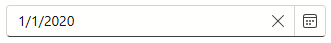
Nullable Date and Placeholder
If the Date Edit component is bound to a nullable object, users can press Alt + Del to clear the editor value (set it to null).
Set the ClearButtonDisplayMode property to Auto to show the Clear button when the editor has a non-null value. Use the NullText property to specify the prompt text (placeholder) when the editor value is null.
<DxDateEdit @bind-Date="@DateTimeValue"
            ClearButtonDisplayMode="DataEditorClearButtonDisplayMode.Auto"
            NullText="Select a date..."></DxDateEdit>

@code {
    DateTime? DateTimeValue { get; set; } = new DateTime(2020, 01, 01);
}
You can also specify a custom null value for the Date Edit component. This value can be used with nullable and regular DateTime types. For additional information, refer to NullValue.
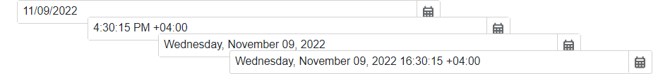
Date Format
Use the Format property to format the Date Edit’s value in edit mode when the editor is focused, and use the DisplayFormat property to format the editor’s display value when the editor is not focused. If you do not set the DisplayFormat property, the Format is applied in display and edit modes.
The following example applies the long date format in display mode and the short date format in edit mode:
<DxDateEdit @bind-Date="@DateTimeValue" DisplayFormat="D" Format="d"></DxDateEdit>

@code {
    DateTime DateTimeValue { get; set; } = DateTime.Now;
}
Refer to the following Microsoft help topics for additional information about supported formats: Standard Date and Time Format Strings and Custom Date and Time Format Strings.
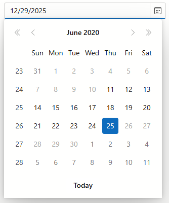
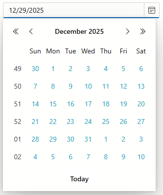
Min/Max Dates
Use the MinDate and MaxDate properties to specify a range of available dates. The Date Edit’s calendar disables dates that are out of the range and hides navigation arrows for them.
The default minimum and maximum values are System.DateTime.MinValue and System.DateTime.MaxValue.
Note
- The maximum date should be greater than the minimum date. Otherwise, an exception occurs.
- If a user types a date that is out of the range, the Date Edit keeps the previously selected date.
- You can set the
Dateproperty to a date outside the date range. In this case, the Date Edit displays the date as is, and the editor’s calendar displays the closest available date.
<DxDateEdit Date="DateTime.Today"
            MinDate="@(new DateTime(2020, 06, 11))"
            MaxDate="@(new DateTime(2020, 06, 25))" />
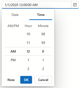
Time Section
Date Edit can display a time section that contains a scroll picker. Users can edit time values in the picker or enter values in the edit box.
Set the TimeSectionVisible property to true to display the time section in the component. The TimeSectionScrollPickerFormat property allows you to specify the format of the time value in the picker. If the TimeSectionScrollPickerFormat property is not specified, section appearance depends on current culture.
<DxDateEdit @bind-Date="@DateTimeValue"
            TimeSectionVisible="true"
            TimeSectionScrollPickerFormat="tt h m">
</DxDateEdit>

@code {
    DateTime DateTimeValue { get; set; } = DateTime.Now;
}
In many scenarios, users can benefit from a limited range of values. For instance, since meetings typically start on the hour or at 30-minute intervals, there is no need to show all 60 minute options. You can simplify the time picker by removing unnecessary values and specifying the time intervals using the following properties:
Disable Dates
Handle the CustomDisabledDate event to disable individual dates. This event is raised each time a day cell is rendered.
<DxDateEdit @bind-Date="@DateTimeValue" CustomDisabledDate="@OnCustomDisabledDate"></DxDateEdit>

@code {
    DateTime dateTimeValue = DateTime.Now;
    DateTime DateTimeValue { get => dateTimeValue; set { dateTimeValue = value; InvokeAsync(StateHasChanged); } }

    void OnCustomDisabledDate(CalendarCustomDisabledDateEventArgs args) {
        args.IsDisabled = args.Date < DateTime.Today.AddDays(-20) || GetDisabledDates().Exists(d => DaysEqual(d, args.Date));
    }
    bool DaysEqual(DateTime date1, DateTime date2) {
        return (date1.Year == date2.Year && date1.DayOfYear == date2.DayOfYear);
    }
    List<DateTime> GetDisabledDates() {
        DateTime baseDate = DateTime.Today;
        return new List<DateTime>() { baseDate.AddDays(-9), baseDate.AddDays(-4), baseDate.AddDays(-3), baseDate.AddDays(3), baseDate.AddDays(5), baseDate.AddDays(6), baseDate.AddDays(15) };
    }
}

Highlight Special Dates
You can use the DayCellTemplate property to highlight individual dates in the Date Edit’s calendar. The template’s context parameter allows you to access the current date-time object and its settings.
The following code snippet applies different styles to different dates.
    <DxDateEdit @bind-Date="@DateTimeValue"
                SizeMode="Params.SizeMode"
                CssClass="cw-320"
                InputId="deHighlightDates">
        <DayCellTemplate>
            <a class="@GetCssClassNames(context)">@context.Day.ToString()</a>
        </DayCellTemplate>
    </DxDateEdit>
    @* ... *@
@code {
    DateTime DateTimeValue { get; set; } = DateTime.Today;
    CalendarData Data { get; set; } = new CalendarData();

    string GetCssClassNames(DateTime date) {
        if(Data.PersonalDays.Exists(d => DaysEqual(d, date)))
            return "fw-bold text-success";
        if(Data.Holidays.Exists(d => DaysEqual(d, date)))
            return "text-danger";
        if(Data.BirthDates.Exists(d => DaysEqual(d, date)))
            return "fw-bold text-info";

        return null;
    }
    bool DaysEqual(DateTime date1, DateTime date2) {
        return (date1.Year == date2.Year && date1.DayOfYear == date2.DayOfYear);
    }
}

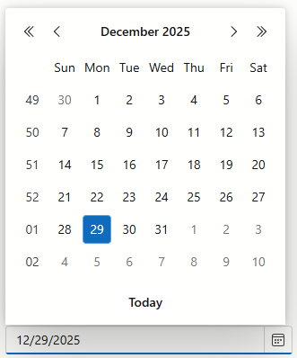
Set the First Day of the Week
The first day of a week in the Date Edit’s drop-down calendar depends on current culture settings. Use the FirstDayOfWeek property to specify a different day.
<DxDateEdit Date="DateTime.Today" FirstDayOfWeek="DayOfWeek.Monday"></DxDateEdit>

To specify a rule that determines the first week of the year, use the WeekNumberRule property.
Appearance Customization
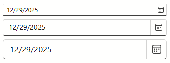
Use the SizeMode property to specify the size of a Date Edit. The following code snippet applies different size modes to Date Edit components.
<DxDateEdit @bind-Date="@DateTimeValue" SizeMode="SizeMode.Small"></DxDateEdit>

<DxDateEdit @bind-Date="@DateTimeValue" SizeMode="SizeMode.Medium"></DxDateEdit>

<DxDateEdit @bind-Date="@DateTimeValue" SizeMode="SizeMode.Large"></DxDateEdit>

@code {
    DateTime DateTimeValue { get; set; } = DateTime.Now;
}
To customize Date Edit input, use the InputCssClass property. The following code snippet applies the custom style to the text within the input:
<DxDateEdit @bind-Date="@DateTimeValue" InputCssClass="my-style"></DxDateEdit>

@code {
    DateTime DateTimeValue { get; set; } = DateTime.Now;
}
For additional information, refer to the following help topics:
Datepicker Modes
<DxDateEdit> adapts a datepicker to the device type.
Mobile and tablet devices display a datepicker as a scroll picker.
Note
Mobile devices show a datepicker in a modal window.
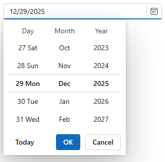
Other device types display a datepicker as a calendar.
Set the PickerDisplayMode property to Calendar or ScrollPicker to show the same datepicker type on all devices. For the scroll picker, you can also use the ScrollPickerFormat property to define the date format for each part (day, month, and year).
<DxDateEdit @bind-Date="@DateTimeValue" PickerDisplayMode="DatePickerDisplayMode.ScrollPicker"
            ScrollPickerFormat="dddd MMMM yyyy"></DxDateEdit>

@code {
    DateTime DateTimeValue { get; set; } = DateTime.Now;
}
You can also place custom content and define CSS styles in the calendar type datepicker. Use the DayCellTemplate property to access the current date-time object and its settings.
<DxDateEdit @bind-Date="@DateTimeValue">
    <DayCellTemplate>
        <span class="text-info">@context.Day.ToString()</span>
    </DayCellTemplate>
</DxDateEdit>

@code{
    DateTime DateTimeValue { get; set; } = DateTime.Today;
}
Hide Built-In Drop-Down Button
Set the ShowDropDownButton to false to hide the built-in button that invokes a drop-down calendar. If you need a custom drop-down button, you can add a new command button.
Add Command Buttons
You can add custom command buttons to the Date Edit component. Refer to Command Buttons for additional information.
The following code adds date increment/decrement buttons to the Date Edit.
<DxDateEdit @bind-Date="@DateTimeValue">
    <Buttons>
        <DxEditorButton IconCssClass="editor-icon editor-icon-chevron-left-small"
                        Tooltip="Previous day"
                        Position="@EditorButtonPosition.Left"
                        Click="@(_ => OnChangeDayButtonClick(false))" />
        <DxEditorButton IconCssClass="editor-icon editor-icon-chevron-right-small"
                        Tooltip="Next day"
                        Position="@EditorButtonPosition.Right"
                        Click="@(_ => OnChangeDayButtonClick(true))" />
    </Buttons>
</DxDateEdit>

@code{
    DateTime DateTimeValue { get; set; } = DateTime.Today;

    void OnChangeDayButtonClick(bool isAdd) {
        DateTimeValue = DateTimeValue.AddDays(isAdd ? 1 : -1);
    }
}

Input Validation
You can add a standalone Date Edit or the Form Layout component to Blazor’s standard EditForm. This form validates user input based on data annotation attributes defined in a model and indicates errors.
<EditForm Model="@starship" Context="EditFormContext">
    <DataAnnotationsValidator />
    <DxFormLayout >
        <DxFormLayoutItem Caption="Production Date:" ColSpanMd="6" >
            <Template >
                <DxDateEdit @bind-Date="@starship.ProductionDate" />
            </Template>
        </DxFormLayoutItem>
        @*...*@
    </DxFormLayout>
</EditForm>

@code {
    private Starship starship=new Starship();
}
For additional information, refer to the following help topic: Validate Input.
Read-Only State
<DxDateEdit> supports a read-only state. Set the ReadOnly property to true to activate this option.
<DxDateEdit ReadOnly="true"> </DxDateEdit>
Drop-Down Window Direction
Use the DropDownDirection property to specify the direction in which the drop-down calendar is displayed relative to the input element. The default value is Down. The following code sample changes the direction to Up:
<DxDateEdit Date="DateTime.Today" DropDownDirection="DropDownDirection.Up" />
Note
If the editor is close to a browser window’s edge and there is not enough space to display the drop-down window in the specified direction, the drop-down window is displayed in the opposite direction.
Keyboard Navigation
The DevExpress Blazor Date Edit supports keyboard navigation. Users can navigate to the editor’s input element and within the drop-down calendar (Date and Time sections).
Note
Keyboard support allows users to interact with application content in cases they cannot use a mouse or they rely on assistive technologies (like screen readers or switch devices). Refer to the Accessibility help topic for information on other accessibility areas that we address.
Shortcut Keys for Input Element
The following shortcut keys are available when the editor’s input element is focused:
| Shortcut Keys | Description |
|---|---|
| Tab | Moves focus to the next focusable element on a page. Note that the drop-down button, custom buttons, and the Clear button are excluded from the page tab sequence. |
| Shift + Tab | Moves focus to the previous focusable element on a page. |
| Alt + Del | Clears the editor value (sets it to null). |
| Alt + Down Arrow | Opens the drop-down calendar. |
Shortcut Keys for Drop-Down Calendar
The following shortcut keys are available when the drop-down calendar is open:
| Shortcut Keys | Description |
|---|---|
| Refer to Calendar shortcuts. | All calendar shortcut keys are available. |
| Right Arrow, Left Arrow | Switches between Date and Time sections. |
| Space, Enter | Selects the date, updates the Date parameter value, closes the drop-down calendar, and moves focus to the input element. If the Date section is active and the editor has the Time section, this shortcut key moves focus to the first carousel in the Time section. |
| Esc, Alt + Up Arrow | Closes the drop-down calendar and moves focus to the input element. |
Tab Sequence in Drop-Down Calendar

Tab Sequence in Drop-Down Calendar (with Time Section)

Tab Sequence in Adaptive Datepicker

HTML Attributes and Events
You can use HTML attributes and events to configure the Date Edit.
<DxDateEdit Date="DateTime.Today"
            id="date"
            name="date"
            autocomplete="on"
            @oninput="MyFunction">
</DxDateEdit>

@code {
    void MyFunction(){
        //...
    }
}
Troubleshooting
If a Blazor application throws unexpected exceptions, refer to the following help topic: Troubleshooting.
Full-Width Numerals (IME)
The Date Edit mask does not support full-width numerals produced by Input Method Editors (IMEs). The editor accepts only standard ASCII digits.
As a workaround, you can implement a JavaScript function that handles the component input element’s beforeinput and pasteevents to convert input data to a standard string.