DxDateEdit<T>.PickerDisplayMode Property
Specifies the datepicker type.
Namespace: DevExpress.Blazor
Assembly: DevExpress.Blazor.v26.1.dll
Declaration
[DefaultValue(DatePickerDisplayMode.Auto)]
[Parameter]
public DatePickerDisplayMode PickerDisplayMode { get; set; }
Property Value
| Type | Default | Description |
|---|---|---|
| DatePickerDisplayMode | Auto | A DatePickerDisplayMode enumeration value. |
Available values:
| Name | Description |
|---|---|
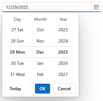
| Auto | Mobile and tablet devices display a datepicker as a scroll picker. |
| Calendar | All devices display a datepicker as a calendar. |
| ScrollPicker | All devices display a datepicker as a scroll picker. |
Remarks
When the PickerDisplayMode property is set to Auto, DxDateEdit<T> adapts a datapicker to the device type.
Mobile and tablet devices display a datapicker as a scroll picker.
Other device types display a datepicker as a calendar.
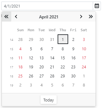
Set the PickerDisplayMode property to Calendar or ScrollPicker to display a calendar or scroll picker on all devices.
<DxDateEdit @bind-Date="@DateTimeValue" PickerDisplayMode="DatePickerDisplayMode.ScrollPicker"></DxDateEdit>

@code {
    DateTime DateTimeValue { get; set; } = DateTime.Now;
}
Tip
Mobile devices show a datepicker in a modal window.
For the scroll picker, you can also use the ScrollPickerFormat property to define a date format for each scroll picker part (a day, month, and year).