DxDateEdit<T>.ShowDropDownButton Property
Specifies whether the Date Edit displays the built-in button that invokes a calendar.
Namespace: DevExpress.Blazor
Assembly: DevExpress.Blazor.v26.1.dll
Declaration
[DefaultValue(true)]
[Parameter]
public bool ShowDropDownButton { get; set; }
Property Value
| Type | Default | Description |
|---|---|---|
| Boolean | true |
|
Remarks
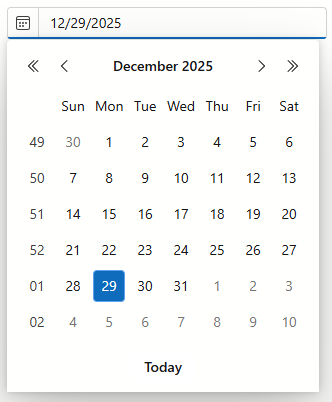
The DxDateEdit<T> component shows the built-in drop-down button that invokes a calendar. You can set the ShowDropDownButton property to false to hide this button.
You can also add a custom drop-down button to the Date Edit:
- Add the
<Buttons></Buttons>tag to the component’s markup to define theButtonscollection. - Add a DxDateEditDropDownButton object.
- Set up button properties to customize the button:
The following code snippet hides the built-in drop-down button, adds a new drop-down button, and specifies its position.
<DxDateEdit Date="DateTime.Today" ShowDropDownButton=false>
    <Buttons>
        <DxDateEditDropDownButton Position="EditorButtonPosition.Left"/>
    </Buttons>
</DxDateEdit>
See Also