Columns in Blazor Grid
- 24 minutes to read
DevExpress Blazor Grid supports several column types: data column (bound and unbound), command column, and selection column. You can declare columns within the Columns template.
Column Types
The DevExpress Blazor Grid component supports the following column types:
Data column (Bound)
Bound columns get their data from the bound data source. Declare a DxGridDataColumn object in the Columns template and specify the FieldName property to bind the column to a data field.
Note
The FieldName property value must be unique for each data column.
DxGrid generates a user-friendly column caption based on the field name. Use the Caption property to specify a custom column name.
@inject WeatherForecastService ForecastService

<DxGrid Data="@Data">
    <Columns>
        <DxGridDataColumn FieldName="Date" DisplayFormat="D" />
        <DxGridDataColumn FieldName="TemperatureC" Caption="@("Temp. (\x2103)")" Width="120px" />
        <DxGridDataColumn FieldName="TemperatureF" Caption="@("Temp. (\x2109)")" Width="120px" />
        <DxGridDataColumn FieldName="Forecast" />
        <DxGridDataColumn FieldName="CloudCover" />
    </Columns>
</DxGrid>

@code {
    object Data { get; set; }

    protected override void OnInitialized() {
        Data = ForecastService.GetForecast();
    }
}

Create a Foreign Key (ComboBox) Column
A foreign key is a database key used to manage relationships between individual tables. You can use the key to identify a specific column in a referenced table and obtain column data. Do the following to create such a column:
- Add a DxGridDataColumn object to the Grid’s column collection.
- Assign the field name that stores foreign keys to the column’s FieldName property.
- Place DxComboBoxSettings in the column’s EditSettings tag.
- Assign an external data source to the Data setting.
- Assign the name of the external data source field that stores foreign keys to the ValueFieldName setting. The TextFieldName setting allows you specify text strings displayed within the Grid instead of foreign keys.

<DxGrid Data="Products"
        EditModelSaving="OnEditModelSaving"
        EditMode="GridEditMode.EditRow">
    <Columns>
        <DxGridCommandColumn DeleteButtonVisible="false" />
        <DxGridDataColumn FieldName="CategoryId" Caption="Category Name">
            <EditSettings>
                <DxComboBoxSettings
                    Data="Categories"
                    ValueFieldName="CategoryId"
                    TextFieldName="CategoryName"
                    FilteringMode="DataGridFilteringMode.Contains"
                    ClearButtonDisplayMode="DataEditorClearButtonDisplayMode.Auto"/>
            </EditSettings>
        </DxGridDataColumn>
        <DxGridDataColumn FieldName="ProductName" />
        <DxGridDataColumn FieldName="UnitPrice" DisplayFormat="c" />
        <DxGridDataColumn FieldName="UnitsInStock" />
        <DxGridDataColumn FieldName="QuantityPerUnit" />
    </Columns>
</DxGrid>

@code {
    NorthwindContext Northwind { get; set; }
    List<Product> Products { get; set; }
    List<Category> Categories { get; set; }
    @* ... *@
    async Task OnEditModelSaving(GridEditModelSavingEventArgs e) {
        var editableProduct = (Product)e.EditModel;
        e.CopyChangesToDataItem();
        await Northwind.SaveChangesAsync();

        Products = await Northwind.Products.ToListAsync();
    }
    @* ... *@
}
Data Column (Unbound)
Unbound columns display values that are not stored in the assigned data collection. To create an unbound column, declare a DxGridDataColumn object in the Columns template and specify the following properties:
- UnboundType
- Indicates that the column is unbound and specifies its data type.
- FieldName
- Specifies a unique name that should not match field names in the grid’s data source.
You can use one of the following APIs to populate an unbound column with data:
- UnboundExpression
- Specifies an expression that calculates column values. An expression can consist of field names, constants, operators, and functions and should use our Criteria Language Syntax.
- UnboundColumnData
- Allows you to implement custom logic or obtain column values from a custom/external data source.
<DxGrid Data="forecasts" UnboundColumnData="Grid_CustomUnboundColumnData">
    <Columns>
        <DxGridDataColumn FieldName="Date" Caption="Date" />
        <DxGridDataColumn FieldName="TemperatureC" Caption="@("Temperature (\x2103)")" />
        <DxGridDataColumn FieldName="TemperatureF" Caption="@("Temperature (\x2109)")"
                          UnboundType="GridUnboundColumnType.Decimal"
                          UnboundExpression="32 + [TemperatureC] / 0.5556" />
        <DxGridDataColumn FieldName="Summary"
                          UnboundType="GridUnboundColumnType.String" />
    </Columns>
</DxGrid>

@code {
    private WeatherForecast[]? forecasts;

    protected override async Task OnInitializedAsync() {
        forecasts = await ForecastService.GetForecastAsync(DateTime.Now);
    }

    void Grid_CustomUnboundColumnData(GridUnboundColumnDataEventArgs e) {
        if (e.FieldName == "Summary") {
            int temperature = Convert.ToInt32(e.GetRowValue("TemperatureC"));
            e.Value = GetTemperatureString(temperature);
        }
    }

    static string GetTemperatureString(int value) {
        if (value < -10)
            return "Cool";
        if (value >= -10 && value < 5)
            return "Chilly";
        if (value >= 5 && value < 15)
            return "Warm";
        return "Hot";
    }
}

Limitations
- When you use a Server Mode data source, the DxGrid component does not support unbound columns whose values are populated in the UnboundColumnData event handler. You can create unbound columns whose values are calculated based on UnboundExpression.
- When you use a GridDevExtremeDataSource, DxGrid does not support unbound columns.
Command Column
Declare a DxGridCommandColumn object in the Columns template to display a command column.
<DxGrid Data="Products" KeyFieldName="ProductId">
    <Columns>
        <DxGridCommandColumn />
        ...
    </Columns>
</DxGrid>
A command column displays CRUD-related buttons (New, Edit, and Delete) and the Clear button that resets values in the filter row. For rows in edit mode (EditRow), the column displays Save and Cancel buttons.

Use Width and DisplayMode properties to adjust column appearance. The following properties allow you to hide unnecessary command buttons:
- NewButtonVisible
- Specifies whether the command column displays the New button.
- EditButtonVisible
- Specifies whether the command column displays Edit buttons.
- DeleteButtonVisible
- Specifies whether the command column displays Delete buttons.
- ClearFilterButtonVisible
- Specifies whether the command column displays the Clear button.
- SaveButtonVisible
- Specifies whether the command column displays the Save button in
EditRoworEditCelledit mode. - CancelButtonVisible
- Specifies whether the command column displays the Cancel button in
EditRoworEditCelledit mode.
Selection Column
Declare a DxGridSelectionColumn object in the Columns template to display a selection column.
<DxGrid Data="Products" KeyFieldName="ProductId">
    <Columns>
        <DxGridSelectionColumn />
        ...
    </Columns>
</DxGrid>
When the SelectionMode property is set to Multiple (the default value), the selection column displays checkboxes. Users can click them to select and deselect individual rows.

In Multiple selection mode, the selection column displays the Select All checkbox in the column header. A user can click this checkbox to select or deselect all rows on the current page or on all grid pages depending on the SelectAllCheckboxMode property value. Available property values are as follows:
- Page
- The Select All checkbox selects and deselects all rows on the current grid page. This mode changes to
Mixedwhen the Grid is bound to a large data source and vertical virtual scrolling mode is activated. - AllPages
- The Select All checkbox selects and deselects all rows on all grid pages. This mode changes to
Mixedwhen the Grid is bound to a large data source. - Mixed
- The Select All checkbox selects and deselects all rows on the current grid page. An additional drop-down button displays a context menu that allows users to select and deselect all rows on all grid pages.
<DxGrid Data="Products"
        KeyFieldName="ProductId"
        SelectAllCheckboxMode="GridSelectAllCheckboxMode.Mixed">
    <Columns>...</Columns>
</DxGrid>

To hide the Select All checkbox, disable the column’s AllowSelectAll option.
Note
The Select All checkbox functionality has limitations. For additional information, refer to the following section: Selection Limitations.
When the SelectionMode property is set to Single, the selection column displays radio buttons. Users can click a button to select one row at a time.
<DxGrid Data="Products" KeyFieldName="ProductId" SelectionMode="GridSelectionMode.Single">
    <Columns>
        <DxGridSelectionColumn />
        ...
    </Columns>
</DxGrid>

Band Column (Header Bands)
You can combine columns into logical groups called bands. To create such a group, declare a DxGridBandColumn object and specify child columns in the Columns template. You can create as many nesting levels as your business task requires.

<DxGrid @ref="Grid"
        Data="Data">
    <Columns>
        <DxGridDataColumn FieldName="SalesPerson" Caption="Salesperson" />
        <DxGridBandColumn Caption="Order">
            <Columns>
                <DxGridDataColumn FieldName="CompanyName" />
                <DxGridDataColumn FieldName="OrderDate" Caption="Date" Width="100px" />
                <DxGridBandColumn Caption="Product">
                    <Columns>
                        <DxGridDataColumn FieldName="ProductName" Caption="Name" />
                        <DxGridDataColumn FieldName="UnitPrice"
                                          DisplayFormat="c"
                                          CaptionAlignment="GridTextAlignment.Right"
                                          Width="100px" />
                    </Columns>
                </DxGridBandColumn>
                <DxGridDataColumn FieldName="Quantity" Width="80px" />
            </Columns>
        </DxGridBandColumn>
    </Columns>
</DxGrid>

@code {
    object Data { get; set; }
    IGrid Grid { get; set; }
    protected override async Task OnInitializedAsync() {
        var invoices = await NwindDataService.GetInvoicesAsync();
        var customers = await NwindDataService.GetCustomersAsync();
        Data = invoices.OrderBy(i => i.OrderDate).Join(customers, i => i.CustomerId, c => c.CustomerId, (i, c) => {
            return new {
                    CompanyName = c.CompanyName,
                    SalesPerson = i.Salesperson,
                    UnitPrice = i.UnitPrice,
                    OrderDate = i.OrderDate,
                    ProductName = i.ProductName,
                    Quantity = i.Quantity
            };
        });
    }
}
Column Settings
Column Order
The Grid layout can include multiple column zones. The display order of zones is as follows:
In a zone, the DxGrid displays columns based on their visible indices in the following order:
Columns with non-negative visible indexes. The leftmost column has the smallest index value.
Columns with unset and negative visible indexes. Columns appear in the same order as in grid markup.
Grouped columns are invisible unless you set the ShowGroupedColumns property to true.
Users can reorder columns by dragging headers within the column header panel or in the column chooser. Set the DxGrid.AllowColumnReorder or DxGridColumn.AllowReorder property to false to prevent users from reordering columns.
Column Width
DxGrid uses the fixed table layout algorithm to render HTML, and column widths never depend on the column content - the component does not adjust column width based on column content automatically. Refer to the following topic for additional information about grid layout specifics: Layout Specifics.
You can use the following column properties to specify the grid column layout:
Note that a non-empty band ignores these properties. The band width is the total width of nested column widths.
You can also call the AutoFitColumnWidths() method to adjust column widths to their content automatically. The following example calls the AutoFitColumnWidths method to calculate initial optimal column widths:
<DxGrid Data="Products"
        @ref="MyGrid"
        EditMode="GridEditMode.EditRow"
        TextWrapEnabled="false">
    <Columns>
        <DxGridCommandColumn MinWidth="135" />
        <DxGridDataColumn FieldName="ProductName" Width="20%" />
        <DxGridDataColumn FieldName="CategoryId" Caption="Category Name">
            <EditSettings>
                <DxComboBoxSettings Data="Categories" ValueFieldName="CategoryId" TextFieldName="CategoryName" />
            </EditSettings>
        </DxGridDataColumn>
        <DxGridDataColumn FieldName="Category.Description" Caption="Description" />
        <DxGridDataColumn FieldName="UnitPrice" DisplayFormat="c">
            <EditSettings>
                <DxSpinEditSettings MinValue="0M" Mask="n3" />
            </EditSettings>
        </DxGridDataColumn>
        <DxGridDataColumn FieldName="UnitsInStock" Width="50px" />
        <DxGridDataColumn FieldName="QuantityPerUnit" Width="50px" />
        <DxGridDataColumn FieldName="Discontinued" Width="50px" />
    </Columns>
</DxGrid>

@code {
    List<Product> Products { get; set; }
    IGrid MyGrid { get; set; }

    protected override void OnAfterRender(bool firstRender) {
         if(firstRender) {
             MyGrid.AutoFitColumnWidths();
         }
    }
}
To specify the column width in an exported document, use the ExportWidth property.
Column Resize
Use the ColumnResizeMode property to allow users to resize grid columns. If allowed, the following resize operations are available to users:
- Drag a column header’s right border.
- Double-click a column’s right border to apply the optimal width based on column content.
You can set the ColumnResizeMode property to one of the following values:
- Disabled
- A user cannot resize columns.
- NextColumn
- When a user resizes a column, the width of the column to the right changes (considering the MinWidth value), but the Grid’s total width does not change. Users cannot change the width of the rightmost column.
- ColumnsContainer
- When a user resizes a column, all other columns retain their widths, but the width of the container that stores all Grid columns changes.
Text Customization
When a value does not fit into a cell as a single line, the cell displays multiple lines of text. Set the TextWrapEnabled property to false to disable word wrap (trim extra words). Instead of trimmed characters, the DxGrid component displays an ellipsis. Users can hover over the cell to display complete cell text in a tooltip.

Use one of the following properties to align text in data cells or column captions:

Fixed (Anchored) Columns
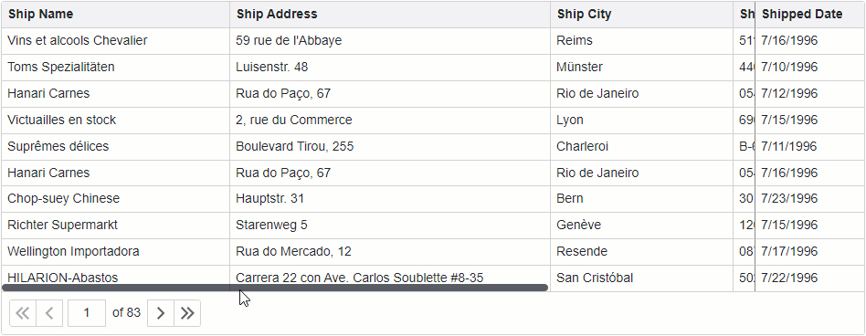
If the combined column width exceeds the size of the component, DxGrid displays a horizontal scrollbar. If you want a column to always stay within the view, regardless of horizontal scrolling, anchor that column to the component’s left or right edge.
Users can reorder and resize fixed columns. They can control their visibility in the column chooser. However, users cannot move regular columns to a fixed column zone and vice versa.
Set a column’s FixedPosition property to Left or Right to freeze the column.
The following code snippet anchors (fixes) Ship Name and Shipped Date columns to the grid’s left and right edges:
<DxGrid Data="Data" >
    <Columns>
        <DxGridDataColumn FieldName="ShipName" FixedPosition="GridColumnFixedPosition.Left" Width="250px" />
        <DxGridDataColumn FieldName="ShipAddress" Width="350px" />
        <DxGridDataColumn FieldName="ShipCity" Width="200px" />
        <DxGridDataColumn FieldName="ShipPostalCode" Width="150px" />
        <DxGridDataColumn FieldName="ShipCountry" Width="200px" />
        <DxGridDataColumn FieldName="Freight" Width="100px" />
        <DxGridDataColumn FieldName="OrderDate" DisplayFormat="d" Width="120px" />
        <DxGridDataColumn FieldName="ShippedDate" FixedPosition="GridColumnFixedPosition.Right" Width="120px" />
    </Columns>
</DxGrid>
Export Settings
The grid exports data of every data column unless its ExportEnabled property is set to false. A column whose Visible property is set to false is exported as a hidden column (one that has a zero width).
You can use the Column.IsHidden property in the CustomizeColumn action to show and hide columns in the resulting document.
await Grid.ExportToXlsxAsync("ExportResult", new GridXlExportOptions() {
    CustomizeColumn = CustomizeColumn,
});
void CustomizeColumn(GridExportCustomizeColumnEventArgs e) {
    e.Column.IsHidden = false;
}
Save and Restore Column Settings
The Grid allows you to save its layout between application work sessions. Saved information includes the following column settings:
- Group index
- Sort index
- Sort direction
- Position
- Visibility
- Width
Refer to the following topic for additional information: GridPersistentLayout.
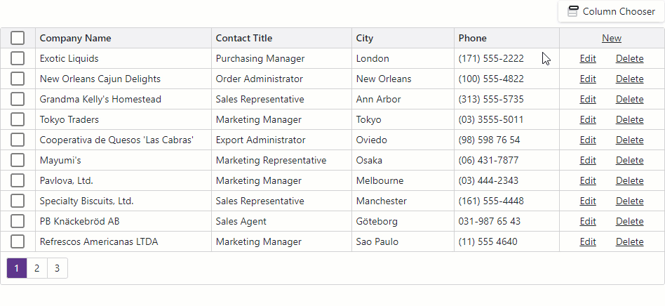
Column Chooser
The column chooser is a pop-up window that lists all grid columns (data, command, and selection) unless a column’s or its parent band’s ShowInColumnChooser property is set to false.
<DxGrid Data="Products">
    <Columns>
        <DxGridDataColumn FieldName="SupplierId" GroupIndex="0" Caption="Supplier" />
        <DxGridDataColumn FieldName="UnitPrice" AllowReorder="false" />
        <DxGridDataColumn FieldName="UnitsInStock" AllowReorder="false" />
        <DxGridDataColumn FieldName="QuantityPerUnit" ShowInColumnChooser="false" />
        <DxGridBandColumn Caption="Product">
            <Columns>
                <DxGridDataColumn FieldName="ProductName" Caption="Name" />
                <DxGridDataColumn FieldName="CategoryId" Visible="false" Caption="Category" />
            </Columns>
        </DxGridBandColumn>
        <DxGridDataColumn FieldName="Discontinued" FixedPosition="GridColumnFixedPosition.Right" />
    </Columns>
</DxGrid>

The column chooser allows users to perform the following actions:
- Show or hide columns
- A user can select or clear a checkbox in the chooser to show or hide the corresponding column. This action changes the column’s Visible property value.
- Reorder columns
- A user can move a column to a new position within the column chooser. Such an operation changes the column’s VisibleIndex property value. Note that the chooser draws a thick line between regular and fixed columns. Columns cannot cross that line. Non-reorderable columns have a lock icon.
Grouped columns are hidden from the grid data area and disabled in the column chooser. You can set the ShowGroupedColumns property to true to display grouped columns in the grid layout and enable them in the chooser.
Call any of the ShowColumnChooser method overloads to display the column chooser.
<DxButton Text="Column Chooser" Click="ColumnChooserButton_Click" />
<DxGrid @ref="Grid" Data="Data">
    <Columns> ... </Columns>
</DxGrid>

@code {
    IGrid Grid { get; set; }

    void ColumnChooserButton_Click() {
        Grid.ShowColumnChooser();
    }
}
To customize the appearance of column chooser items, handle the CustomizeElement event. The following code snippet highlights fixed columns in the column chooser.
<DxGrid @ref="@Grid" Data="@Data" CustomizeElement="CustomizeColumnChooserItems" ... >
    <Columns>
        <DxGridSelectionColumn FixedPosition="GridColumnFixedPosition.Left" />
        <DxGridCommandColumn FixedPosition="GridColumnFixedPosition.Right" />
        <DxGridDataColumn FieldName="CompanyName" />
        <DxGridDataColumn FieldName="ContactName" />
        <DxGridDataColumn FieldName="Phone" Visible="false" />
    </Columns>
</DxGrid>

@code {
    //...
    void CustomizeColumnChooserItems(GridCustomizeElementEventArgs e) {
        if(e.ElementType == GridElementType.ColumnChooserItem && e.Column.FixedPosition != GridColumnFixedPosition.None) {
                e.CssClass = "highlighted-item";
        }
    }
}

Task-Based Examples
This section contains code samples that demonstrate column functionality.
Create Columns at Runtime
The following code snippet demonstrates how you can create grid columns at runtime. Note that you can combine columns declared in markup and created at runtime.
@using System.Reflection
@using System.ComponentModel
@inject EmployeeService EmployeeData

<DxGrid Data="employees">
    <Columns>
        <DxGridCommandColumn />
        @BuildGridColumns(typeof(Employee))
    </Columns>
</DxGrid>

@code {
    IEnumerable<Employee> employees;
    protected override async Task OnInitializedAsync() {
        employees = await EmployeeData.GetData();
    }
    RenderFragment BuildGridColumns(Type itemType) {
    var props = TypeDescriptor.GetProperties(itemType);
    return b => {
      foreach(PropertyDescriptor prop in props) {
        b.OpenComponent(0, typeof(DxGridDataColumn));
        b.AddAttribute(1, "FieldName", prop.Name);
        b.CloseComponent();
      }
    };
  }
}

Display Text Instead of Checkboxes in a Column with Boolean Values
The grid shows checkboxes instead of column cell values if a column is bound to the Boolean or Nullable Boolean type.
Set the ShowCheckBoxInDisplayMode property to false to show text strings instead of checkboxes in display mode. To customize these strings, specify the following properties:
<DxGrid Data="products" PageSize="5">
    <Columns>
        <DxGridDataColumn FieldName="ProductName" />
        <DxGridDataColumn FieldName="UnitPrice" />
        <DxGridDataColumn FieldName="UnitsInOrder" />
        <DxGridDataColumn FieldName="Discontinued">
            <EditSettings>
                <DxCheckBoxSettings ShowCheckBoxInDisplayMode="false"
                                    CheckedDisplayText="Yes"
                                    IndeterminateDisplayText="Unknown"
                                    UncheckedDisplayText="No" />
            </EditSettings>
        </DxGridDataColumn>
    </Columns>
</DxGrid>

@code {
    private Product[]? products;
    protected override async Task OnInitializedAsync() {
        products = await ProductData.GetData();
    }
}

Sort Columns in Alphabetical Order in Column Chooser
The grid displays columns in the column chooser in the same order as they appear in the grid. This allows users to reorder grid columns with the column chooser.
If the column chooser in your application does not require the columns reorder feature, you can implement a custom column chooser to display columns alphabetically.
In the following code snippet, the DxListBox<TData, TValue> component lists grid columns. When a user selects or deselects List Box items, the ValueChanged event fires. The event handler changes the Visible property value according to current item selection.
<DxListBox Data="AllColumns" CssClass="my-list-box"
    SelectionMode="ListBoxSelectionMode.Multiple"
    ShowCheckboxes="true"
    TextFieldName="Caption"
    Values="VisibleColumns"
    ValuesChanged="@((IEnumerable<IGridColumn> values) => SelectedDataItemsChanged(values))" />

<DxGrid @ref="Grid" Data="Data" PageSize="6">
    <Columns>
        <DxGridSelectionColumn Caption="Selection Column" />
        <DxGridCommandColumn Caption="Command Column" />
        <DxGridDataColumn FieldName="ContactName" Caption="Contact Name" />
        <DxGridDataColumn FieldName="CompanyName" Caption="Company Name" />
        <DxGridDataColumn FieldName="Country" Caption="Country" Visible="false" />
        <DxGridDataColumn FieldName="City" Caption="City" />
        <DxGridDataColumn FieldName="Phone" Caption="Phone" />
    </Columns>
</DxGrid>

@code {
    IGrid Grid { get; set; }
    object Data { get; set; }
    public IEnumerable<IGridColumn> AllColumns { get; set; }
    public IEnumerable<IGridColumn> VisibleColumns { get; set; }

    protected override async Task OnInitializedAsync() {
        Data = await NwindDataService.GetSuppliersAsync();
    }

    void SelectedDataItemsChanged(IEnumerable<IGridColumn> values) {
        Grid.BeginUpdate();
        foreach (var column in Grid.GetColumns())
            column.Visible = values.Contains(column);
        Grid.EndUpdate();
        VisibleColumns = values;
    }

    protected override void OnAfterRender(bool firstRender) {
        if(firstRender) {
            AllColumns = Grid.GetColumns().OrderBy(i => i, ColumnsComparerImpl.Default).ToList();
            VisibleColumns = Grid.GetVisibleColumns();
            StateHasChanged();
        }
    }

    class ColumnsComparerImpl : IComparer<IGridColumn> {
        public static IComparer<IGridColumn> Default { get; } = new ColumnsComparerImpl();
        ColumnsComparerImpl() { }
        int IComparer<IGridColumn>.Compare(IGridColumn x, IGridColumn y) {
            if(x is IGridSelectionColumn)
                return -1;
            if(x is IGridCommandColumn && y is IGridDataColumn)
                return -1;
            if(x is IGridDataColumn xData && y is IGridDataColumn yData) {
                var xName = !string.IsNullOrEmpty(xData.Caption) ? xData.Caption : xData.FieldName;
                var yName = !string.IsNullOrEmpty(yData.Caption) ? yData.Caption : yData.FieldName;
                return string.Compare(xName, yName);
            }
        return 0;
        }
    }
}

Display Image Column
To display an image from a binary source, place an <img> element into CellDisplayTemplate and specify the src property. Review the example below:
<DxGridDataColumn FieldName="ImageData">
    <CellDisplayTemplate>
        <img style="width: 300px;" src="@GetImageSource(context)" />
    </CellDisplayTemplate>
</DxGridDataColumn>
const string ImageSourceFormat = "data:image/gif;base64,{0}";

void GetImageSource(GridCellDisplayTemplateContext context) {
    return string.Format(ImageSourceFormat, Convert.ToBase64String((byte[])context.Value));
}
Display Values of Two Fields in One Column
Implement an unbound column to display custom data in the grid.
In the following code snippet, the grid data source contains FirstName and LastName fields. To display full names in a column, create an unbound column and set its UnboundType property to String. You can calculate column values in two ways:
Create FirstName and LastName hidden columns and concatenate their values in the UnboundExpression property.
<DxGrid Data="employees" > <Columns> <DxGridDataColumn FieldName="FirstName" Visible="false" /> <DxGridDataColumn FieldName="LastName" Visible="false" /> <DxGridDataColumn FieldName="FullName" UnboundType="GridUnboundColumnType.String" UnboundExpression="[FirstName]+ ' ' +[LastName]" /> <DxGridDataColumn FieldName="HireDate" /> <DxGridDataColumn FieldName="Email" /> </Columns> </DxGrid> @code { Employee[]? employees; protected override async Task OnInitializedAsync() { employees = await EmployeeData.GetData(); } }Handle the UnboundColumnData event and use the GetRowValue(String) method to access values of the FirstName and LastName data fields.
<DxGrid Data="employees" UnboundColumnData="Grid_UnboundColumnData">
    <Columns>
        <DxGridDataColumn FieldName="FullName" UnboundType="GridUnboundColumnType.String" />
        <DxGridDataColumn FieldName="HireDate" />
        <DxGridDataColumn FieldName="Email" />
    </Columns>
</DxGrid>

@code {
    Employee[]? employees;
    protected override async Task OnInitializedAsync() {
        employees = await EmployeeData.GetData();
    }
    void Grid_UnboundColumnData(GridUnboundColumnDataEventArgs e) {
        if(e.FieldName == "FullName") {
            e.Value = $"{e.GetRowValue("FirstName")} {e.GetRowValue("LastName")}";
        }
    }
}

Implement Data Editing without Command Column
To implement external command buttons, create buttons outside the grid, handle their click events and call the following methods:
- StartEditNewRowAsync
- Starts editing a new row.
- StartEditRowAsync | StartEditDataItemAsync
- Start editing the specified row or data item.
- SaveChangesAsync
- Initializes the save process and fires the EditModelSaving event. Handle this event to post changes to the underlying data source.
- CancelEditAsync
- Cancels row editing and discards changes.
- ShowRowDeleteConfirmation | ShowDataItemDeleteConfirmation
- Initializes the delete process and displays the delete confirmation dialog for the specified row or data item. When a user confirms the delete operation, the DataItemDeleting event fires. Handle this event to delete the record from the underlying data source.
.grid-container {
    width: 950px;
}
.pager-container {
    display: flex;
    justify-content: space-between;
    padding: 8px;
    border: 1px solid #d2d2d2;
    border-bottom: none;
}
<div class="grid-container">
    <div class="pager-container">
        <div>
            <DxButton Text="Add" Click="() => Grid.StartEditNewRowAsync()" />
            <DxButton Text="Edit" Click="() => Grid.StartEditRowAsync(Grid.GetFocusedRowIndex())" />
            <DxButton Text="Delete" Click="() => Grid.ShowRowDeleteConfirmation(Grid.GetFocusedRowIndex())" />
        </div>
        <div>
            <DxButton Text="Save" Click="() => Grid.SaveChangesAsync()" Enabled="IsEditing" />
            <DxButton Text="Cancel" Click="() => Grid.CancelEditAsync()" Enabled="IsEditing"/>
        </div>
    </div>
    <DxGrid @ref="Grid" Data="DataSource" FocusedRowEnabled="true" EditMode="GridEditMode.EditRow"
            KeyFieldName="EmployeeId"
            CustomizeEditModel="Grid_CustomizeEditModel"
            EditModelSaving="Grid_EditModelSaving"
            DataItemDeleting="Grid_DataItemDeleting">
        <Columns>
            <DxGridDataColumn FieldName="FirstName" />
            <DxGridDataColumn FieldName="LastName" />
            <DxGridDataColumn FieldName="Title" />
        </Columns>
    </DxGrid>
</div>

@code {
    bool IsEditing => Grid != null ? Grid.IsEditing() : false;
    IEnumerable<EditableEmployee> DataSource { get; set; }
    IGrid Grid { get; set; }

    protected override async Task OnInitializedAsync() {
        DataSource = await NwindDataService.GetEmployeesEditableAsync();
    }
    void Grid_CustomizeEditModel(GridCustomizeEditModelEventArgs e) {
        if(e.IsNew) {
            var newEmployee = (EditableEmployee)e.EditModel;
            newEmployee.FirstName = "John";
            newEmployee.LastName = "Doe";
        }
    }
    async Task Grid_EditModelSaving(GridEditModelSavingEventArgs e) {
        if(e.IsNew)
            await NwindDataService.InsertEmployeeAsync((EditableEmployee)e.EditModel);
        else
            await NwindDataService.UpdateEmployeeAsync((EditableEmployee)e.DataItem, (EditableEmployee)e.EditModel);
        await UpdateDataAsync();
    }
    async Task Grid_DataItemDeleting(GridDataItemDeletingEventArgs e) {
        await NwindDataService.RemoveEmployeeAsync((EditableEmployee)e.DataItem);
        await UpdateDataAsync();
    }
    async Task UpdateDataAsync() {
        DataSource = await NwindDataService.GetEmployeesEditableAsync();
    }
}
