Filter Row in Blazor Grid
- 9 minutes to read
Enable the ShowFilterRow option to activate a row that allows users to filter data (filtering is case-insensitive.). The Grid component generates and configures cell editors for filter row cells based on associated column data types. When a user types into an editor, the Grid creates a filter condition based on the editor value and applies this condition to the corresponding column.
<DxGrid Data="@Data" ShowFilterRow="true">
    @*...*@
</DxGrid>

Filter Row Editor Settings
Declare an object that contains editor settings in the EditSettings property to customize the default editor or replace it with another editor. If the editor does not support the associated data type, the Grid uses a read-only text box instead. The table below lists classes that define cell editor settings and the corresponding data types:
Editor Settings | Generated for Data Types | Supported Data Types |
|---|---|---|
All data types | ||
Never generated | Numeric, String, TimeSpan, TimeOnly, | |
Never generated | ||
In the following code snippet, the ProductID column’s markup contains the DxSpinEditSettings object that customizes the automatically generated editor.
<DxGrid Data="@products"
        ShowFilterRow="true"
        EditMode="GridEditMode.EditRow">
    <Columns>
        <DxGridCommandColumn />
        <DxGridDataColumn FieldName="ProductID" >
            <EditSettings>
                <DxSpinEditSettings ShowSpinButtons="false" ReadOnly="true" NullText="Type the ID" />
            </EditSettings>
        </DxGridDataColumn>
        <DxGridDataColumn FieldName="ProductName" />
        <DxGridDataColumn FieldName="UnitPrice" />
        <DxGridDataColumn FieldName="UnitsInOrder" />
    </Columns>
</DxGrid>

Customize Editor Settings at Runtime
At runtime, you can handle the CustomizeFilterRowEditor event to customize editors in the filter row or call the GetColumnEditSettings method to access and customize editor settings.
Filter Row Operator Type and Initial Value
The Grid applies the Contains filter operator to columns bound to the String data type; in other cases, the Equals operator is used. You can use a column’s FilterRowOperatorType property to explicitly specify the operator type.
The FilterRowValue property allows you to specify the initial value in the filter row editor. If you define this property, you should also specify the FilterRowOperatorType property.
When a user clicks an editor’s Clear button, the filter row does not change the current operator type.
Note
The filter menu and filter row use the same set of filter criteria for fields and may affect each other. For example, when a user types a value in the filter row and then picks a value in a filter menu of the same column, the Grid component applies different criteria. When a user enters a value in the filter row again, the Grid applies the new operator set by the filter menu. You can implement the UI to change the filter row’s operator type to make sure which filter criteria is currently applied. Refer to the following example for additional information: https://github.com/DevExpress-Examples/blazor-grid-filter-operator-selector.
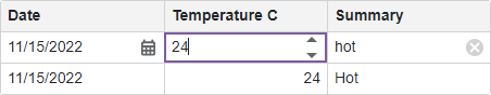
Filter Data By Display Text
Set the FilterMode property to DisplayText to filter grid rows by display text. In this case, the Grid displays a text box editor in the column’s filter row cell. This scenario can be useful when you specify custom display text for cells (see DisplayFormat property and CustomizeCellDisplayText event descriptions).
Important
The Grid does not support filtering by display text when you use a Server Mode data source or GridDevExtremeDataSource.
<DxGrid Data="@Data" ShowFilterRow="true" CustomizeCellDisplayText="Grid_CustomizeCellDisplayText" >
    <Columns>
        <DxGridDataColumn FieldName="Date" DisplayFormat="D"
            FilterMode="GridColumnFilterMode.DisplayText" />
        <DxGridDataColumn FieldName="CloudCover" />
        <DxGridDataColumn FieldName="TemperatureC" TextAlignment="GridTextAlignment.Left" Caption="Forecast"
            FilterMode="GridColumnFilterMode.DisplayText" />
    </Columns>
</DxGrid>

@code {
    void Grid_CustomizeCellDisplayText(GridCustomizeCellDisplayTextEventArgs e) {
    if(e.FieldName == "TemperatureC") {
        int val = Convert.ToInt32(e.Value);
        if(val < 15)
            e.DisplayText = "Cold";
        else if(val < 25)
            e.DisplayText = "Warm";
        else
            e.DisplayText = "Hot";
    }
}

Filter Row Cell Template
You can create templates for filter row cells. Template properties are available at the component and column levels.
| Element | Property |
|---|---|
| Component level template | DxGrid.DataColumnFilterRowCellTemplate |
| Data column’s template | DxGridDataColumn.FilterRowCellTemplate |
| Command column’s template | DxGridCommandColumn.FilterRowCellTemplate |
| Selection column’s template | DxGridSelectionColumn.FilterRowCellTemplate |
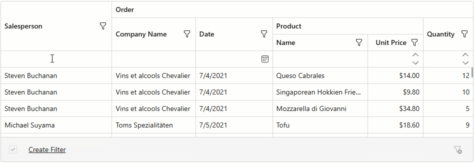
In the following code snippet, the UnitPrice column declares FilterRowCellTemplate. The template contains a combobox editor that allows users to select a filter from a set of predefined criteria.

<DxGrid Data="GridData" ShowFilterRow="true" >
    <Columns>
        <DxGridDataColumn FieldName="OrderId" Caption="Order ID" DisplayFormat="d" />
        <DxGridDataColumn FieldName="OrderDate" DisplayFormat="d" />
        <DxGridDataColumn FieldName="ProductName" />
        <DxGridDataColumn FieldName="UnitPrice" DisplayFormat="c2" >
            <FilterRowCellTemplate>
                <DxComboBox @bind-Value="context.FilterCriteria"
                            Data="UnitPriceIntervals" ValueFieldName="Criteria" TextFieldName="DisplayText"
                            ClearButtonDisplayMode="DataEditorClearButtonDisplayMode.Auto" />
            </FilterRowCellTemplate>
        </DxGridDataColumn>
        <DxGridDataColumn FieldName="Shipped"
                          UnboundType="GridUnboundColumnType.Boolean"
                          UnboundExpression="[ShippedDate] <> Null" />
    </Columns>
</DxGrid>


@code {
    object GridData { get; set; }
    static readonly IReadOnlyList<PriceFilterInterval> UnitPriceIntervals = new PriceFilterInterval[] {
        new("[UnitPrice] < 10", "< $10"),
        new("[UnitPrice] between (10, 100)", "$10 to $100"),
        new("[UnitPrice] > 100", "> $100")
    };
    protected override async Task OnInitializedAsync() {
        GridData = await NwindDataService.GetInvoicesAsync();
    }
    record PriceFilterInterval(CriteriaOperator Criteria, string DisplayText) {
        public PriceFilterInterval(string CriteriaText, string DisplayText)
            : this(CriteriaOperator.Parse(CriteriaText), DisplayText) {
        }
    }
}
Command Column
Declare a DxGridCommandColumn object in the Columns template to display a command column. This column contains the Clear button that resets the entire filter. You can use the ClearFilterButtonVisible property to control button visibility.
You can also define the column’s FilterRowCellTemplate to display custom content in the filter row cell.

Disable Column Filtering
Disable a column’s FilterRowEditorVisible property to prevent users from filtering data by this column.
The following example hides the filter row editor in the Shipped column:

<DxGrid Data="GridData" ShowFilterRow="true" CssClass="my-grid" ColumnResizeMode="GridColumnResizeMode.ColumnsContainer">
    <Columns>
        <DxGridDataColumn FieldName="OrderId" Caption="Order ID" DisplayFormat="d" />
        <DxGridDataColumn FieldName="OrderDate" DisplayFormat="d" />
        <DxGridDataColumn FieldName="ProductName" FilterRowValue='"Queso"' />
        <DxGridDataColumn FieldName="UnitPrice" DisplayFormat="c2" />
        <DxGridDataColumn FieldName="Shipped" FilterRowEditorVisible="false"
                          UnboundType="GridUnboundColumnType.Boolean"
                          UnboundExpression="[ShippedDate] <> Null" />
        <DxGridCommandColumn NewButtonVisible="false" EditButtonVisible="false" DeleteButtonVisible="false" />
    </Columns>
</DxGrid>
Editor Render Mode
The Grid component renders editors in filter row and edit cells so that editors occupy the entire grid cell.
Set the Grid’s EditorRenderMode property to Detached to render automatically generated editors as standalone editors with their borders and paddings. This property also affects DevExpress Blazor editors placed directly in the following templates:
Customize Filter Row Appearance
Handle the CustomizeElement event to customize Filter Row appearance. Compare the event argument’s e.ElementType property with the GridElementType.FilterRow value to determine whether the processed element is the Filter Row.
To customize individual Filter Row elements, use the following values for the e.ElementType property:
GridElementType.FilterCellGridElementType.FilterCommandCellGridElementType.FilterSelectionCell
Apply a Filter When a User Types Text
To filter data as a user types in the filter row, follow the steps below:
- Define a FilterRowCellTemplate and put a DxTextBox editor in the template.
- Set the editor’s BindValueMode to
OnInputto update the actual editor text each time when a user changes input text. - Handle the TextChanged event to apply a filter when editor text changes.
<DxGridDataColumn Caption="Summary" FieldName="Summary">
    <FilterRowCellTemplate>
        <DxTextBox Text="@((string)context.FilterRowValue)" BindValueMode=BindValueMode.OnInput
                   TextChanged="(string v) => context.FilterRowValue = v" />
    </FilterRowCellTemplate>
</DxGridDataColumn>
Case-Insensitive Filtering
Filtering is always case-insensitive for most data sources except for a GridDevExtremeDataSource.
If a GridDevExtremeDataSource uses LINQ to Objects, it also ignores word case; otherwise, filtering is case-sensitive. Use the StringToLower option to enable/disable case sensitivity in the GridDevExtremeDataSource:
@inherits OwningComponentBase
@inject Microsoft.Extensions.Configuration.IConfiguration Configuration
<DxGrid Data="@Data" PageSize="10">
    <Columns>
        <DxGridDataColumn FieldName="State" Width="5%" />
        <DxGridDataColumn FieldName="Area" MinWidth="100" />
        <DxGridDataColumn FieldName="City" Caption="County" MinWidth="100" />
        <DxGridDataColumn FieldName="Name" Caption="Location" MinWidth="100" />
        <DxGridDataColumn FieldName="Year" DisplayFormat="0" Width="10%" />
        <DxGridDataColumn FieldName="Bedrooms" Width="10%" />
        <DxGridDataColumn FieldName="Population" DisplayFormat="#,0" MinWidth="80" Width="10%" />
    </Columns>
</DxGrid>

@code {
    RentInfoDataService RentInfoDataService { get; set; }
    object Data { get; set; }
    protected override void OnInitialized() {
        // Refer to https://learn.microsoft.com/dotnet/api/microsoft.aspnetcore.components.owningcomponentbase
        RentInfoDataService = ScopedServices.GetRequiredService<RentInfoDataService>();
        var connectionString = ConnectionStringUtils.GetGridLargeDataConnectionString(Configuration);
        if(string.IsNullOrEmpty(connectionString)) return;
        var dataSource = new GridDevExtremeDataSource<AreaRentInfo>(RentInfoDataService.GetAreaRentInfo());
        dataSource.CustomizeLoadOptions = (loadOptions) => {
            loadOptions.PrimaryKey = new[] { "Oid" };
            loadOptions.PaginateViaPrimaryKey = true;
            loadOptions.StringToLower = true;
        };
        Data = dataSource;
    }
}
Filter Synchronization
The Grid component automatically synchronizes filter changes across the following UI elements:
- Column filter menus
- Filter row
- Filter panel
- Filter builder dialog
Of these elements, only the filter panel and filter builder can display all filter conditions. Other elements have limitations, for example, column filter menus do not support the Contains operator, and filter row cells cannot display the Betweencondition. To ensure the entire filter expression is visible, add a filter panel to the Grid. The panel also provides access to the filter builder dialog.
Note
The Grid updates a column’s FilterRowOperatorType once users apply filters to column data using another UI element. For instance, after a user selects a filter menu value, the column’s FilterRowOperatorType switches to Equals. The operator type remains Equals even after the filter is cleared.
You can extend filter row UI and display filter operators for each column. Refer to the following example for additional information: Incorporate a selector for filter row operator type.