DxGrid.CustomizeElement Event
SECURITY-RELATED CONSIDERATIONS
The style-src: unsafe-inline CSP directive is not compatible with the Style event argument. Consider using the CssClass event argument as a safer alternative. Refer to the following help topic for additional information:
Allows you to customize grid elements.
Namespace: DevExpress.Blazor
Assembly: DevExpress.Blazor.Grid.v26.1.dll
Declaration
[Parameter]
public Action<GridCustomizeElementEventArgs> CustomizeElement { get; set; }
Parameters
| Type | Description |
|---|---|
| GridCustomizeElementEventArgs | An object that defines data for this event. |
Remarks
The CustomizeElement event fires each time the Grid component is re-rendered; for instance, when you update data from an in-memory data source or call the AutoFitColumnWidths() method.
The event fires for most grid elements. Use ElementType, VisibleIndex, and Column event arguments to obtain information about the currently processed element.
CssClass, Style, and Attributes event arguments allow you to customize element settings as requirements dictate.
Task-Based Examples
Customize Appearance and Display a Custom Tooltip
The following code customizes the appearance of grid elements that meet the following criteria:
- Data rows with Total > 1000 are highlighted.
- All Total values are bold.
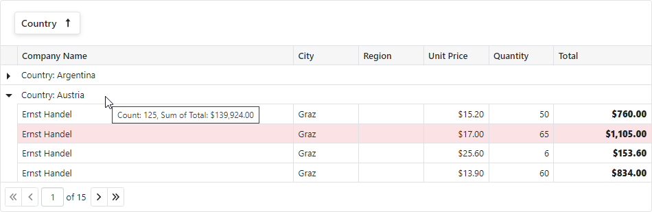
- If grid rows are grouped by Country, the group row’s tooltip displays group summary values.
<DxGrid @ref="Grid" CustomizeElement="Grid_CustomizeElement" ... />
@* ... *@
@code {
    // ...
    IGrid Grid { get; set; }
    void Grid_CustomizeElement(GridCustomizeElementEventArgs e) {
        if(e.ElementType == GridElementType.DataRow && (System.Decimal)e.Grid.GetRowValue(e.VisibleIndex, "Total") > 1000) {
            e.CssClass = "highlighted-item";
        }
        if(e.ElementType == GridElementType.DataCell && e.Column.Name == "Total") {
            e.CssClass = "fw-800";
        }
        if(e.ElementType == GridElementType.GroupRow && e.Column.Name == "Country") {
            var summaryItems = e.Grid.GetGroupSummaryItems().Select(i => e.Grid.GetGroupSummaryDisplayText(i, e.VisibleIndex));
            e.Attributes["title"] = string.Join(", ", summaryItems);
        }
    }
}
.highlighted-item > td {
    background-color: var(--dxds-color-surface-danger-subdued-rest)
}
.highlighted-item > td:first-child {
    background-color: transparent;
}
.fw-800 {
    font-weight: 800;
}
Show a Custom Context Menu
The following code sample invokes a custom context menu for column headers and rows:
The oncontextmenu:preventDefault attribute disables the standard browser context menu. In the Grid’s CustomizeElement event handler, subscribe to the contextmenu event that displays a custom context menu.
<DxGrid @ref="Grid" CustomizeElement="Grid_CustomizeElement" @oncontextmenu:preventDefault ... />

@code {
    GridContextMenuContainer ContextMenuContainer { get; set; }
    void Grid_CustomizeElement(GridCustomizeElementEventArgs e) {
        if(GridContextMenuHelper.IsContextMenuElement(e.ElementType)) {
            e.Attributes["oncontextmenu"] = EventCallback.Factory.Create<MouseEventArgs>(
                this,
                async mArgs => await ContextMenuContainer.Grid_ContextMenu(e, mArgs)
            );
        }
    }
    ...
}
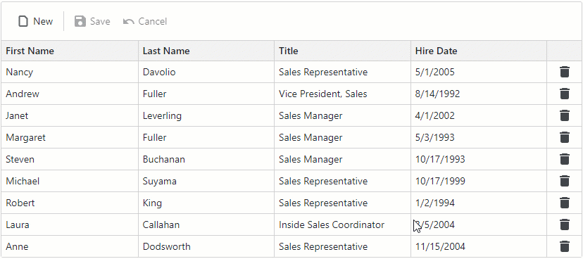
Highlight Modified Cells
<div>
    <DxGrid @ref="Grid"
            Data="Data"
            ValidationEnabled="false"
            KeyFieldName="EmployeeId"
            EditMode="GridEditMode.EditCell"
            EditModelSaving="Grid_EditModelSaving"
            CustomizeElement="Grid_CustomizeElement"
            CustomizeEditModel="Grid_CustomizeEditModel">
        <Columns>
            <DxGridDataColumn FieldName="FirstName" />
            <DxGridDataColumn FieldName="LastName" />
            <DxGridDataColumn FieldName="Title" />
            <DxGridDataColumn FieldName="HireDate" />
            <DxGridCommandColumn Width="30px" NewButtonVisible="false">
            @* ... *@
            </DxGridCommandColumn>
        </Columns>
        @* ... *@
    </DxGrid>
</div>

@code {
    IGrid Grid { get; set; }
    IList<Employee> Data { get; set; }
    @* ... *@
    void Grid_CustomizeElement(GridCustomizeElementEventArgs e) {
        if (e.ElementType == GridElementType.DataCell) {
            var employee = (Employee)Grid.GetDataItem(e.VisibleIndex);
            var column = (IGridDataColumn)e.Column;
            if (TryGetChangedEntityEntry(employee, out var entityEntry)) {
                if (entityEntry.State == EntityState.Added || entityEntry.Property(column.FieldName).IsModified)
                    e.CssClass = "grid-modified-cell";
            }
        }
    }
    @* ... *@
}
Alternate Row Style
void Grid_CustomizeElement(GridCustomizeElementEventArgs e) {
    if(e.ElementType == GridElementType.DataRow && e.VisibleIndex % 2 == 1) {
        e.CssClass = "alt-item";
    }
}
.alt-item {
    --dxbl-grid-row-bg: var(--dxds-color-surface-neutral-subdued-rest);
}

Change Focus and Selection Color
<DxGrid @ref="Grid" CustomizeElement="Grid_CustomizeElement" ... />

@code {
    IGrid Grid { get; set; }
    void Grid_CustomizeElement(GridCustomizeElementEventArgs e) {
        if (e.ElementType == GridElementType.DataRow && Grid.IsRowSelected(e.VisibleIndex)) {
            e.CssClass = "custom-selection-style";
        }
        if (e.ElementType == GridElementType.DataRow && Grid.IsRowFocused(e.VisibleIndex)) {
            e.CssClass = "custom-focus-style";
        }
    }
...
}
Modify Data Cell Paddings
void Grid_CustomizeElement(GridCustomizeElementEventArgs e) {
    if (e.ElementType == GridElementType.DataCell) {
        e.Style = "padding: 0px";
    }
}
Conditionally Hide Commands
void Grid_CustomizeElement(GridCustomizeElementEventArgs e) {
    if (e.ElementType == GridElementType.CommandCell &&
            (System.Int32)e.Grid.GetRowValue(e.VisibleIndex, "Profit") < 0) {
        e.CssClass = "hidden-item";
    }
}
.hidden-item button {
    visibility: hidden;
}
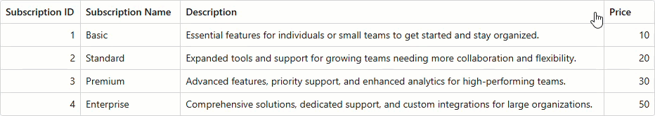
Truncate Cell Text with Ellipsis
The text-overflow CSS property controls how users are informed when text has been clipped. The most common value, ellipsis, automatically adds an ellipsis (…) to the end of the truncated text.
<DxGrid Data="Data.Subscriptions.Plans"
        @ref="Grid"
        CustomizeElement="Grid_CustomizeDescriptions"
        ColumnResizeMode="GridColumnResizeMode.NextColumn">
    <Columns>
        <DxGridDataColumn FieldName="Id" Caption="Subscription ID" />
        <DxGridDataColumn FieldName="Name" Caption="Subscription Name" />
        <DxGridDataColumn FieldName="Description" Caption="Description" />
        <DxGridDataColumn FieldName="PriceMonth" Caption="Price" />
    </Columns>
</DxGrid>

@code {
    IGrid Grid { get; set; }

    void Grid_CustomizeDescriptions(GridCustomizeElementEventArgs e)
    {
        if (e.ElementType == GridElementType.DataCell)
        {
            var column = (DxGridDataColumn)e.Column;
            if (column.FieldName == "Description")
            {
                e.CssClass = "clip-cell-content";
            }
        }
    }
}
Note
The text-overflow CSS property only takes effect when white-space is set to nowrap and the overflow property is set to hidden, scroll, or auto.
.clip-cell-content {
    text-overflow: ellipsis;
    white-space: nowrap;
}
Modify Column Header Style Based on Sort Settings
void Grid_CustomizeElement(GridCustomizeElementEventArgs e) {
    if (e.ElementType == GridElementType.HeaderCell) {
        var column = (DxGridDataColumn)e.Column;
        if (column.AllowSort == false)
            e.CssClass = "nonsortable-header";
        else
            e.CssClass = "my-header-cell";
    }
}
.nonsortable-header {
    background-color: red !important;
}
.my-header-cell[aria-sort="ascending"] {
    background-color: green !important;
}
.my-header-cell[aria-sort="descending"] {
    background-color: red !important;
}
Change Data Row Height
void Grid_CustomizeElement(GridCustomizeElementEventArgs e) {
    if(e.ElementType == GridElementType.DataCell) {
        e.Style = "min-height: 40px";
    }
}
Remove the Expand Button When a Detail Row Does Not Have Children
void Grid_CustomizeElement(GridCustomizeElementEventArgs e) {
    if (e.ElementType == GridElementType.DataRow) {
        if (((GridItem)MyGrid.GetDataItem(e.VisibleIndex)).HasChildren == false) //Your conditions here
            e.CssClass = "hide-expand-button";
    }
}
.hide-expand-button .dxbl-grid-expand-button {
    display: none !important;
}