DxComboBox<TData, TValue>.DisplayFormat Property
Specifies the pattern used to format the ComboBox’s display value when the editor is not focused.
Namespace: DevExpress.Blazor
Assembly: DevExpress.Blazor.v26.1.dll
Declaration
[DefaultValue(null)]
[Parameter]
public string DisplayFormat { get; set; }
Property Value
| Type | Default | Description |
|---|---|---|
| String | null | The format pattern. |
Remarks
Use the following ComboBox properties and templates to specify how editor values and items are displayed:
DisplayFormat: Formats the editor value when the editor is not focused.- EditFormat: Formats the editor value when the editor is focused.
ItemDisplayTemplate,EditBoxDisplayTemplate, andColumnCellDisplayTemplate: Customize the appearance of drop-down list items, an item displayed in the edit box, and cells (for a multi-column ComboBox).
This help topic describes how to use the DisplayFormat property in one-column and multi-column ComboBoxes. Refer to the following topic for additional information about supported format strings: Format strings and .NET types.
Format a One-Column ComboBox
The following example applies the currency format to numeric values.
<DxComboBox Data="@Prices" @bind-Value="@CurrentPrice" DisplayFormat="C"></DxComboBox>

@code {
    IEnumerable<decimal> Prices = new List<decimal>() {
        20.5m,
        25,
        50,
    };

    string CurrentPrice { get; set; }
}

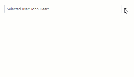
Format a Multi-Column ComboBox
The following code snippet adds three columns to a ComboBox and applies the {1} {2} format to the component’s display values. This format specifies that the editor value includes values of the following columns: FirstName (VisibleIndex = 1) and LastName (VisibleIndex = 2).
<DxComboBox Data="@Staff.DataSource"
            @bind-Value="@SelectedPerson"
            EditFormat="{1} {2}"
            DisplayFormat="Selected user: {1} {2}">
    <Columns>
        <DxListEditorColumn FieldName="Id" Width="50px" />
        <DxListEditorColumn FieldName="FirstName" />
        <DxListEditorColumn FieldName="LastName" />
    </Columns>
</DxComboBox>

@code {
    Person SelectedPerson { get; set; } = Staff.DataSource[0];
}
Format ComboBox Bound to a Custom-Type Collection
If you bind the ComboBox to a custom-type collection, you set the TextFieldName property. This property specifies the custom object’s field name that returns strings for the ComboBox’s drop-down window. The DisplayFormat is applied to these field values.
If the TextFieldName property is not specified, the ComboBox component searches for a Text field in the data source and uses this field as a text field. Otherwise, ComboBox populates its items with the CustomType.ToString() values. In these cases, the DisplayFormat is applied to these values.
<DxComboBox Data="@Data"
            @bind-Value="@CurrentID"
            DisplayFormat="dd/MM/yyyy"
            TextFieldName="@nameof(Model.DateTimeValue)"
            ValueFieldName="@nameof(Model.ID)">
</DxComboBox>

@code {
    public class Model {
        public DateTime DateTimeValue { get; set; }
        public int ID { get; set; }
    }

    int CurrentID { get; set; }
    List<Model> Data;

    protected override void OnInitialized() {
        Data = new() {
            new() { DateTimeValue = DateTime.Today.AddDays(-1), ID = 0 },
            new() { DateTimeValue = DateTime.Today, ID = 1 },
            new() { DateTimeValue = DateTime.Today.AddDays(1), ID = 2 },
            new() { DateTimeValue = DateTime.Today.AddDays(2), ID = 3 }
        };
    }
}
