DxComboBox<TData, TValue>.Columns Property
Allows you to add columns to the ComboBox.
Namespace: DevExpress.Blazor
Assembly: DevExpress.Blazor.v26.1.dll
Declaration
[Parameter]
public RenderFragment Columns { get; set; }
Property Value
| Type | Description |
|---|---|
| RenderFragment | A collection of columns (UI fragments). |
Remarks
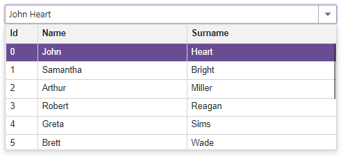
The DevExpress Blazor ComboBox control can display data across multiple columns. Follow the steps below to create columns:
- Add
<Columns>...</Columns>tag to the component’s markup to declare the column collection. - Populate the column collection with DxListEditorColumn objects. Each object corresponds to a separate column.
- For each
DxListEditorColumnobject, specify the data source field that populates column cells. - Specify the
DxListEditorColumnproperties to customize the column’s appearance as needed.
To format an edit box’s value, use the EditFormat property.
<DxComboBox Data="@Staff.DataSource"
            @bind-Value="@SelectedPerson"
            EditFormat ="{1} {2}">
    <Columns>
        <DxListEditorColumn FieldName="Id" Width="50px" />
        <DxListEditorColumn FieldName="FirstName" Caption="Name"/>
        <DxListEditorColumn FieldName="LastName" Caption="Surname"/>
    </Columns>
</DxComboBox>

@code {
    Person SelectedPerson { get; set; } = Staff.DataSource[0];
}
See Also