DxMenu.DisplayMode Property
Specifies whether the menu is displayed as a panel with root items or in a compact view.
Namespace: DevExpress.Blazor
Assembly: DevExpress.Blazor.v26.1.dll
Declaration
[DefaultValue(MenuDisplayMode.Auto)]
[Parameter]
public MenuDisplayMode DisplayMode { get; set; }
Property Value
| Type | Default | Description |
|---|---|---|
| MenuDisplayMode | Auto | A MenuDisplayMode enumeration value. |
Available values:
| Name | Description |
|---|---|
| Auto | Mobile and tablet devices show the menu in a compact view. |
| Desktop | The menu is shown as a panel with root items. Child items are available in drop-down menus. |
| Mobile | The menu is in a compact view. |
Remarks
The Menu component supports different display modes (the DisplayMode property):
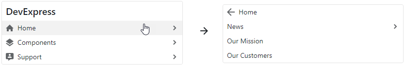
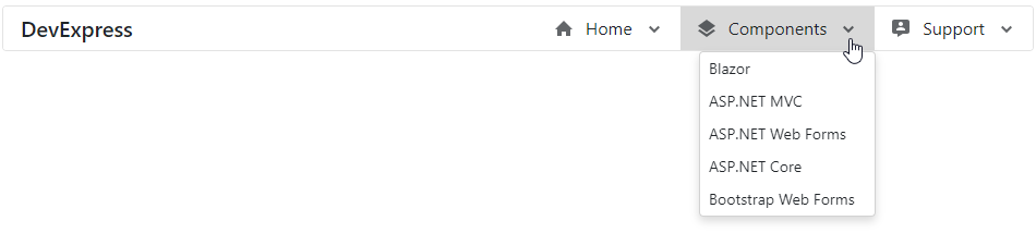
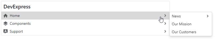
Auto- the menu automatically adapts to the device type.Desktop- the menu is shown as a panel with root items. The menu view also depends on the orientation: horizontal orientation places child items in drop-down menus; vertical orientation shows submenus with child items to the side of the menu container.Mobile- the menu has a compact view and depends on the orientation. In the horizontal orientation, it is a hamburger menu. In the vertical orientation, the menu looks like a desktop menu - a panel with root items, but submenus are shown in the main menu container and have the Back button.
The following code snippet specifies display mode:
<DxMenu Orientation="Orientation.Horizontal"
        DisplayMode="MenuDisplayMode.Desktop">
        ...
</DxMenu>
Desktop Horizontal Menu
Desktop Vertical Menu
Mobile Horizontal Menu

Mobile Vertical Menu