DxMaskedInput<T> Class
A text editor supports text, numeric, date-time, and regular expression masks.
Namespace: DevExpress.Blazor
Assembly: DevExpress.Blazor.v26.1.dll
Declaration
public class DxMaskedInput<T> :
    DxMaskedInputBase<T>,
    IFocusableEditor
Type Parameters
| Name | Description |
|---|---|
| T | The value type. |
Remarks
The DevExpress Masked Input for Blazor (<DxMaskedInput>) is a text editor that supports masks.
Most data editors work only with specific data types (DateTime, numeric objects, and so on). Date Time, Spin Edit, and Time Edit do not work when the data source stores dates or numbers as strings. Masked Input supports string values. The component converts strings from the data source to the corresponding type (DateTime, int, and so on) and then treats the value as a date or number. This allows you to use the full feature set of the selected mask type (Date-Time or Numeric) with string values.
Add a Masked Input to a Project
Follow the steps below to add the Masked Input component to an application:
- Create a Blazor Server or Blazor WebAssembly application.
- Add the
<DxMaskedInput>…</DxMaskedInput>markup to a.razorfile. - Configure the component: apply a mask, specify the editor’s value, handle value changes, and so on (see the sections below).
API Reference
Refer to the following list for the component API reference: DxMaskedInput Members.
Static Render Mode Specifics
Blazor Masked Input does not support static render mode. Enable interactivity to use the component in your application. Refer to the following topic for more details: Enable Interactive Render Mode.
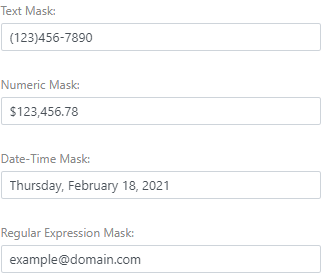
Apply a Mask
The Masked Input component supports the following mask types.
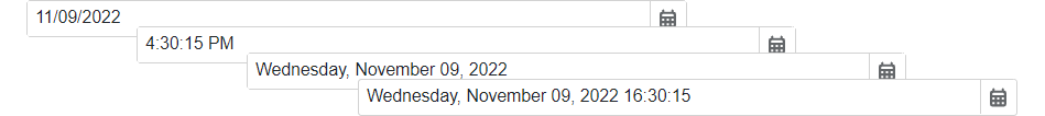
Date-Time
Date-time masks allow users to enter only date and time values. Users can navigate between mask sections, such as month, day, and hour, and use the Up Arrow and Down Arrow keys or the mouse wheel to increase or decrease section values, unless AllowUpDownArrowKeys and AllowMouseWheel are disabled.
Follow the steps below to apply a date-time mask:
- Make sure that the Value property is set to a DateTime object or a compatible String (for instance, “11/09/2022”). In the latter case, set the MaskMode property to
DateTime. - Assign a predefined or custom pattern to the Mask property.
- Optional. Add the DxDateTimeMaskProperties component to the Masked Input markup to customize mask settings.
The following code snippet applies a date-time mask:
<DxMaskedInput @bind-Value="@Value"
            Mask="@DateTimeMask.ShortDate">
    <DxDateTimeMaskProperties CaretMode="@MaskCaretMode.Advancing" />
</DxMaskedInput>

@code {
    DateTime Value = DateTime.Now;
}
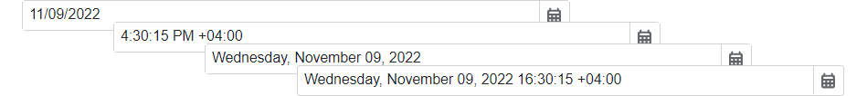
Date-Time Offset
Date-time offset masks allow users to enter only date and/or time values, including the time’s offset from Coordinated Universal Time (UTC). Users can navigate between mask sections (such as months, days, and hours) and increase/decrease section values with the Up Arrow and Down Arrow keys and the mouse wheel (unless AllowUpDownArrowKeys and AllowMouseWheel are disabled).
Follow the steps below to apply a date-time offset mask:
- Make sure that the Value property is set to a DateTimeOffset object or a compatible String (for instance, “11/09/2022”). In the latter case, set the MaskMode property to
DateTimeOffset. - Assign a predefined or custom pattern to the Mask property.
- Optional. Add the DxDateTimeOffsetMaskProperties component to the Masked Input markup to customize mask settings.
The following code snippet applies a date-time offset mask:
<DxMaskedInput @bind-Value="@Value"
            Mask="@DateTimeMask.ShortDate">
    <DxDateTimeOffsetMaskProperties CaretMode="@MaskCaretMode.Advancing" />
</DxMaskedInput>

@code {
    DateTimeOffset Value = DateTimeOffset.Now;
}
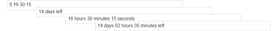
Time Span
Time span masks allow users to enter only time intervals. Users can navigate between mask sections (such as days, hours, and minutes) and increase/decrease section values with the Up Arrow and Down Arrow keys and the mouse wheel (unless AllowUpDownArrowKeys and AllowMouseWheel are disabled).
Follow the steps below to apply a time span mask:
- Make sure that the Value property is set to a TimeSpan object or a compatible String (for instance, “5:16:30:15”). In the latter case, set the MaskMode property to
TimeSpan. - Assign a predefined or custom pattern to the Mask property.
- Optional. Add the DxTimeSpanMaskProperties component to the Masked Input markup to customize mask settings.
The following code snippet applies a time span mask:
<DxMaskedInput @bind-Value="@Value"
            Mask="@TimeSpanMask.GeneralShortFormat">
    <DxTimeSpanMaskProperties CaretMode="@MaskCaretMode.Advancing" />
</DxMaskedInput>

@code {
    TimeSpan Value = new TimeSpan(6, 25, 30);
}
Numeric
Numeric masks allow users to enter only numeric values. Users can navigate between digits and increase/decrease digit values with the Up Arrow and Down Arrow keys and the mouse wheel (unless AllowUpDownArrowKeys and AllowMouseWheel are disabled).
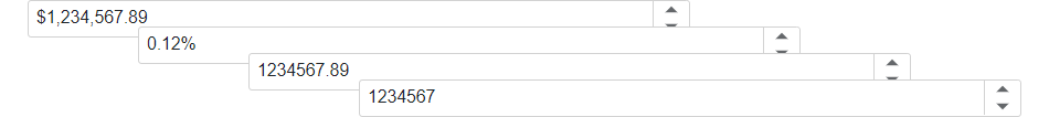
Follow the steps below to apply a numeric mask:
- Make sure that the Value property is set to a numeric object or a compatible String (for instance, “1234567”). In the latter case, set the MaskMode property to
Numeric. - Assign a predefined or custom pattern to the Mask property.
- Optional. Add the DxNumericMaskProperties component to the Masked Input markup to customize mask settings.
The following code snippet applies a numeric mask:
<DxMaskedInput @bind-Value="@Value"
            Mask="@NumericMask.RealNumber">
    <DxNumericMaskProperties Culture="Culture" />
</DxMaskedInput>

@code {
    Double Value = 1234567;
    CultureInfo Culture = CultureInfo.GetCultureInfo("fr-FR");
}
Text
Text masks allow users to enter only strings of limited length, such as phone numbers, zip codes, and social security numbers.
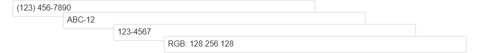
Follow the steps below to apply a text mask:
- Make sure that the Value property is set to a String object or the MaskMode property is set to
Text. - Combine metacharacters, special characters, and literal characters to create a mask pattern and assign it to the Mask property.
- Optional. Add the DxTextMaskProperties component to the Masked Input markup to customize mask settings.
The following code snippet applies a text mask:
<DxMaskedInput @bind-Value="Value"
               Mask="(000) 000-0000" >
    <DxTextMaskProperties Placeholder="Placeholder" />
</DxMaskedInput>

@code{
    String Value;
    char Placeholder = '#';
}
Regular Expression
If the mask types listed above do not meet your requirements, you can use regular expression masks. This mask type allows you to create advanced masks of variable lengths with multiple acceptable patterns and a limited range of character input.
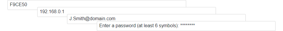
Follow the steps below to apply a regular expression mask:
- Set the MaskMode property to
RegEx. - Combine metacharacters, quantifiers, and literal characters to create a mask pattern and assign it to the Mask property.
- Optional. Add the DxRegExMaskProperties component to the Masked Input markup to customize mask settings.
The following code snippet applies a regular expression mask:
<DxMaskedInput @bind-Value="Value"
               Mask="\d{3,10}"
               MaskMode="@MaskMode.RegEx">
    <DxRegExMaskProperties Placeholder="Placeholder" />
</DxMaskedInput>

@code {
    String Value;
    char Placeholder = '#';
}
Edit Value
Use the Value property to specify an editor value or to bind the displayed text to a data source object. You can use the @bind attribute to bind the Value property to a data field. Refer to the following topic for details: Two-Way Data Binding.
Also, the specified value should fit the Mask pattern. Otherwise, the value cannot be displayed.
<DxMaskedInput @bind-Value="Value" Mask="[A-Z]*" MaskMode="MaskMode.RegEx"/>

@code {
    string Value { get; set; } = "TEXT";
}
The Value property updates its value when the editor loses focus (OnLostFocus mode). You can set the BindValueMode property to OnInput or OnDelayedInput to update the Value property when a user changes the input value.
Handle a Value Change
If you do not use two-way data binding, handle the ValueChanged event to respond to changes made in the editor. The following code snippet enables the Update Text button once a user types in the Masked Input editor.
<DxMaskedInput Value="Value"
               ValueChanged="@((int newValue) => OnValueChanged(newValue))"
               Mask="@NumericMask.Currency">
</DxMaskedInput>
<DxButton Enabled="@IsEnabled">Update Value</DxButton>

@code {
    int Value = 0;
    bool IsEnabled = false;

    void OnValueChanged(int newValue)
    {
        Value = newValue;
        if (newValue != 0)
            IsEnabled = true;
        else IsEnabled = false;
    }
}
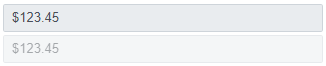
Disabled and ReadOnly Modes
Use the Enabled and ReadOnly properties to disable and mark the Masked Input component as read-only.
<DxMaskedInput @bind-Value="@Value"
               Mask="@NumericMask.Currency"
               ReadOnly="true">
</DxMaskedInput>

<DxMaskedInput @bind-Value="@Value"
               Mask="@NumericMask.Currency"
               Enabled="false">
</DxMaskedInput>

@code {
    double Value { get; set; } = 123.45;
}
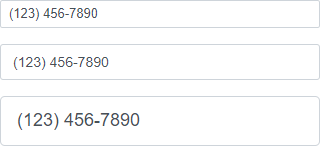
Appearance Customization
Use the SizeMode property to specify a Masked Input size. The following code snippet applies different size modes to Masked Input components.
<DxMaskedInput SizeMode="SizeMode.Small" @bind-Value="@Value" Mask="(000) 000-0000" />

<DxMaskedInput SizeMode="SizeMode.Medium" @bind-Text="@Value" Mask="(000) 000-0000" />

<DxMaskedInput SizeMode="SizeMode.Large" @bind-Text="@Value" Mask="(000) 000-0000" />

@code {
    string Value { get; set; }
}
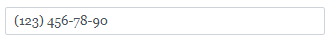
To apply custom CSS rules to Masked Input, use the InputCssClass property. The following code snippet changes the component font:
<DxMaskedInput @bind-Value="@Value"
                InputCssClass="my-style"
                Mask="(999) 000-00-00">
</DxMaskedInput>

@code {
    string Value { get; set; }
}
For additional information, refer to the following help topics:
Clear Button and Placeholder
Set the ClearButtonDisplayMode property to Auto to display the Clear button in the Masked Input editor when it is not empty. Use the NullText property to display the prompt text (placeholder) in the editor when its value is null.
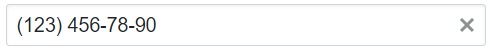
<DxMaskedInput @bind-Value="@Value"
               ClearButtonDisplayMode="DataEditorClearButtonDisplayMode.Auto"
               NullText="Specify a phone..."
               Mask="(000) 000-00-00">
</DxMaskedInput>

@code {
    string Value { get; set; }
}
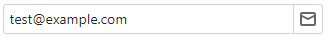
Add Command Buttons
You can add command buttons to the Masked Input. Refer to Command Buttons for additional information.
The following code snippet adds the Send E-mail button to the Masked Input component.
<DxMaskedInput Value="@Email"
               ValueChanged="@((string value) => OnEmailChanged(value))"
               Mask="@EmailMask"
               MaskMode="MaskMode.RegEx">
    <Buttons>
        <DxEditorButton IconCssClass="editor-icon editor-icon-mail"
                        Tooltip="Send Email"
                        NavigateUrl="@EmailLink"
                        CssClass="dx-demo-editor-width" />
    </Buttons>
</DxMaskedInput>


@code{
    string Email { get; set; } = "test@example.com";
    string EmailMask { get; set; } = @"(\w|[.-])+@(\w|-)+\.(\w|-){2,4}";
    string EmailLink { get; set; } = "mailto:test@example.com";
    void OnEmailChanged(string email) {
        Email = email;
        EmailLink = $"mailto:{email}";
    }
}
Input Validation
Refer to the following topics for base information about input validation:
You can add a standalone Masked Input or the Form Layout component to the Blazor standard EditForm. This form validates user input based on data annotation attributes defined in a model and indicates errors.
<EditForm Model="@starship" Context="EditFormContext">
    <DataAnnotationsValidator />
    <DxFormLayout >
        <DxFormLayoutItem Caption="Identifier:" ColSpanMd="6" >
            <Template >
                <DxMaskedInput @bind-Value="@starship.Identifier" Mask=".{,16}" MaskMode="@MaskMode.RegEx" />
            </Template >
        </DxFormLayoutItem >
        @*...*@
    </DxFormLayout>
</EditForm>

@code {
    private Starship starship = new Starship();
}
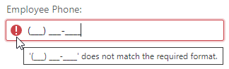
Note that if the Mask property contains strongly required values, the input value is validated even if the corresponding model field does not have the Required data validation attribute. The following code specifies a mask for the EmployeePhone string field:
<EditForm Model="@Model" Context="EditFormContext">
    <DxFormLayout>
        <DxFormLayoutItem Caption="Employee Phone:" ColSpanMd="6">
            <Template>
                <DxMaskedInput @bind-Value="@EmployeePhone"
                               Mask="(999) 000-0000" />
            </Template>
        </DxFormLayoutItem>
        @*...*@
    </DxFormLayout>
</EditForm>


@code {
    public string EmployeePhone { get; set; }
}
To disable input validation, set the MaskMode to RegEx and set the Mask property to a regular expression that accepts an empty string.
<EditForm Model="@Model" Context="EditFormContext">
    <DxFormLayout>
        <DxFormLayoutItem Caption="Employee Phone:" ColSpanMd="6">
            <Template>
                <DxMaskedInput @bind-Value="@EmployeePhone"
                               Mask="@(@"(\(\d{0,3}\)\d{3}\-\d{4})?")"
                               MaskMode="@MaskMode.RegEx" />
            </Template>
        </DxFormLayoutItem>
        @*...*@
    </DxFormLayout>
</EditForm>


@code {
    public string EmployeePhone { get; set; }
}
An alternative solution is to use the optional digit metacharacter for all digits: Mask="(999) 999-9999".
HTML Attributes and Events
You can use HTML attributes and events to configure the Masked Input.
<DxMaskedInput @bind-Value="@Value"
               Mask="(000) 000-0000"
               @onfocusout="MyFunction" />

@AlertText

@code {
    string Value { get; set; }

    void MyFunction()
    {
        AlertText = $"The Masked Input is out of focus!";
    }
}
Troubleshooting
If a Blazor application throws unexpected exceptions, refer to the following help topic: Troubleshooting.
Full-Width Numerals (IME)
The Masked Input mask does not support full-width numerals produced by Input Method Editors (IMEs). The editor accepts only standard ASCII digits.
As a workaround, you can implement a JavaScript function that handles the component input element’s beforeinput and pasteevents to convert input data to a standard string.