DxGridDataColumn.CellDisplayTemplate Property
Specifies a template used to display the column’s cells.
Namespace: DevExpress.Blazor
Assembly: DevExpress.Blazor.Grid.v26.1.dll
Declaration
[Parameter]
public RenderFragment<GridDataColumnCellDisplayTemplateContext> CellDisplayTemplate { get; set; }
Property Value
| Type | Description |
|---|---|
| RenderFragment<GridDataColumnCellDisplayTemplateContext> | The template for the column’s cells. |
Remarks
The CellDisplayTemplate property allows you to specify custom content and change the appearance of cells in individual columns. To define a common template for cells of all Grid columns, use the DxGrid.DataColumnCellDisplayTemplate.
The CellDisplayTemplate property accepts a GridDataColumnCellDisplayTemplateContext object as the context parameter. You can use the parameter’s members to get information about a column cell (DataColumn, Value, DisplayText, HighlightedDisplayText, VisibleIndex). You can also access the Grid object and use its members to obtain additional information about the Grid.
For additional information about templates in the Grid component, refer to the following topic: Templates in Blazor Grid.
Cell Editing Specifics
During edit operations, the Grid applies user changes only to the edit model and keeps the data item unchanged. DataItem, DisplayText, and Value context parameters return information about the data item, not the edit model. As a result, values of these properties do not reflect unsaved changes.
When the EditMode is set to CellEdit, only one grid cell can be in edit mode while others are in display mode. The CellDisplayTemplate affects contents of cells in display mode, including cells with modified values. To display unsaved changes in the CellDisplayTemplate, use the edit model’s field values instead of properties of the template’s context parameter:
@inject NwindDataService NwindDataService

<DxGrid @ref="Grid"
        Data="DataSource"
        KeyFieldName="EmployeeId"
        EditMode="GridEditMode.EditCell"
        EditModelSaving="Grid_EditModelSaving">
    <Columns>
        <DxGridDataColumn FieldName="FirstName">
            <CellDisplayTemplate Context="displayContext">
                @{
                    string value;
                    if (displayContext.Grid.IsEditingRow(displayContext.VisibleIndex)) {
                        var editModel = (Employee)displayContext.Grid.GetEditContext().Model;
                        value = editModel.FirstName;
                    }
                    else
                        value = displayContext.DisplayText;
                }
                <span>@value</span>
            </CellDisplayTemplate>
        </DxGridDataColumn>
        <DxGridDataColumn FieldName="LastName" />
        <DxGridDataColumn FieldName="BirthDate" />
        <DxGridDataColumn FieldName="HireDate" />
    </Columns>
</DxGrid>

@code {
    IGrid Grid { get; set; }
    IEnumerable<Employee> DataSource { get; set; }

    protected override async Task OnInitializedAsync() {
        DataSource = await NwindDataService.GetEmployeesAsync();
    }
    async Task Grid_EditModelSaving(GridEditModelSavingEventArgs e) {
        var editableEmployee = (Employee)e.EditModel;
        await NwindDataService.UpdateEmployeeAsync((Employee)e.DataItem, editableEmployee);
        DataSource = await NwindDataService.GetEmployeesAsync();
    }
}
Examples
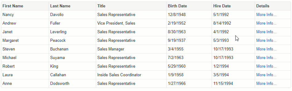
Show the More Info Links
The following example displays the More Info… links in cells of a column bound to the EmployeeId field. Users can click these links to view details about data rows in a pop-up window.
@using Microsoft.EntityFrameworkCore
@inject IDbContextFactory<NorthwindContext> NorthwindContextFactory
@implements IDisposable

<DxGrid Data="@Data">
    <Columns>
        <DxGridDataColumn FieldName="FirstName" />
        <DxGridDataColumn FieldName="LastName" />
        <DxGridDataColumn FieldName="Title" />
        <DxGridDataColumn FieldName="BirthDate" />
        <DxGridDataColumn FieldName="HireDate" />
        <DxGridDataColumn FieldName="EmployeeId" Caption="Details" AllowSort="false">
            <CellDisplayTemplate>
                <a class="d-block text-left" href="javascript:;" @onclick="() => ShowDetails(context)">More Info...</a>
            </CellDisplayTemplate>
        </DxGridDataColumn>
    </Columns>
</DxGrid>
<DxPopup @bind-Visible="@PopupVisible"
         HeaderText="@PopupHeaderText"
         HorizontalAlignment="HorizontalAlignment.Center"
         VerticalAlignment="VerticalAlignment.Center">
    @PopupContent
</DxPopup>

@code {
    IEnumerable<Employee> Data { get; set; }
    NorthwindContext Northwind { get; set; }
    Employee CurrentEmployee { get; set; }

    protected override void OnInitialized() {
        Northwind = NorthwindContextFactory.CreateDbContext();
        Data = Northwind.Employees
            .ToList();
    }
    bool PopupVisible {
        get { return CurrentEmployee != null; }
        set { if(!value) CurrentEmployee = null; }
    }
    string PopupHeaderText {
        get { return CurrentEmployee != null ? CurrentEmployee.FirstName + " " + CurrentEmployee.LastName : ""; }
    }
    string PopupContent {
        get { return CurrentEmployee != null ? CurrentEmployee.Notes : ""; }
    }
    public void ShowDetails(GridDataColumnCellDisplayTemplateContext context) {
        CurrentEmployee = Data.Where(e => e.EmployeeId == (int)context.Value).FirstOrDefault();
    }
    public void Dispose() {
        Northwind?.Dispose();
    }
}
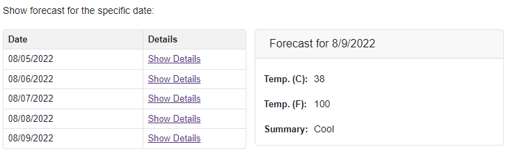
Show Detail Information in DxFormLayout
The following example creates a template grid column that shows the Show Details link. Users can click this link to view detail information about the current grid record. The information is displayed in the Blazor Form Layout.