Templates in Blazor Grid
- 5 minutes to read
Grid templates are RenderFragment<TValue> type properties. These render fragments can contain both markup and other Razor components. A template’s Razor markup can access an implicit parameter named context. This parameter is derived from the TValue type and contains template-related members.
<DxGrid Data="Products" ShowSearchBox="true">
    <Columns> ... </Columns>
    <SearchBoxTemplate>
        <DxSpinEdit Value="GetSpinEditValue(context.SearchText)"
                    ValueChanged="(int? v) => context.SearchText = v.ToString()"
                    ClearButtonDisplayMode="DataEditorClearButtonDisplayMode.Auto" />
    </SearchBoxTemplate>
</DxGrid>
You can use the Context attribute to change the parameter name. This name change is essential when you nest components that contain RenderFragment<TValue> properties, otherwise, the following error can occur: The child content element ‘ChildContent’ of component ‘X’ uses the same parameter name (‘context’) ….
<EditFormTemplate Context="editFormContext">
    <DxFormLayout>
        <DxFormLayoutItem Caption="First Name:">
            @editFormContext.GetEditor("FirstName")
        </DxFormLayoutItem>
        <DxFormLayoutItem Caption="Last Name:">
            @editFormContext.GetEditor("LastName")
        </DxFormLayoutItem>
    </DxFormLayout>
</EditFormTemplate>
Data Column Templates
This section lists data column properties that allow you to create templates for various elements.


| Element | Property |
|---|---|
| Column Header Caption | HeaderCaptionTemplate |
| Filter Row Cell | FilterRowCellTemplate |
| Group Row | GroupRowTemplate |
| Cell (Edit Mode) | CellEditTemplate |
| Cell (Display Mode) | CellDisplayTemplate |
| Column Group Footer | GroupFooterTemplate |
| Column Footer | FooterTemplate |
| Column Filter Menu | FilterMenuTemplate |
Command Column Templates
This section lists command column properties that allow you to create templates for various elements.

| Element | Property |
|---|---|
| Column Header | HeaderCaptionTemplate, HeaderTemplate |
| Filter Row Cell | FilterRowCellTemplate |
| Cell (Edit Mode) | CellEditTemplate |
| Cell (Display Mode) | CellDisplayTemplate |
| Column Group Footer | GroupFooterTemplate |
| Column Footer | FooterTemplate |
Selection Column Templates
This section lists selection column properties that allow you to create templates for various elements.

| Element | Property |
|---|---|
| Column Header | HeaderCaptionTemplate, HeaderTemplate |
| Filter Row Cell | FilterRowCellTemplate |
| Cell (Display Mode) | CellDisplayTemplate |
| Column Group Footer | GroupFooterTemplate |
| Column Footer | FooterTemplate |
Grid-Level Templates
This section lists template properties available on the component level. These properties serve two main purposes:
- Modify elements that are not part of columns.
- Specify templates that apply to all columns of a particular type.


| Element | Grid Property |
|---|---|
| Search Box | SearchBoxTemplate |
| Edit Form | EditFormTemplate |
| Detail Row | DetailRowTemplate |
| Cell (Display Mode) | DataColumnCellDisplayTemplate |
| Cell (Edit Mode) | DataColumnCellEditTemplate |
| Empty Data Area | EmptyDataAreaTemplate |
| Column Header Caption | ColumnHeaderCaptionTemplate |
| Toolbar | ToolbarTemplate |
| Filter Row Cell | DataColumnFilterRowCellTemplate |
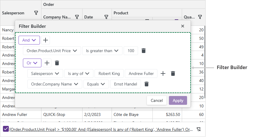
| Filter Builder | FilterBuilderTemplate |
| Column Filter Menu | DataColumnFilterMenuTemplate |
| Group Row | DataColumnGroupRowTemplate |
| Column Footer | ColumnFooterTemplate |
| Column Group Footer | ColumnGroupFooterTemplate |
GitHub Examples
- How to use DxUpload component to upload images to the grid
- How to edit a row on a separate page
- Use the DxTagBox control to filter a column against multiple values
- Create a custom record deletion confirmation dialog
- How to add a nested Grid to create a master-detail layout
- Master-Detail with partial loading
- Incorporate a selector for filter row operator type
- How to implement a date range filter
- Use icons instead of default command buttons
Task-Based Examples
This section contains code samples that demonstrate template functionality.
Create a Template an Runtime
You can specify a template as a method that returns required content (RenderFragment<TValue>). If the method returns null, the Grid renders the default element.
The following code snippet demonstrates two options used to specify the template - in the markup and in the AfterRender method.
<DxGrid Data="@forecasts" ShowFilterRow="true" @ref="Grid" >
    <Columns>
        <DxGridDataColumn FieldName="Date" FilterRowCellTemplate="GetFilterTemplate(true)" />
        <DxGridDataColumn FieldName="Temperature" FilterRowCellTemplate="GetFilterTemplate(false)" />
        <DxGridDataColumn FieldName="Summary" />
    </Columns>
</DxGrid>

@code {
    protected override void OnAfterRender(bool firstRender) {
        if (firstRender) {
            Grid.BeginUpdate();
            var column = Grid.GetDataColumns().First(c => c.FieldName == "Summary");
            column.CellDisplayTemplate = context => {
                return @<text><h1>@context.DisplayText</h1></text>;
            };
            column.FilterRowCellTemplate = GetFilterTemplate(false);
            Grid.EndUpdate();
        }
        base.OnAfterRender(firstRender);
    }
    RenderFragment<GridDataColumnFilterRowCellTemplateContext> GetFilterTemplate(bool isCustom) {
        if (!isCustom) return null;
        return context => {
            return __builder => {
                <DxDateEdit Date="(DateTime?)context.FilterRowValue"
                    DateChanged="(DateTime? v) => context.FilterRowValue = v" />
            };
        };
    }
}
Custom Pager
DxGrid does not support a template for the pager. However, you can set the PagerVisible property to false to hide the default pager and use custom components for navigation.
In the following code snippet, an external DxPager component allows users to navigate between pages.
.grid-container {
    width: 950px;
}
.pager-container {
    display: flex;
    justify-content: space-between;
    padding: 8px;
    border: 1px solid #d2d2d2;
    border-top: none;
}
<div class="grid-container">
    <DxGrid Data="Data" @bind-PageIndex="@ActivePageIndex" PagerVisible="false" PageSize="6" >
        <Columns>
            <DxGridDataColumn FieldName="ContactName" />
            <DxGridDataColumn FieldName="CompanyName" />
            <DxGridDataColumn FieldName="Country" />
            <DxGridDataColumn FieldName="City" />
        </Columns>
    </DxGrid>
    <div class="pager-container">
        <DxPager PageCount="@PageCount" @bind-ActivePageIndex="@ActivePageIndex" />
        <div>
            <DxButton Text="Custom Button 1" />
            <DxButton Text="Custom Button 2" />
        </div>
    </div>
</div>

@code {
    IEnumerable<object> Data { get; set; }
    int PageCount { get; set; }
    int ActivePageIndex { get; set; } = 1;

    protected override async Task OnInitializedAsync() {
        Data = await NwindDataService.GetCustomersAsync();
        PageCount = (int)Math.Ceiling((decimal)Data.Count()/6);
    }
}

Display Images in Grid Cells
To display an image from a binary source, place an <img> element into CellDisplayTemplate and specify the src property. Review the following example:
<DxGridDataColumn FieldName="ImageData">
    <CellDisplayTemplate>
        <img style="width: 300px;"
        src="@String.Format("data:image/gif;base64,{0}", Convert.ToBase64String((byte[])context.Value))" />
    </CellDisplayTemplate>
</DxGridDataColumn>
Display Links in Grid Cells
To display links in grid cells, implement a CellDisplayTemplate and add a link element to it.
The following code snippet displays the following links in a grid:
- A link that sends an email.
- A link that shows additional information.
<DxGrid Data="@employees" >
    <Columns>
        <DxGridDataColumn FieldName="FirstName" />
        <DxGridDataColumn FieldName="LastName" />
        <DxGridDataColumn FieldName="HireDate" />
        <DxGridDataColumn FieldName="Email">
            <CellDisplayTemplate>
                <a href="@("mailto:" + (string)(context.Value))">@((string)(context.Value))</a>
            </CellDisplayTemplate>
        </DxGridDataColumn>
         <DxGridDataColumn FieldName="ID" Caption="Notes">
            <CellDisplayTemplate>
                <a class="d-block text-left" href="javascript:;"
                    @onclick="() => ShowDetails(context)">More Info...</a>
            </CellDisplayTemplate>
        </DxGridDataColumn>
    </Columns>
</DxGrid>

@code {
    Employee[]? employees;
    protected override async Task OnInitializedAsync() {
        employees = await EmployeeData.GetData();
    }
    public void ShowDetails(GridDataColumnCellDisplayTemplateContext context) {
        Employee CurrentEmployee = employees.Where(e => e.ID == (int)context.Value).FirstOrDefault();
        string EmployeeInfo = CurrentEmployee != null ? CurrentEmployee.Notes : "";
        // ...
    }
}
