DxTimeEdit<T>.Buttons Property
Allows you to add command buttons to the Time Edit.
Namespace: DevExpress.Blazor
Assembly: DevExpress.Blazor.v26.1.dll
Declaration
[Parameter]
public RenderFragment Buttons { get; set; }
Property Value
| Type | Description |
|---|---|
| RenderFragment | A collection of buttons (UI fragments). |
Remarks
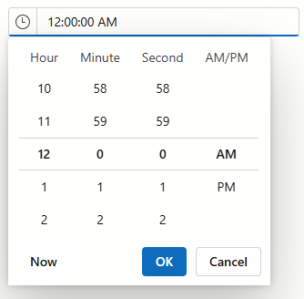
The Time Edit component has the built-in button that invokes a drop-down time picker. You can use the ShowDropDownButton property to hide this button.
You can also add custom command buttons to the Time Edit:
- Add the
<Buttons></Buttons>tag to the component’s markup to define theButtonscollection. Fill the
Buttonscollection. The following buttons are available:- DxTimeEditDropDownButton - A button that invokes a drop-down time picker (can be added to the DxTimeEdit<T> only).
- DxEditorButton - A custom button displayed in an editor.
Set up button properties to customize the buttons:
CssClassPositionFocusable- and so on
Buttons are displayed in an editor in the following order:
- The “Clear” button.
- Custom buttons and customized component-specific buttons (in the same order as they appear in markup).
- Built-in buttons.
Example
The following code snippet hides the built-in drop-down button, adds a new drop-down button, and specifies its position.
<DxTimeEdit Time="DateTime.Today.TimeOfDay" ShowDropDownButton=false>
    <Buttons>
        <DxTimeEditDropDownButton Position="EditorButtonPosition.Left"/>
    </Buttons>
</DxTimeEdit>
Limitation: Conditional Render
We do not recommend that you use conditional render within the <Buttons></Buttons> tag.
This may cause an incorrect button order. The following example demonstrates a case when Button1 may change its position.
<Buttons>
    @if(condition) {
        <DxEditorButton Text="Button1"/>
    }
    <DxEditorButton Text="Button2"/>
    <DxEditorButton Text="Button3"/>
</Buttons>
If you need to hide a button, set the Visible property to false.