Appointment Forms and Tooltips in Blazor Scheduler
- 24 minutes to read
The DevExpress Blazor Scheduler allows you to customize appointment forms and tooltips. This topic describes default forms and tooltips, how to customize their appearance, and embed predefined/custom layout items and buttons.
Default Appointment Tooltip
The DevExpress Blazor Scheduler shows a tooltip when a user clicks an appointment. The tooltip’s header contains the following buttons: Show Edit Form, Delete Appointment, Close Appointment, and Restore Occurence (for appointments with changed occurence). The tooltip’s body can display the appointment subject, start date, end date, location, description, and resource (if these properties are specified).

You can customize the tooltip’s body and header.
You can also hide the tooltip (set the ShowAppointmentTooltip property to false).
Custom Appointment Tooltip
You can use AppointmentTooltipTemplate and AppointmentTooltipHeaderTemplate properties to customize a tooltip’s body and header. These properties accept a SchedulerAppointmentTooltipInfo object as the context parameter. Use the context parameter to access appointment data.
You can add predefined or custom buttons to appointment tooltip templates.
The following code snippet creates a custom tooltip. The tooltip header displays the appointment’s subject (context.Appointment.Subject), the accepted status if it is true, and predefined buttons. The tooltip body displays the appointment’s subject (context.Appointment.Subject) and resource (context.Resource.Caption).
@using Data

<DxScheduler StartDate="@DateTime.Today"
             DataStorage="@DataStorage"
             GroupType="SchedulerGroupType.Date"
             ShowAppointmentTooltip = "true">
    <Views>
        <DxSchedulerDayView DayCount="2" ShowWorkTimeOnly="true"/>
    </Views>
    <AppointmentTooltipHeaderTemplate>
        <div class="tooltip-text-header">@context.Appointment.Subject</div>
        @if (IsAccepted(context))
        {
            <div class="my-margin">(Accepted)</div>
        }
        <DxSchedulerShowAppointmentCompactFormButton></DxSchedulerShowAppointmentCompactFormButton>
        <DxSchedulerDeleteAppointmentButton></DxSchedulerDeleteAppointmentButton>
        <DxSchedulerCloseAppointmentButton></DxSchedulerCloseAppointmentButton>
    </AppointmentTooltipHeaderTemplate>
    <AppointmentTooltipTemplate>
        <span class="my-align">
            @context.Appointment.Subject
        </span>
        @if (context.Resource != null)
        {
            <span class="my-align">
                (@context.Resource.Caption)
            </span>
        }
    </AppointmentTooltipTemplate>
</DxScheduler>

@code {
    DxSchedulerDataStorage DataStorage = new DxSchedulerDataStorage() {
            AppointmentsSource = ResourceAppointmentCollection.GetAppointments(),
            AppointmentMappings = new DxSchedulerAppointmentMappings() {
                Type = "AppointmentType",
                Start = "StartDate",
                End = "EndDate",
                Subject = "Caption",
                AllDay = "AllDay",
                Location = "Location",
                Description = "Description",
                LabelId = "Label",
                StatusId = "Status",
                RecurrenceInfo = "Recurrence",
                ResourceId = "ResourceId",
                CustomFieldMappings = new List<DxSchedulerCustomFieldMapping> {
                new DxSchedulerCustomFieldMapping{ Name = "Accepted", Mapping = "Accepted" }
            }
            },
            ResourcesSource = ResourceAppointmentCollection.GetResourcesForGrouping(),
            ResourceMappings = new DxSchedulerResourceMappings() {
                Id = "Id",
                Caption = "Name",
                BackgroundCssClass = "BackgroundCss",
                TextCssClass = "TextCss"
            }
        };
    bool IsAccepted(SchedulerAppointmentTooltipInfo tooltipInfo) =>
        (bool)tooltipInfo.CustomFields["Accepted"];
}

Default Appointment Form
A Scheduler can show two forms when users create and edit appointments:
- The compact edit form - Appears when a user creates or edits an appointment.
- The extended edit form - Opens when a user clicks the expand button in the compact edit form.
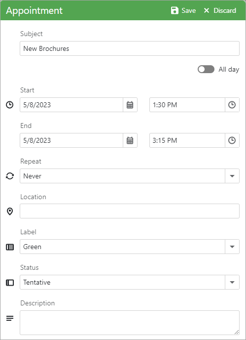
Extended Appointment Form
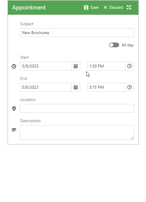
Compact Appointment Form
Use the AppointmentFormMode property to specify which form is available for users.
@using Data

<DxScheduler StartDate="@DateTime.Today"
             DataStorage="@DataStorage"
             AppointmentFormMode="SchedulerAppointmentFormMode.EditForm">
    <DxSchedulerWeekView/>
</DxScheduler>

@code {
    DxSchedulerDataStorage DataStorage = new DxSchedulerDataStorage() {
        AppointmentsSource = AppointmentCollection.GetAppointments(),
        AppointmentMappings = new DxSchedulerAppointmentMappings() {
            Id = "Id",
            Type = "AppointmentType",
            Start = "StartDate",
            End = "EndDate",
            Subject = "Caption",
            AllDay = "AllDay",
            Location = "Location",
            Description = "Description",
            LabelId = "Label",
            StatusId = "Status",
            RecurrenceInfo = "Recurrence"
        }
    };
}
You can change the Repeat item list in default appointment forms. Refer to Specify Available Recurrence Modes.
You can also create a custom appointment form.
Custom Appointment Form
Use the following properties to create a custom appointment edit form:
- AppointmentCompactFormLayout - the layout of the compact form that appears when a user creates or edits an appointment.
- AppointmentCompactFormHeaderTemplate - the header of the compact form.
- AppointmentFormLayout - the layout of the extended form that opens when a user clicks the expand button in the compact edit form.
- AppointmentFormHeaderTemplate - the header of the extended form.
You can use predefined and custom layout items to construct the layout in the same way as when you use the DxFormLayout component.
You can also add predefined and custom buttons to appointment forms and their headers.
Predefined Layout Items
You can add the following predefined layout items to set up the layout. They correspond to the items of the default appointment form.
- DxSchedulerSubjectFormLayoutItem
- DxSchedulerAllDayFormLayoutItem
- DxSchedulerStartDateFormLayoutItem
- DxSchedulerStartTimePickerFormLayoutItem
- DxSchedulerEndDateFormLayoutItem
- DxSchedulerEndTimePickerFormLayoutItem
- DxSchedulerRepeatFormLayoutItem
- DxSchedulerLocationFormLayoutItem
- DxSchedulerLabelFormLayoutItem
- DxSchedulerStatusFormLayoutItem
- DxSchedulerResourceFormLayoutItem
- DxSchedulerDescriptionFormLayoutItem
<DxScheduler StartDate="@DateTime.Today"
             DataStorage="@DataStorage"
             ActiveViewType="SchedulerViewType.WorkWeek">
    <Views>
        <DxSchedulerWorkWeekView VisibleTime="@(new DxSchedulerTimeSpanRange(TimeSpan.FromHours(8),
                                 TimeSpan.FromHours(19)))">
            @*...*@
        </DxSchedulerWorkWeekView>
    </Views>
    <AppointmentFormLayout >
        <DxSchedulerSubjectFormLayoutItem/>
        <DxSchedulerAllDayFormLayoutItem/>
        <DxSchedulerStartDateFormLayoutItem/>
        <DxSchedulerStartTimeFormLayoutItem/>
        <DxSchedulerEndDateFormLayoutItem/>
        <DxSchedulerEndTimeFormLayoutItem/>
        <DxSchedulerRepeatFormLayoutItem/>
        <DxSchedulerLocationFormLayoutItem/>
        <DxSchedulerLabelFormLayoutItem/>
        <DxSchedulerStatusFormLayoutItem/>
        <DxSchedulerResourceFormLayoutItem/>
        <DxSchedulerDescriptionFormLayoutItem/>
    </AppointmentFormLayout>
</DxScheduler>
You can customize settings of these predefined items. For instance, show or hide an icon, assign a custom icon, change a caption, and much more. Refer to an item’s member list for additional information.
Custom Layout Items
If predefined items do not suit your requirements, you can use a custom layout item. Add a DxSchedulerCustomFormLayoutItem to the form layout and use its Template property to define item content. For example, you can display an editor for a custom appointment property.
AppointmentFormLayout and AppointmentCompactFormLayout accept a SchedulerAppointmentFormInfo object as the Context parameter. You can use this parameter in the layout item template to obtain information about appointment settings.
If appointments contain custom properties, implement a SchedulerAppointmentFormInfo descendant and declare the corresponding properties in the class. Handle the AppointmentFormShowing event and assign a custom descendant instance to the event’s FormInfo argument.
<DxScheduler StartDate="@DateTime.Today"
             DataStorage="@DataStorage"
             ActiveViewType="SchedulerViewType.WorkWeek"
             AppointmentFormShowing="OnAppointmentFormShowing">
    @*...*@
    <AppointmentFormLayout Context="formInfo">
        @*...*@
        <DxSchedulerCustomFormLayoutItem ColSpanMd="12">
            <Template>
                <div class="my-style">
                    <DxCheckBox @bind-Checked="@(((CustomAppointmentFormInfo)formInfo).IsAccepted)"
                                Alignment="CheckBoxContentAlignment.Right">Accept</DxCheckBox>
                </div>
            </Template>
        </DxSchedulerCustomFormLayoutItem>
    </AppointmentFormLayout>
</DxScheduler>

@code {
    DxScheduler scheduler { get; set; }

    public class CustomAppointmentFormInfo : SchedulerAppointmentFormInfo {
        public CustomAppointmentFormInfo(DxSchedulerAppointmentItem AppointmentItem,
                DxSchedulerDataStorage DataStorage, DxScheduler scheduler) : base(AppointmentItem, DataStorage, scheduler) { }

        public bool IsAccepted {
            get { return (bool)CustomFields["IsAccepted"]; }
            set { CustomFields["IsAccepted"] = value; }
        }
    }

    void OnAppointmentFormShowing(SchedulerAppointmentFormEventArgs args) {
        args.FormInfo = new CustomAppointmentFormInfo(args.Appointment, DataStorage, scheduler);
    }

    DxSchedulerDataStorage DataStorage = new DxSchedulerDataStorage() {
        AppointmentsSource = AppointmentCollection.GetAppointments(),
        AppointmentMappings = new DxSchedulerAppointmentMappings() {
            Id = "Id",
            Type = "AppointmentType",
            Start = "StartDate",
            End = "EndDate",
            Subject = "Caption",
            AllDay = "AllDay",
            Location = "Location",
            Description = "Description",
            LabelId = "Label",
            StatusId = "Status",
            RecurrenceInfo = "Recurrence"
        }
    };
    // ...
}
Predefined Buttons
You can add the following predefined buttons to appointment forms, tooltips and their headers:
- DxSchedulerCloseAppointmentButton
- DxSchedulerCloseRecurrenceSettingsFormButton
- DxSchedulerDeleteAppointmentButton
- DxSchedulerDiscardAppointmentChangesButton
- DxSchedulerRestoreAppointmentOccurrenceButton
- DxSchedulerSaveAppointmentChangesButton
- DxSchedulerShowAppointmentCompactFormButton
- DxSchedulerShowAppointmentEditFormButton
<DxScheduler StartDate="@DateTime.Today"
             DataStorage="@DataStorage"
             ActiveViewType="SchedulerViewType.WorkWeek">
    <Views>
        <DxSchedulerWorkWeekView VisibleTime="@(new DxSchedulerTimeSpanRange(TimeSpan.FromHours(8),
                                 TimeSpan.FromHours(19)))">
            @*...*@
        </DxSchedulerWorkWeekView>
    </Views>
    <AppointmentFormHeaderTemplate>
        <DxSchedulerSaveAppointmentChangesButton/>
        <DxSchedulerDeleteAppointmentButton/>
        <DxSchedulerDiscardAppointmentChangesButton/>
    </AppointmentFormHeaderTemplate>
</DxScheduler>
You can customize settings of these predefined buttons. For instance, you can show or hide an icon and change a button’s text or tooltip.
Custom Buttons
If predefined buttons do not suit your requirements, you can create a custom button. Add a DxButton to the form layout or form header, and handle its Click event. You can use the following methods in the handler:
- ClosePopupAsync()
- CloseRecurrenceSettingsFormAsync()
- CreateAppointmentAsync(DateTime, DateTime, Boolean, Object)
- DeleteAppointmentAsync(DxSchedulerAppointmentItem)
- RestoreAppointmentOccurrenceAsync(DxSchedulerAppointmentItem)
- SaveAppointmentAsync(DxSchedulerAppointmentItem)
- ShowAppointmentTooltipAsync(DxSchedulerAppointmentItem, DxSchedulerResourceItem)
The following code snippet creates a button that closes the edit form.
<DxScheduler StartDate="@DateTime.Today"
             DataStorage="@DataStorage"
             @ref="Scheduler">
    <Views>
        <DxSchedulerWeekView ShowWorkTimeOnly="false"
                             TimeIndicatorVisibility="SchedulerTimeIndicatorVisibility.Never"
                             TimeScale="@(new TimeSpan(0,15,0))"
                             WorkTime="@(new DxSchedulerTimeSpanRange(TimeSpan.FromHours(9), TimeSpan.FromHours(18)))"
                             VisibleTime="@(new DxSchedulerTimeSpanRange(TimeSpan.FromHours(8), TimeSpan.FromHours(19)))">
        </DxSchedulerWeekView>
    </Views>
    <AppointmentFormHeaderTemplate>
        <div class="popup-text-header">@context.Subject</div>
        <DxButton Click="@(() => Scheduler.ClosePopupAsync())"
                  Text="Close"
                  IconCssClass="btn-icon-close"
                  RenderStyle="ButtonRenderStyle.None"
                  CssClass="custom-button">
        </DxButton>
    </AppointmentFormHeaderTemplate>
</DxScheduler>

@code {
    DxScheduler Scheduler { get; set; }
}
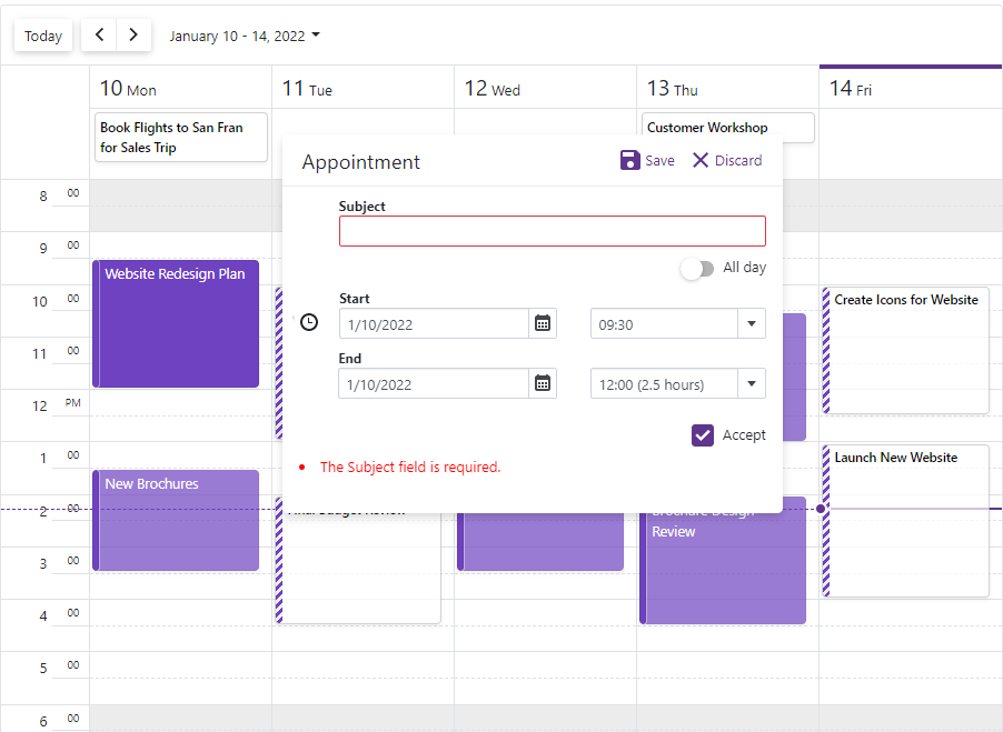
Form Validation
Follow the steps below to enable appointment form validation:
- Implement a SchedulerAppointmentFormInfo class descendant and mark appointment properties with data annotation attributes.
- Handle the AppointmentFormShowing event and assign a custom descendant instance to the event argument’s FormInfo property.
- Set the Scheduler’s ValidateEditForm property to
true. - Add a DxSchedulerCustomFormLayoutItem to the form layout and use the ValidationSummary component in the item template to display validation messages.
Important
You should not rely on form validation alone to secure your Blazor-powered app. Form validation is designed to improve usability. A threat actor can bypass validation and send malicious data to the server. To minimize security related threats/risks, you must validate user input using multiple strategies. Refer to the following topic for additional information: Validate User Input.
@using System.ComponentModel.DataAnnotations

<DxScheduler StartDate="@DateTime.Today"
             DataStorage="@DataStorage"
             ActiveViewType="SchedulerViewType.WorkWeek"
             AppointmentFormShowing="OnAppointmentFormShowing"
             ValidateEditForm="true">
    @*...*@
    <AppointmentFormLayout>
        @*...*@
        <DxSchedulerCustomFormLayoutItem ColSpanMd="12">
            <Template>
                <ValidationSummary />
            </Template>
        </DxSchedulerCustomFormLayoutItem>
    </AppointmentFormLayout>
</DxScheduler>

@code {
    DxScheduler scheduler { get; set; }

    public class CustomAppointmentFormInfo : SchedulerAppointmentFormInfo {
        public CustomAppointmentFormInfo(DxSchedulerAppointmentItem AppointmentItem,
                DxSchedulerDataStorage DataStorage, DxScheduler scheduler) : base(AppointmentItem, DataStorage, scheduler) { }

        [Required]
        public override string Subject {
            get { return base.Subject; }
            set { base.Subject = value; }
        }
        // ...
    }

    void OnAppointmentFormShowing(SchedulerAppointmentFormEventArgs args) {
        args.FormInfo = new CustomAppointmentFormInfo(args.Appointment, DataStorage, scheduler);
    }
    // ...
}
Complete Example
The following example demonstrates how to:
- Add the IsAccepted custom property to appointments as described in the following topic: Custom Fields.
- Use AppointmentFormLayout and AppointmentCompactFormLayout properties to create a layout for the extended and compact edit forms.
- Add predefined layout items (Subject, All day, Start, End to both forms; Location and Description to the extended form).
- Add two custom layout items: the first item displays the
IsAcceptedproperty’s editor, the second item shows validation summary. - Mark the Subject appointment property with the RequiredAttribute.
- Set the Scheduler’s ValidateEditForm property to
trueto enable appointment form validation.

Extended Appointment Form
Compact Appointment Form
@using System.ComponentModel.DataAnnotations

<DxScheduler StartDate="@DateTime.Today"
             DataStorage="@DataStorage"
             ActiveViewType="SchedulerViewType.WorkWeek"
             AppointmentFormShowing="OnAppointmentFormShowing"
             ValidateEditForm="true"
             CssClass="mw-1100">
    <Views>
        <DxSchedulerWorkWeekView VisibleTime="@(new DxSchedulerTimeSpanRange(TimeSpan.FromHours(8),
                                 TimeSpan.FromHours(19)))">
            <HorizontalAppointmentTemplate>
                <div class="demo-sc-apt @((bool)context.CustomFields["IsAccepted"] ?
                           "demo-sc-accepted " : "")">
                    <div class="card demo-apt-bg dxbl-purple-color"></div>
                    <div class="card app-subject demo-sc-apt-content text-white">
                        @context.Appointment.Subject
                    </div>
                </div>
            </HorizontalAppointmentTemplate>
            <VerticalAppointmentTemplate>
                <div class="vertical-app demo-sc-apt @((bool)context.CustomFields["IsAccepted"] ?
                           "demo-sc-accepted" : "")">
                    <div class="card demo-apt-bg dxbl-purple-color"></div>
                    <div class="card demo-sc-apt-content text-white">
                        <div class="card demo-sc-status-container">
                            <div class="card demo-apt-status dxbl-purple-color"></div>
                        </div>
                        <div class="demo-apt-subject">
                            @context.Appointment.Subject
                        </div>
                    </div>
                </div>
            </VerticalAppointmentTemplate>
        </DxSchedulerWorkWeekView>
    </Views>
    <AppointmentFormLayout Context="formInfo">
        <DxSchedulerSubjectFormLayoutItem/>
        <DxSchedulerAllDayFormLayoutItem/>
        <DxSchedulerStartDateFormLayoutItem/>
        <DxSchedulerStartTimeFormLayoutItem/>
        <DxSchedulerEndDateFormLayoutItem/>
        <DxSchedulerEndTimeFormLayoutItem/>
        <DxSchedulerLocationFormLayoutItem/>
        <DxSchedulerDescriptionFormLayoutItem/>
        <DxSchedulerCustomFormLayoutItem ColSpanMd="12">
            <Template>
                <div class="my-style">
                    <DxCheckBox @bind-Checked="@(((CustomAppointmentFormInfo)formInfo).IsAccepted)"
                        Alignment="CheckBoxContentAlignment.Right">Accept</DxCheckBox>
                </div>
            </Template>
        </DxSchedulerCustomFormLayoutItem>
        <DxSchedulerCustomFormLayoutItem ColSpanMd="12">
            <Template>
                <ValidationSummary />
            </Template>
        </DxSchedulerCustomFormLayoutItem>
    </AppointmentFormLayout>
    <AppointmentCompactFormLayout Context="formInfo">
        <DxSchedulerSubjectFormLayoutItem></DxSchedulerSubjectFormLayoutItem>
        <DxSchedulerAllDayFormLayoutItem></DxSchedulerAllDayFormLayoutItem>
        <DxSchedulerStartDateFormLayoutItem></DxSchedulerStartDateFormLayoutItem>
        <DxSchedulerStartTimeFormLayoutItem></DxSchedulerStartTimeFormLayoutItem>
        <DxSchedulerEndDateFormLayoutItem></DxSchedulerEndDateFormLayoutItem>
        <DxSchedulerEndTimeFormLayoutItem></DxSchedulerEndTimeFormLayoutItem>
        <DxSchedulerCustomFormLayoutItem ColSpanMd="12">
            <Template>
                <div class="my-style">
                    <DxCheckBox @bind-Checked="@(((CustomAppointmentFormInfo)formInfo).IsAccepted)"
                        Alignment="CheckBoxContentAlignment.Right">Accept</DxCheckBox>
                </div>
            </Template>
        </DxSchedulerCustomFormLayoutItem>
        <DxSchedulerCustomFormLayoutItem ColSpanMd="12">
            <Template>
                <ValidationSummary />
            </Template>
        </DxSchedulerCustomFormLayoutItem>
    </AppointmentCompactFormLayout>
</DxScheduler>

@code {
    public class CustomAppointmentFormInfo : SchedulerAppointmentFormInfo {
        public CustomAppointmentFormInfo(DxSchedulerAppointmentItem AppointmentItem, DxSchedulerDataStorage DataStorage)
            : base(AppointmentItem, DataStorage) { }

        [Required]
        public override string Subject {
            get { return base.Subject; }
            set { base.Subject = value; }
        }

        public bool IsAccepted {
            get { return (bool)CustomFields["IsAccepted"]; }
            set { CustomFields["IsAccepted"] = value; }
        }
    }

    void OnAppointmentFormShowing(SchedulerAppointmentFormEventArgs args) {
        args.FormInfo = new CustomAppointmentFormInfo(args.Appointment, DataStorage);
    }

    DxSchedulerDataStorage DataStorage = new DxSchedulerDataStorage() {
        AppointmentsSource = AppointmentCollection.GetAppointments(),
        AppointmentMappings = new DxSchedulerAppointmentMappings() {
            Id = "Id",
            Type = "AppointmentType",
            Start = "StartDate",
            End = "EndDate",
            Subject = "Caption",
            AllDay = "AllDay",
            Location = "Location",
            Description = "Description",
            CustomFieldMappings = new List<DxSchedulerCustomFieldMapping> {
                new DxSchedulerCustomFieldMapping { Name = "IsAccepted", Mapping = "Accepted" }
            }
        }
    };
}
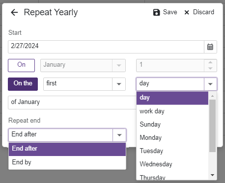
Recurrence Form
When a user creates or edits a recurring appointment and selects a value other than Never in the Appointment form’s Repeat section, the Recurrence form appears. This form has a different layout for each rule type: Daily, Weekly, Monthly, Yearly. When a user fills in form fields and clicks Save, field values are saved to the DxSchedulerRecurrenceInfo object.
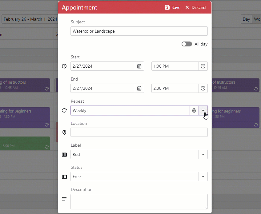
In the Recurrence form, you can change the list of repeat end items and the list of week days available for Repeat Monthly and Repeat Yearly appointments. To do this, handle the Scheduler’s AppointmentFormShowing event, use the RecurrenceFormInfo property to get information about the Recurrence form, modify RepeatEndItems and WeekDayItems properties.
The following code snippet does the following:
- Defines two items in the Repeat end list: End after, End by. The list displays items in the same order as in code.
- Removes the Weekend item from the Week day list.
<DxScheduler DataStorage="@DataStorage"
             AppointmentFormMode="SchedulerAppointmentFormMode.EditForm"
             AppointmentFormShowing="OnAppointmentFormShowing">
    <DxSchedulerWeekView ShowWorkTimeOnly="true" />
</DxScheduler>

@code {
    DxSchedulerDataStorage DataStorage = new DxSchedulerDataStorage() {
            AppointmentsSource = AppointmentCollection.GetAppointments(),
            AppointmentMappings = new DxSchedulerAppointmentMappings() {
                Start = "StartDate",
                End = "EndDate",
                Subject = "Caption",
                LabelId = "Label",
                StatusId = "Status"
            }
        };

    void OnAppointmentFormShowing(SchedulerAppointmentFormEventArgs args) {
        args.FormInfo.RecurrenceFormInfo.RepeatEndItems = new List<SchedulerRecurrenceRange>() {
            SchedulerRecurrenceRange.OccurrenceCount,
            SchedulerRecurrenceRange.EndByDate
        };

        args.FormInfo.RecurrenceFormInfo.WeekDayItems.Remove(SchedulerWeekDays.WeekendDays);
    }
}
You can also customize the Repeat field in default appointment forms. Refer to Specify Available Recurrence Modes.
Tooltip and Form Events
The DevExpress Blazor Scheduler component allows you to handle events that fire when users open/close tooltips and edit forms. You can cancel operations or execute additional logic.
| Event | Description |
|---|---|
| AppointmentTooltipShowing | Fires before an appointment tooltip is shown. |
| AppointmentTooltipShown | Fires after an appointment tooltip is shown. |
| AppointmentTooltipClosing | Fires before an appointment tooltip is closed. |
| AppointmentTooltipClosed | Fires after an appointment tooltip is closed. |
| AppointmentFormShowing | Fires before the appointment form is shown. |
| AppointmentFormShown | Fires after an appointment form is shown. |
| AppointmentFormClosing | Fires before the appointment form is closed. |
| AppointmentFormClosed | Fires after the appointment form is closed. |