DxDropDownButtonBase.Tooltip Property
Specifies a button’s tooltip text.
Namespace: DevExpress.Blazor
Assembly: DevExpress.Blazor.v26.1.dll
Declaration
[DefaultValue(null)]
[Parameter]
public string Tooltip { get; set; }
Property Value
| Type | Default | Description |
|---|---|---|
| String | null | The tooltip text. |
Remarks
Use the Tooltip property to specify tooltip text for the following components:
- DxDropDownButton
- A button that reveals a drop-down element with a list of commands or custom content.
- DxSplitButton
- A composite control that consists of a primary button and a toggleable secondary button that reveals a drop-down element.
- DxDropDownButtonItem
- Defines a drop-down list item. Used in DxDropDownButton or DxSplitButton.
The following code snippet assigns tooltips to the DxDropDownButton component and its nested items:
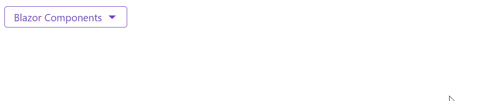
<DxDropDownButton Text="Blazor Components"
                  RenderStyleMode="ButtonRenderStyleMode.Outline"
                  Tooltip="Click to see possible options">
    <Items>
        <DxDropDownButtonItem Text="Documentation"
                              NavigateUrl="https://docs.devexpress.com/Blazor/400725/blazor-components"
                              Tooltip="This item contains a link" />
        <DxDropDownButtonItem Text="Demos"
                              NavigateUrl="https://demos.devexpress.com/blazor/"
                              Tooltip="This item contains a link" />
    </Items>
</DxDropDownButton>
See Also