TreeListCustomizeElementEventArgs.ElementType Property
Returns an element type.
Namespace: DevExpress.Blazor
Assembly: DevExpress.Blazor.Grid.v26.1.dll
Declaration
public TreeListElementType ElementType { get; }Property Value
| Type | Description |
|---|---|
| TreeListElementType | An enumeration value. |
Available values:
| Name | Description |
|---|---|
| DataRow | A data row. |
| DataCell | A data column cell. |
| CommandCell | A command column cell. |
| SelectionCell | A selection column cell. |
| EditRow | An edit row. |
| EditCell | A cell displayed in the edited row. |
| EditCommandCell | A command column cell displayed in the edited row. |
| EditSelectionCell | A selection column cell displayed in the edited row. |
| EditFormCell | An edit form cell. |
| PopupEditForm | |
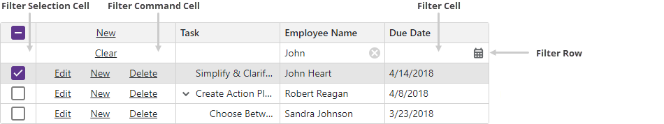
| FilterRow | The filter row. |
| FilterCell | A filter row’s edit cell. |
| FilterCommandCell | A filter row‘s command column cell. |
| FilterSelectionCell | A filter row’s selection column cell. |
| HeaderRow | A row that contains TreeList column headers. |
| HeaderCell | A data column header cell. |
| HeaderCommandCell | A command column header cell. |
| HeaderSelectionCell | A selection column‘s header cell. |
| FooterRow | The footer. |
| FooterCell | A band‘s footer cell. |
| FooterCommandCell | The footer‘s command column cell. |
| FooterSelectionCell | The selection column’s footer cell. |
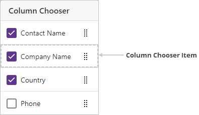
| ColumnChooserItem | A column chooser item. |
| PagerContainer | A container that stores the TreeList pager. |
| SearchBoxContainer | A container that stores the TreeList search box. |
| ToolbarContainer | A container that stores the TreeList toolbar. |
| EmptyDataArea | An empty data area. |
| EmptyBandCell | A band‘s empty data cell. |
| HeaderBandCell | A band‘s header cell. |
| FooterBandCell | A footer cell. |
| RowDragAnchorCell | A drag anchor. |
| DragHint | A drag hint. |
| EditNewRootItemRow | A new item row. |
| FilterPanel | The filter panel. |
Remarks
Use this property to define an element type when you handle the CustomizeElement event.
The following code customizes the appearance of TreeList elements that meet the following criteria:
- Rows that have child rows are highlighted.
- Cells in March Change and September Change columns that display values larger than
5%are colored green. - Cells in March Change and September Change columns that display negative values are colored red.
<DxTreeList Data="Data"
            KeyFieldName="ID"
            ParentKeyFieldName="RegionID"
            CustomizeElement="TreeList_CustomizeElement">
    <Columns>
        <DxTreeListDataColumn FieldName="Region" />
        <DxTreeListDataColumn FieldName="MarchSales" DisplayFormat="c0" />
        <DxTreeListDataColumn FieldName="SeptemberSales" DisplayFormat="c0" />
        <DxTreeListDataColumn FieldName="MarchChange" DisplayFormat="p2" />
        <DxTreeListDataColumn FieldName="SeptemberChange" DisplayFormat="p2" />
        <DxTreeListDataColumn FieldName="MarketShare" DisplayFormat="p0" />
    </Columns>
</DxTreeList>

@code {
    object Data { get; set; }

    protected override void OnInitialized () {
        Data = SalesByRegionDataProvider.GenerateData();
    }

    void TreeList_CustomizeElement(TreeListCustomizeElementEventArgs e) {
        if(e.ElementType == TreeListElementType.DataRow
                         && (int)e.TreeList.GetRowValue(e.VisibleIndex, "RegionID") == 0) {
            e.CssClass = "parent-region-row";
        }
        if(e.ElementType == TreeListElementType.DataCell && e.Column is ITreeListDataColumn dataColumn) {
            if(dataColumn.FieldName == "MarchChange" || dataColumn.FieldName == "SeptemberChange") {
                var value = (decimal)e.TreeList.GetRowValue(e.VisibleIndex, dataColumn.FieldName);
                if(value > 0.05M) {
                    e.CssClass = "win-threshold";
                }
                else if(value < 0) {
                    e.CssClass = "loss-threshold";
                }
            }
        }
    }
}
.parent-region-row {
    --dxbl-grid-row-bg: var(--dxds-color-surface-neutral-subdued-rest);
}
td.loss-threshold {
    background-color: rgba(245, 198, 203, 0.5);
}
td.win-threshold {
    background-color: rgba(198, 245, 203, 0.5);
}

Images
TreeList Rows

Data Row

Empty Data Area

Header and Footer

Header Band Elements
On the image below, the Contact Information column is an empty band:

Filter Elements
Toolbar Container

Column Chooser