DxCheckBox<T>.Checked Property
Specifies the checkbox’s state.
Namespace: DevExpress.Blazor
Assembly: DevExpress.Blazor.v26.1.dll
Declaration
[Parameter]
public T Checked { get; set; }
Property Value
| Type | Description |
|---|---|
| T | The data type. |
Remarks
The DxCheckBox<T> component can have two states (checked and unchecked) or three states (checked, unchecked, and indeterminate) depending on the Checked property’s type.
The following table lists <DxCheckBox>‘s predefined data types and shows how these types’ values define checkbox states.
Data Type | Checked State | Unchecked State | Indeterminate State |
|---|---|---|---|
|
| (not supported) | |
|
|
| |
|
|
| |
|
|
| |
|
|
| |
|
|
|
Note
If the CheckType property is set to Switch, <DxCheckBox> can display the checked and unchecked states only. The indeterminate state is considered as unchecked.
You can also bind <DxCheckBox> to any data type that is not listed above. See Custom Data Types for additional information.
Handle the CheckedChanged event to respond to the checkbox’s state changes.
CheckBox with Two States
The following sample creates a checkbox and bind its Checked property to a Boolean object. In this case, the checkbox supports two states.
<DxCheckBox @bind-Checked="@Value">@GetText()</DxCheckBox>

@code{
    bool Value { get; set; }

    string GetText() {
        if (Value) return "Checked";
        else return "Unchecked";
    }
}
The default checkbox state is unchecked. To switch the state, users should click the checkbox or press Space when the checkbox is focused.

CheckBox with Three States
The following sample creates a checkbox and bind its Checked property to a Nullable Boolean object. In this case, the checkbox supports three states.
Set the AllowIndeterminateStateByClick property to true to enable users to set the indeterminate state.
<DxCheckBox @bind-Checked="@Value" AllowIndeterminateStateByClick="true">@GetText()</DxCheckBox>

@code{
    bool? Value { get; set; }

    string GetText() {
        if (Value == true) return "Checked";
        if (Value == false) return "Unchecked";
        return "Indeterminate";
    }
}
The default checkbox state is indeterminate. Users can click the checkbox or press Space to change the state in the following order: Indeterminate → Checked → Unchecked → Indeterminate, and so on.
If the AllowIndeterminateStateByClick is set to false (the default value), users can switch states in the following order: Indeterminate (default) → Checked → Unchecked → Checked → Unchecked, and so on.
Custom Data Types
You can also bind <DxCheckBox> to a custom data type (Enum, Object, etc.) Use the following properties to explicitly specify how to consider type values:
- ValueChecked - Specifies a value that corresponds to the checked state.
- ValueUnchecked - Specifies a value that corresponds to the unchecked state.
- ValueIndeterminate - Specifies a value that corresponds to the indeterminate state.
if a value is not equal to the specified properties, it is considered as the indeterminate state.
The following example binds <DxCheckBox> to an Enum object.
<DxCheckBox @bind-Checked="@Value" AllowIndeterminateStateByClick ValueChecked="@Opinion.Yes"
ValueUnchecked="@Opinion.No" ValueIndeterminate="@Opinion.Abstain">@GetText()</DxCheckBox>
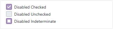
<DxCheckBox Checked="Opinion.Yes" Enabled="false" ValueChecked="@Opinion.Yes"
ValueUnchecked="@Opinion.No" ValueIndeterminate="@Opinion.Abstain">Disabled Checked</DxCheckBox>
<DxCheckBox Checked="Opinion.No" Enabled="false" ValueChecked="@Opinion.Yes"
ValueUnchecked="@Opinion.No" ValueIndeterminate="@Opinion.Abstain">Disabled Unchecked</DxCheckBox>
<DxCheckBox Checked="Opinion.Abstain" Enabled="false" ValueChecked="@Opinion.Yes"
ValueUnchecked="@Opinion.No" ValueIndeterminate="@Opinion.Abstain">Disabled Indeterminate</DxCheckBox>
@code{
enum Opinion { Yes, No, Abstain }
Opinion Value = Opinion.Abstain;
string GetText() {
if(Value == Opinion.Yes) return "Checked";
if(Value == Opinion.No) return "Unchecked";
return "Indeterminate";
}
}