DxFlyout.HeaderTemplate Property
Specifies a template for the flyout window’s header. Replaces the default render fragment (including paddings, scrollbars, etc.)
Namespace: DevExpress.Blazor
Assembly: DevExpress.Blazor.v26.1.dll
Declaration
[Parameter]
public RenderFragment<IPopupElementInfo> HeaderTemplate { get; set; }
Property Value
| Type | Description |
|---|---|
| RenderFragment<IPopupElementInfo> | The header template. |
Remarks
Use the HeaderTemplate property to display any UI render fragment in the header element of the flyout window. This template changes the default header rendering, including paddings, scrollbar, and inner content alignment. If you need to place custom content in the flyout window header but retain its default rendering, use the HeaderContentTemplate instead.
The HeaderTemplate has the context parameter. You can use the parameter’s CloseCallback property to implement a custom close button.
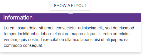
<DxButton RenderStyle="ButtonRenderStyle.Secondary" Click="() => IsOpen = !IsOpen" Id="flyout-overview-target-container">SHOW A FLYOUT</DxButton>

<DxFlyout @bind-IsOpen=IsOpen
          PositionTarget="#flyout-overview-target-container"
          BodyText="Lorem ipsum dolor sit amet, consectetur adipiscing elit, sed do eiusmod tempor
            incididunt ut labore et dolore magna aliqua. Ut enim ad minim veniam, quis nostrud
            exercitation ullamco laboris nisi ut aliquip ex ea commodo consequat."
          Width="max(25vw, 250px)"
          HeaderVisible="true">
    <HeaderTemplate>
        <div class="my-header">
            Information
        </div>
    </HeaderTemplate>
</DxFlyout>

@code {
    bool IsOpen { get; set; } = false;
}
The HeaderTemplate property has priority over HeaderText, HeaderContentTemplate, and HeaderTextTemplate properties.