DxCarousel.SizeMode Property
Specifies the size of the Carousel’s navigation controls.
Namespace: DevExpress.Blazor
Assembly: DevExpress.Blazor.v26.1.dll
Declaration
[DefaultValue(null)]
[Parameter]
public SizeMode? SizeMode { get; set; }
Property Value
| Type | Default | Description |
|---|---|---|
| Nullable<SizeMode> | null | The size mode. If the property is not specified (the value is |
Available values:
| Name | Description |
|---|---|
| Small | Small size. |
| Medium | Medium size. |
| Large | Large size. |
Remarks
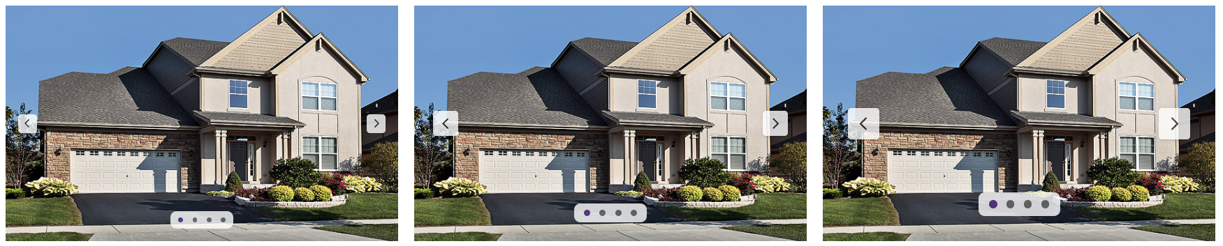
The SizeMode property allows you to apply different size modes to the <DxCarousel> component’s navigation controls.
To define the component size, use Height and Width properties.
Example
The following code snippet customizes the size of the Carousel component and applies the Large size mode to navigation controls:
<DxCarousel Width="500px"
            Height="300px"
            Data="@GetCarouselData()"
            SizeMode="SizeMode.Large"
            ImageSrcField="Source"
            ImageAltField="AlternateText"
            LoopNavigationEnabled="true"
            ImageSizeMode="CarouselImageSizeMode.FillAndCrop">
 </DxCarousel>

@code {
    List<CarouselData> GetCarouselData() {
    List<CarouselData> result = new List<CarouselData>();
    result.Add(new CarouselData("../images/image1.jpg", "Image 1"));
    result.Add(new CarouselData("../images/image2.jpg", "Image 2"));
    result.Add(new CarouselData("../images/image3.jpg", "Image 3"));
    result.Add(new CarouselData("../images/image4.jpg", "Image 4"));

    return result;
}

public class CarouselData {
    public string Source { get; set; }
    public string AlternateText { get; set; }

    public CarouselData(string source, string alt) {
        Source = source;
        AlternateText = alt;
    }
}
}
For additional information, refer to the following topic: Size Modes.
See Also