DxChartSeriesLegendItem.IconCssClass Property
Specifies the cascading style sheet (CSS) class name for the series legend item.
Namespace: DevExpress.Blazor
Assembly: DevExpress.Blazor.v26.1.dll
Declaration
[Parameter]
public string IconCssClass { get; set; }
Property Value
| Type | Description |
|---|---|
| String | The CSS class name. |
Remarks
DevExpress Blazor components support pre-defined icon sets (such as Iconic or Bootstrap-recommended libraries) and custom icon libraries. Refer to the following topic for additional information: Icons.
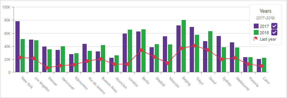
The following code customizes the series legend item:
<DxChartLineSeries Name="2019" Filter="@((SaleInfo s) => s.Date.Year == 2019)"
                   SummaryMethod="Enumerable.Sum"
                   ArgumentField="@(s=> s.City)" ValueField="@(s => s.Amount)">
    <DxChartSeriesLegendItem IconCssClass="oi oi-flag">
        <TextTemplate>Last year</TextTemplate>
    </DxChartSeriesLegendItem>
</DxChartLineSeries>
See Also