DxToolbar Class
A toolbar control that implements an adaptive button-based interface.
Namespace: DevExpress.Blazor
Assembly: DevExpress.Blazor.v23.2.dll
NuGet Package: DevExpress.Blazor
Declaration
public class DxToolbar :
    DxControlComponent<ToolbarJSInteropProxy>,
    IToolbarJSInteropProxyServer,
    IJSCallback,
    IModelWrapper<IToolbarModel>,
    ISizeModeAccessor,
    IRequireSelfCascading
Remarks
The DevExpress Toolbar component for Blazor (<DxToolbar>) implements adaptive button-based interfaces in your application. The component allows users to access frequently used actions.

Add a Toolbar to a Project
Follow the steps below to add the Toolbar component to an application:
- Use a DevExpress Project Template to create a new Blazor Server or Blazor WebAssembly application. If you use a Microsoft project template or already have a Blazor project, configure your project to incorporate DevExpress Blazor components.
- Add the
<DxToolbar>…</DxToolbar>markup to a.razorfile. - Configure the component: add items, specify a toolbar title, handle item clicks, and so on (see the sections below).
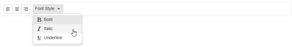
Items
You can specify toolbar items between the <DxToolbar> and </DxToolbar> tags or add them to the DxToolbarBase.Items collection. Use the ChildContent property to add custom content to items. Each item is a DxToolbarItem class instance that can have a collection of child items (the DxToolbarItem.Items property).
The Toolbar component can contain drop-down buttons, checked items, and link buttons. You can customize item appearance and group items, and use templates to specify an item’s layout and appearance. Refer to the DxToolbarItem class description for more information.
<div class="card p-2">
    <DxToolbar>
        <Items>
            <DxToolbarItem GroupName="align" IconCssClass="oi oi-align-left" />
            <DxToolbarItem GroupName="align" IconCssClass="oi oi-align-center" />
            <DxToolbarItem GroupName="align" IconCssClass="oi oi-align-right" />
            <DxToolbarItem Text="Font Style" BeginGroup="true">
                <Items>
                    <DxToolbarItem IconCssClass="oi oi-bold"
                                   Text="Bold"
                                   GroupName="bold" />
                    <DxToolbarItem IconCssClass="oi oi-italic"
                                   Text="Italic"
                                   GroupName="italic" />
                    <DxToolbarItem IconCssClass="oi oi-underline"
                                   Text="Underline"
                                   GroupName="underline" />
                </Items>
            </DxToolbarItem>
        </Items>
    </DxToolbar>
</div>
Custom Content
You can use a toolbar item’s property values to implement custom content for your toolbar item. In the example below, the item contains a badge and a button that uses the item’s Text property value as the button text.
<div class="card p-2">
    <DxToolbar>
        <Items>
            <DxToolbarItem Text="Products" />
            <DxToolbarItem Text="Support" />
            <DxToolbarItem Text="Documentation" />
            <DxToolbarItem Text="Blog">
                @context.Text<span class="badge rounded-pill bg-primary ms-1">3</span>
            </DxToolbarItem>
         </Items>
    </DxToolbar>
</div>

Data Binding
You can populate the Toolbar component with items from a data source.
Follow the steps below to bind Toolbar to data:
Use the Data property to specify a data source. You can use different collection types:
- Flat data (a collection of items organized as a single-level structure)
- Hierarchical data (a collection of nested items)
Add the DataMappings tag to the component’s markup.
Create the DxToolbarDataMapping instance and map item properties (BeginGroup, NavigateUrl, and so on) to data source fields. Mappings are used to assign data from the source collection to the component’s data model.
For flat data collections, use the Key and ParentKey properties to create a hierarchy of items. If the Toolbar’s structure is linear, you can omit these properties.
For hierarchical data collections, the Children property is required to build the data model.
You can create multiple
DxToolbarDataMappinginstances to specify different mappings for different nesting levels. Use the Level property to specify the item level for which data mappings are applied.
Flat Data
The code below binds the Toolbar to the flat collection of data items and specifies mappings for the Text, Key, and ParentKey properties.
<div class="card p-2">
    <DxToolbar Data=@FormatItem.ToolbarItems>
        <DataMappings>
            <DxToolbarDataMapping Text="ValueName" Key="Id" ParentKey="ParentId" />
        </DataMappings>
    </DxToolbar>
</div>

Hierarchical Data
The code below binds the Toolbar to the collection of FormatItem objects. Each object can have child objects. The code specifies the Children, Text, and Checked mappings to adjust the Toolbar’s data model to the specified data source.
<div class="card p-2">
    <DxToolbar Data=@FormatItem.ToolbarItems ItemClick=@OnItemClicked>
        <DataMappings>
            <DxToolbarDataMapping Name="ValueName" Text="ValueName" Children="Values" Checked="IsChecked" />
            <DxToolbarDataMapping Text="Value" Level="1" />
        </DataMappings>
    </DxToolbar>
</div>

@code {
    void OnItemClicked(ToolbarItemClickEventArgs args) {
        if (args.ItemName == "Align") {
            ((FormatItem)args.Info.Data).ChangeChecked();
        }
    }
}

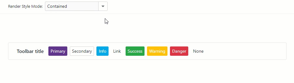
Toolbar Title
Use the Title property to specify a toolbar title. The title is displayed on the left of the toolbar items.
<div class="card p-2">
    <DxToolbar Title="DevExpress">
        <Items>
            <DxToolbarItem Text="Products" />
            <DxToolbarItem Text="Support" />
            <DxToolbarItem Text="Documentation" />
        </Items>
    </DxToolbar>
</div>

You can also use the TitleTemplate property to specify the template for the toolbar title.
<div class="card p-2">
    <DxToolbar Title="DevExpress Logo">
        <TitleTemplate>
            <img width="120" src="images/Logo-Monochrome.svg" alt="@context" />
        </TitleTemplate>
        <Items>
            <DxToolbarItem Text="Products" />
            <DxToolbarItem Text="Support" />
            <DxToolbarItem Text="Documentation" />
         </Items>
    </DxToolbar>
</div>

Customize Appearance
The table below lists API members that allow you to customize the appearance of root items.
| Member | Description |
|---|---|
| DxToolbar.ItemRenderStyleMode | Specifies the color fill mode for all toolbar items. |
| DxToolbar.ItemSizeMode | Specifies the toolbar item’s size. |
| DxToolbarItem.RenderStyle | Specifies the item’s predefined style. |
| DxToolbarItem.RenderStyleMode | Specifies the item’s color fill mode. |
Item Templates
The Toolbar component allows you to use templates to customize the layout and appearance of toolbar items. Use the Template property to define a template for a specific toolbar item.
The example below demonstrates how to add the Search text box to the Toolbar component.
<DxToolbar ItemRenderStyleMode="ToolbarRenderStyleMode.Plain"
           Title="DevExpress Logo">
    <TitleTemplate>
        <div class="icon-logo" role="img" aria-label="@context"></div>
    </TitleTemplate>
    <Items>
        <DxToolbarItem BeginGroup="true"
                       Alignment="ToolbarItemAlignment.Right">
            <Template>
                <div class="d-flex flex-row align-items-center h-100">
                    <SearchItem CssClass="py-0" />
                </div>
            </Template>
        </DxToolbarItem>
        <DxToolbarItem IconCssClass="tb-icon tb-icon-refresh"
                       Tooltip="Refresh"
                       Alignment="ToolbarItemAlignment.Right"
                       BeginGroup="true" />
        <DxToolbarItem IconCssClass="tb-icon tb-icon-settings"
                       Tooltip="Settings" />
    </Items>
</DxToolbar>
<div class="search @CssClass">
    <input type="text" class="form-control form-control-sm search-input" placeholder="Search..." aria-label="Search">
    <span class="search-button d-flex ps-2 pe-2 me-1">
        <span class="search-icon"></span>
    </span>
</div>

@code {
    [Parameter]
    public string CssClass { get; set; }
}

Handle Item Clicks
Use the following events to handle toolbar item clicks:
| Event | Description |
|---|---|
| DxToolbarBase.ItemClick | Fires when users activate any item in the toolbar. |
| DxToolbarItemBase.Click | Fires when users activate a toolbar item. |
The code below demonstrates how to handle the DxToolbarBase.ItemClick event.
<div class="card p-2">
    <DxToolbar Title="Operations:" ItemClick="OnItemClick">
        <DxToolbarItem Text="Insert" Name="Insert"></DxToolbarItem>
        <DxToolbarItem Text="Edit" Name="Edit"></DxToolbarItem>
        <DxToolbarItem Text="Delete" Name="Delete"></DxToolbarItem>
    </DxToolbar>
</div>

@ClickedItem

@code  {
    public string ClickedItem { get; set; } = "";

    void OnItemClick(ToolbarItemClickEventArgs e) {
        ClickedItem = $"The '{e.ItemName}' toolbar button has been clicked";
    }
}

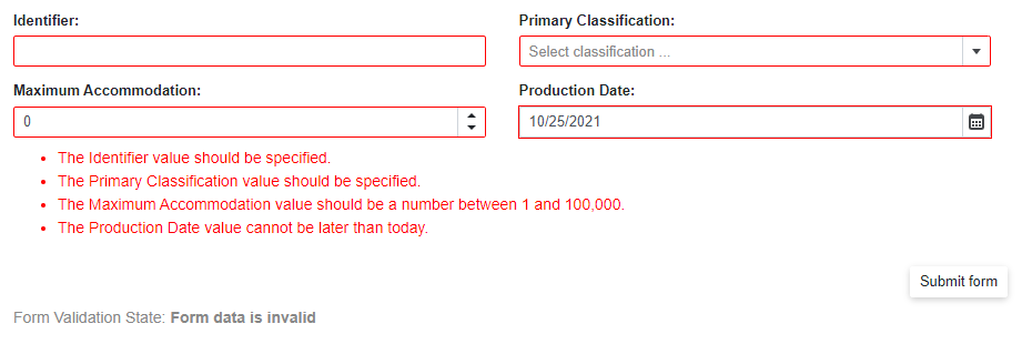
Submit Form on Item Click
You can use a toolbar item to submit a form. This behavior is equivalent to the type=”submit” HTML button’s behavior.
To create such a toolbar item, use the SubmitFormOnClick property.
@using System.ComponentModel.DataAnnotations

<div class="cw-880">
    <EditForm Model="@starship"
              OnValidSubmit="@HandleValidSubmit"
              OnInvalidSubmit="@HandleInvalidSubmit"
              Context="EditFormContext">
        <DataAnnotationsValidator />
        <DxFormLayout>
            <DxFormLayoutItem Caption="Identifier:" ColSpanMd="6">
                <DxTextBox @bind-Text="@starship.Identifier" />
            </DxFormLayoutItem>
            @* ... *@
        </DxFormLayout>
        <DxToolbar>
            <DxToolbarItem SubmitFormOnClick="true" Alignment="ToolbarItemAlignment.Right">Submit form</DxToolbarItem>
        </DxToolbar>
        <div class="row w-100 mx-0">
            <p class="demo-text col-12 mt-2">
                Form Validation State: <b>@FormValidationState</b>
            </p>
        </div>
    </EditForm>
</div>

@code {
    string FormValidationState = @"Press the ""Submit form"" button to validate the form.";
    Starship starship = new Starship() { ProductionDate = DateTime.Now + TimeSpan.FromDays(1) };
    List<string> classifications = new List<string>() { "Defense", "Exploration", "Diplomacy" };
    void HandleValidSubmit() {
        FormValidationState = @"Form data is valid";
    }
    void HandleInvalidSubmit() {
        FormValidationState = @"Form data is invalid";
    }
    [AttributeUsage(AttributeTargets.Property | AttributeTargets.Field | AttributeTargets.Parameter, AllowMultiple = false)]
    public class DateInPastAttribute : ValidationAttribute {
        public override bool IsValid(object value) {
            return (DateTime)value <= DateTime.Today;
        }
    }
    public class Starship {
        [Required(ErrorMessage = "The Identifier value should be specified.")]
        [StringLength(16,
        ErrorMessage = "The Identifier exceeds 16 characters.")]
        public string Identifier { get; set; }
        public DateTime ProductionDate { get; set; }
        // ...
    }
}
For more information, refer to the following help topic: Validate Input.
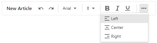
Adaptivity
The Toolbar component supports adaptive mode. The following properties specify how the toolbar responds when the container’s width changes:
- AdaptivityAutoCollapseItemsToIcons - If
true, the text of all items that contain icons is hidden. - AdaptivityAutoHideRootItems - If
true, the toolbar moves root items one by one to the root submenu until the root level reaches the minimum allowed number of items (specified by the AdaptivityMinRootItemCount property). You can also use the AdaptivePriority and AdaptiveText properties to hide an individual item before other items and specify alternative item text for adaptive mode.
<div class="card">
    <DxToolbar Title="New Article"
               ItemRenderStyleMode="ToolbarRenderStyleMode.Plain"
               AdaptivityMinRootItemCount="2"
               AdaptivityAutoHideRootItems="true"
               AdaptivityAutoCollapseItemsToIcons="true">
        <DxToolbarItem BeginGroup="true"
                       Name="Undo"
                       IconCssClass="oi oi-undo"
                       AdaptiveText="Undo" />
        <DxToolbarItem Name="Redo"
                       IconCssClass="oi oi-redo"
                       AdaptiveText="Redo" />
        <DxToolbarItem Name="FontFamily"
                       Text="@currentFont.Name"
                       BeginGroup="true"
                       AdaptiveText="Font Family">
            <Items>
                @foreach (var font in FontInfo.DefaultFonts) {
                    <DxToolbarItem Text="@font.Name"
                                   Style="@font.GetCssString()"
                                   Click="(x) => { currentFont = font; }"
                                   GroupName="fontGroup" />
                }
            </Items>
        </DxToolbarItem>
        <DxToolbarItem Name="FontSize"
                       Text="@currentSize.Size.ToString()"
                       BeginGroup="true"
                       AdaptiveText="Font Size">
            <Items>
                @foreach (var fontSize in FontSizeInfo.DefaultFontSizes) {
                    <DxToolbarItem Text="@fontSize.Size.ToString()"
                                   Click="(x) => { currentSize = fontSize; }"
                                   GroupName="fontSizeGroup" />
                }
            </Items>
        </DxToolbarItem>
        <DxToolbarItem AdaptivePriority="1"
                       GroupName="font-bold"
                       BeginGroup="true"
                       Name="Bold"
                       IconCssClass="oi oi-bold"
                       AdaptiveText="Bold" />
        @* ... *@
        <DxToolbarItem AdaptivePriority="2"
                       BeginGroup="true"
                       GroupName="align"
                       IconCssClass="oi oi-align-left" />
        @* ... *@
    </DxToolbar>
</div>
Keyboard Navigation
The DevExpress Blazor Toolbar component supports keyboard shortcuts that allow users to access every UI element and navigate through toolbar items and drop-down menus. Keyboard navigation is implemented both on the client and server.
The following shortcut keys are available:
| Shortcut Keys | Description |
|---|---|
| Tab, Shift + Tab | Focuses the toolbar or moves focus to the next or previous focusable page element. For modal drop-down windows: Moves focus to a window’s header or body and backwards. |
| Right Arrow | Moves focus to the next toolbar item and separately to every button within a split button. For drop-down menu items with child items: Opens a submenu and moves focus to its first item. |
| Left Arrow | Moves focus to the previous toolbar item and separately to every button within a split button. |
| Up Arrow, Down Arrow | For drop-down menu and submenu items: Moves focus to the next or previous menu item. |
| Enter, Space | Invokes a click event handler for the focused toolbar item. For an ellipsis button or dropdown toolbar item: Opens a drop-down menu and moves focus to its first item. |
| Enter | For templated items: Moves focus to the first focusable element within the template. |
| Down Arrow + Alt | Opens a drop-down menu. |
| End | Moves focus to the last toolbar or menu/submenu item. |
| Home | Moves focus to the first toolbar or menu/submenu item. |
| Esc | For drop-down menu items: Closes the menu and moves focus to the corresponding toolbar item/button. |
| Esc, Tab | For templates within toolbar items: Moves focus to the corresponding toolbar item. |
| Up Arrow + Alt | For drop-down menu and submenu items: Closes the drop-down menu and moves focus to the corresponding toolbar item. |
| Left Arrow, Esc | For drop-down submenu items: Closes the submenu and moves focus to the corresponding parent item. |
Troubleshooting
If a Blazor application throws unexpected exceptions, refer to the following help topic: Troubleshooting.