DxToolbarItem.Items Property
In This Article
Specifies a collection of the current item’s child items.
Namespace: DevExpress.Blazor
Assembly: DevExpress.Blazor.v24.2.dll
NuGet Package: DevExpress.Blazor
#Declaration
C#
[Parameter]
public RenderFragment Items { get; set; }#Property Value
| Type | Description |
|---|---|
| Render |
A UI fragment that the browser renders in the corresponding component’s markup. |
#Remarks
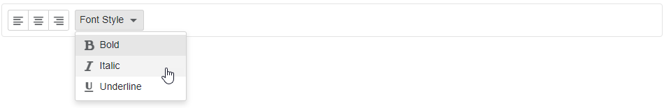
Use the Items property to specify the collection of child items of the current item. This collection contains only the items at the next level. To specify items further down the Toolbar hierarchy, use the Items property of a child item.
You can use the Items property to specify the items of a Toolbar’s root level.
Razor
<div class="card p-2">
  <DxToolbar>
      <DxToolbarItem GroupName="align" IconCssClass="oi oi-align-left" />
      <DxToolbarItem GroupName="align" IconCssClass="oi oi-align-center" />
      <DxToolbarItem GroupName="align" IconCssClass="oi oi-align-right" />
      <DxToolbarItem Text="Font Style" BeginGroup="true">
          <Items>
              <DxToolbarItem IconCssClass="oi oi-bold"
                             Text="Bold"
                             GroupName="bold" />
              <DxToolbarItem IconCssClass="oi oi-italic"
                             Text="Italic"
                             GroupName="italic" />
              <DxToolbarItem IconCssClass="oi oi-underline"
                             Text="Underline"
                             GroupName="underline" />
          </Items>
      </DxToolbarItem>
  </DxToolbar>
</div>
See Also