ButtonEdit Class
A text editor with one or more buttons in the edit box.
Namespace: DevExpress.XtraEditors
Assembly: DevExpress.XtraEditors.v26.1.dll
Declaration
Related API Members
The following members return ButtonEdit objects:
Remarks
The ButtonEdit control is a text editor with one or more buttons in the edit box.
Edit Value
Use the ButtonEdit.EditValue or ButtonEdit.Text property to obtain or modify the edit value.
Handle the ButtonEdit.EditValueChanged or TextChanged event to track edit value changes.
Bind to Data
Use the ButtonEdit.EditValue property to bind the editor to a data source.
buttonEdit1.DataBindings.Add(new System.Windows.Forms.Binding("EditValue", this.carsBindingSource, "Description", true));
Customize ButtonEdit Settings
Use the ButtonEdit.Properties property to access and customize editor settings.
Common settings include:
| Property Name | Description |
|---|---|
| Buttons | Returns the collection of buttons in the current button editor. |
| MaskSettings | Provides access to settings that allow you to create input masks. |
| TextEditStyle | Specifies the editor’s display mode: Standard, HideTextEditor, or DisableTextEditor. |
| AllowButtonNavigation | Activates keyboard navigation. |
Add Buttons and Respond to Button Clicks
Use the Properties.Buttons collection to add/remove buttons.
The following screenshot shows the Buttons collection editor in the Visual Studio IDE:

Buttons (EditorButton) expose the following properties:
Handle the following events to respond to button clicks:
Examples
Create a Button Editor
The following code snippet creates a ButtonEdit control, customizes its buttons, and places the editor onto the form:
using DevExpress.XtraEditors;
using DevExpress.XtraEditors.Controls;

namespace DXApplication {
    public partial class Form1 : XtraForm {
        public Form1() {
            InitializeComponent();

            // Create a `ButtonEdit` and add it to the form.
            ButtonEdit btnEdit1 = new ButtonEdit() {
                Width = 200
            };

            // Configure the default (first) button as an OK button.
            btnEdit1.Properties.Buttons[0].Kind = ButtonPredefines.OK;

            // Add an additional button and treat it as a Delete action.
            btnEdit1.Properties.Buttons.Add(new EditorButton(ButtonPredefines.Delete));

            // Add the editor to the form's controls collection.
            this.Controls.Add(btnEdit1);

            // Handle button clicks.
            btnEdit1.ButtonClick += BtnEdit1_ButtonClick;
        }
        void BtnEdit1_ButtonClick(object sender, ButtonPressedEventArgs e) {
            ButtonEdit editor = sender as ButtonEdit;
            if (e.Button.Kind == ButtonPredefines.OK) {
                // OK button pressed.
                //...
            }
            if (e.Button.Kind == ButtonPredefines.Delete) {
                // Delete button pressed.
                //...
            }
        }
    }
}
Create an In-place Button Editor
The following example creates a ButtonEdit with a Copy button and uses the editor within the Data Grid control to edit cell values in the Description column. The Data Grid control and SVG Image Collection are created at design time.

using DevExpress.XtraEditors;
using DevExpress.XtraEditors.Controls;
using DevExpress.XtraEditors.Repository;
using DevExpress.XtraGrid.Views.Grid;
using System.ComponentModel;
using System.Windows.Forms;

namespace DXApplication {
    public partial class Form1 : XtraForm {
        BindingList<DataItem> dataItems;
        RepositoryItemButtonEdit inplaceButtonEdit;
        public Form1() {
            InitializeComponent();

            // Data source for the grid.
            dataItems = new BindingList<DataItem>() {
                new DataItem() { Id = 1, CategoryName = "Category 1", Description = "Description 1" },
                new DataItem() { Id = 2, CategoryName = "Category 2", Description = "Description 2" },
                new DataItem() { Id = 3, CategoryName = "Category 3", Description = "Description 3" }
            };
        }

        void Form1_Load(object sender, System.EventArgs e) {
            // Bind the grid to data.
            grid.DataSource = dataItems;

            // Ensure the grid and its views/columns are created before accessing `MainView` and columns.
            grid.ForceInitialize();

            var view = grid.MainView as GridView;

            if(view == null)
                return;

            // Create an in-place button editor for the Description column.
            inplaceButtonEdit = new RepositoryItemButtonEdit();

            // Configure the first (default) button to show a glyph (SVG icon) and mark it as "Copy".
            inplaceButtonEdit.Buttons[0].Kind = ButtonPredefines.Glyph;
            inplaceButtonEdit.Buttons[0].Tag = "Copy";
            inplaceButtonEdit.Buttons[0].ImageOptions.SvgImage = svgImageCollection1["copy"];
            inplaceButtonEdit.Buttons[0].ImageOptions.SvgImageSize = new System.Drawing.Size(16, 16);

            // Handle button clicks.
            inplaceButtonEdit.ButtonClick += InplaceButtonEdit_ButtonClick;

            // Register the repository item.
            grid.RepositoryItems.Add(inplaceButtonEdit);

            // Assign the editor to the 'Description' column.
            view.Columns["Description"].ColumnEdit = inplaceButtonEdit;
        }

        void InplaceButtonEdit_ButtonClick(object sender, ButtonPressedEventArgs e) {
            var view = grid.MainView as GridView;

            if (e.Button.Tag != null && e.Button.Tag.ToString() == "Copy") {
                // Copy the Description of the focused row to the clipboard.
                int rowHandle = view.FocusedRowHandle;
                DataItem item = view.GetRow(rowHandle) as DataItem;
                if (item != null) {
                    Clipboard.SetText(item.Description);
                }
            }
        }
    }

    public class DataItem {
        public int Id { get; set; }
        public string CategoryName { get; set; }
        public string Description { get; set; }
    }
}
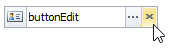
Add a Custom Button with Image
using System;
using System.Drawing;
using DevExpress.XtraEditors.Controls;

// Create a button with a custom image.
EditorButton customButton = new EditorButton(ButtonPredefines.Glyph);

// Specify an SVG image.
// The image is obtained from svgImageCollection1.
// The image collection was created and populated at design time.
customButton.ImageOptions.SvgImage = svgImageCollection1[0];

// Specify the image size.
customButton.ImageOptions.SvgImageSize = new Size(16, 16);

// Add the button to the editor's 'Properties.Buttons' collection.
buttonEdit1.Properties.Buttons.Add(customButton);
The following screenshot illustrates the result:

Tooltips
DevExpress controls support regular and super tooltips. Enable the ShowToolTips option to display tooltips when the mouse pointer hovers over the control.
Customize Regular Tooltip Text
Use the following properties of the target control to specify regular tooltip text and title:
API | Description |
|---|---|
Specifies tooltip text. You can use line breaks in regular tooltips. | |
Specifies whether to parse HTML tags in text. | |
Specifies the tooltip title. If you do not specify tooltip text, the tooltip is not displayed even if you specify the title. |
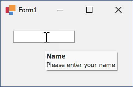
The following code snippet specifies tooltip text and title for a TextEdit editor:
public Form1() {
  InitializeComponent();
  textEdit1.ShowToolTips = true;
  textEdit1.ToolTipTitle = "Name";
  textEdit1.ToolTip = "Please enter your name";
}
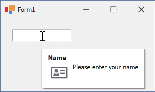
Assign an Image to Regular Tooltips
Use the control’s ToolTipIconType property to assign a predefined icon. The ToolTipController.IconSize property specifies icon size.
Assign a custom image as follows:
- Create a ToolTipController and assign it to the control’s ToolTipController property.
- Create an image collection and assign it to the ToolTipController.ImageList property.
- Handle the ToolTipController.BeforeShow event. Use the e.ImageOptions parameter to assign a raster or vector image to the tooltip.
Note
The ToolTipIconType property has priority over e.ImageOptions. If you assign a custom image, set ToolTipIconType to None.
The following code snippet assigns a custom image to the TextEdit tooltip:
Note
textEdit1, toolTipController1, and svgImageCollection1 were created at runtime.
public Form1() {
  InitializeComponent();
  textEdit1.ShowToolTips = true;
  textEdit1.ToolTipTitle = "Name";
  textEdit1.ToolTip = "Please enter your name";
  textEdit1.ToolTipController = toolTipController1;
  toolTipController1.ImageList = svgImageCollection1;
  toolTipController1.BeforeShow += ToolTipController1_BeforeShow;
}

private void ToolTipController1_BeforeShow(object sender, ToolTipControllerShowEventArgs e) {
  ToolTipController controller = sender as ToolTipController;
  if (e.ToolTip == textEdit1.ToolTip)
    e.ImageOptions.SvgImage = (controller.ImageList as SvgImageCollection)["personalCard"];
}

Display a Super Tooltip
Use the control’s SuperTip property to assign a super tooltip. If you wish to use HTML tags in a super tooltip, enable the SuperToolTip.AllowHtmlText property.
Setting the ToolTipController.ToolTipType property to SuperTip converts existing regular tooltips to super tooltips.
Tip
Read the following help topic for information on how to customize super tooltips: Hints and Tooltips.