RadioGroup Class
Combines multiple options (radio buttons) into a group that supports selecting one of several options.
Namespace: DevExpress.XtraEditors
Assembly: DevExpress.XtraEditors.v26.1.dll
Declaration
Related API Members
The following members return RadioGroup objects:
Remarks
The RadioGroup editor allows an end user to select one of multiple options. Selecting an item deselects the one previously selected, so only one item can be selected at a time.
A user can switch between group buttons by clicking the required button with the mouse or by pressing the arrow keys. The Page Up and Page Down keys set the first and last items, respectively.
Radio buttons in the control are RadioGroupItem object instances. To create a radio group control, create a RadioGroup object and add RadioGroupItem items to the RepositoryItemRadioGroup.Items collection (accessible through the control’s RadioGroup.Properties property).
Use the RepositoryItemRadioGroup.ItemsLayout property to specify how items are arranged. Two item arrangement modes are supported:
Column (Default)

Flow

On screen, radio buttons are identified by specific display captions. Use the RadioGroupItem.Description property to set an item’s caption. Each radio button must be associated with a specific value via the RadioGroupItem.Value property. On selecting an item, its value is automatically assigned to the control’s value specified by the BaseEdit.EditValue property.
Radio group item display captions cannot be localized in the same way as standard RadioButton controls. See the How to make internal strings in my application localizable KB article to learn more.
To get the selected item, use the RadioGroup.SelectedIndex property. This property gets or sets the selected item’s index in the RepositoryItemRadioGroup.Items collection. To change the selected item programmatically, you can use the RadioGroup.SelectedIndex property or set the editor’s BaseEdit.EditValue property.
CheckEdit controls can also be used to display a group of radio buttons. See the RepositoryItemCheckEdit.RadioGroupIndex topic to learn more.
Pager Navigation
The RadioGroup and WindowsUIButtonPanel can be used as a pager for the following controls:
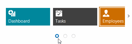
The pager automatically splits the target control’s content into pages, and displays navigation buttons to scroll to corresponding pages. The pager navigation functionality is implemented as a Behavior and can be added to your controls using the BehaviorManager component.
Tooltips
DevExpress controls support regular and super tooltips. Enable the ShowToolTips option to display tooltips when the mouse pointer hovers over the control.
Customize Regular Tooltip Text
Use the following properties of the target control to specify regular tooltip text and title:
API | Description |
|---|---|
Specifies tooltip text. You can use line breaks in regular tooltips. | |
Specifies whether to parse HTML tags in text. | |
Specifies the tooltip title. If you do not specify tooltip text, the tooltip is not displayed even if you specify the title. |
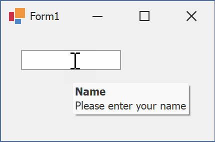
The following code snippet specifies tooltip text and title for a TextEdit editor:
public Form1() {
  InitializeComponent();
  textEdit1.ShowToolTips = true;
  textEdit1.ToolTipTitle = "Name";
  textEdit1.ToolTip = "Please enter your name";
}
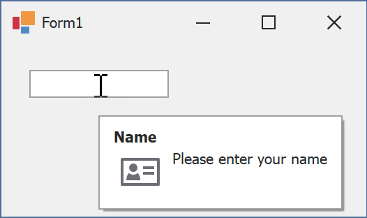
Assign an Image to Regular Tooltips
Use the control’s ToolTipIconType property to assign a predefined icon. The ToolTipController.IconSize property specifies icon size.
Assign a custom image as follows:
- Create a ToolTipController and assign it to the control’s ToolTipController property.
- Create an image collection and assign it to the ToolTipController.ImageList property.
- Handle the ToolTipController.BeforeShow event. Use the e.ImageOptions parameter to assign a raster or vector image to the tooltip.
Note
The ToolTipIconType property has priority over e.ImageOptions. If you assign a custom image, set ToolTipIconType to None.
The following code snippet assigns a custom image to the TextEdit tooltip:
Note
textEdit1, toolTipController1, and svgImageCollection1 were created at runtime.
public Form1() {
  InitializeComponent();
  textEdit1.ShowToolTips = true;
  textEdit1.ToolTipTitle = "Name";
  textEdit1.ToolTip = "Please enter your name";
  textEdit1.ToolTipController = toolTipController1;
  toolTipController1.ImageList = svgImageCollection1;
  toolTipController1.BeforeShow += ToolTipController1_BeforeShow;
}

private void ToolTipController1_BeforeShow(object sender, ToolTipControllerShowEventArgs e) {
  ToolTipController controller = sender as ToolTipController;
  if (e.ToolTip == textEdit1.ToolTip)
    e.ImageOptions.SvgImage = (controller.ImageList as SvgImageCollection)["personalCard"];
}

Display a Super Tooltip
Use the control’s SuperTip property to assign a super tooltip. If you wish to use HTML tags in a super tooltip, enable the SuperToolTip.AllowHtmlText property.
Setting the ToolTipController.ToolTipType property to SuperTip converts existing regular tooltips to super tooltips.
Tip
Read the following help topic for information on how to customize super tooltips: Hints and Tooltips.
Example
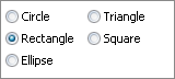
The following code shows how to add items to a RadioGroup and then select one of the items. To select an item, the item’s value is assigned to the editor’s BaseEdit.EditValue property.
using DevExpress.XtraEditors.Controls;

// Create five items.
object[] itemValues = new object[] {10, 11, 12, 13, 14};
string [] itemDescriptions = new string [] {"Circle", "Rectangle", "Ellipse", "Triangle", "Square"};
for(int i = 0; i < itemValues.Length; i++) {
    radioGroup1.Properties.Items.Add(new RadioGroupItem(itemValues[i], itemDescriptions[i]));
}
//Select the Rectangle item.
radioGroup1.EditValue = 11;