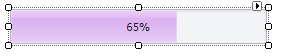
ProgressBarControl Class
The control that indicates the progress of lengthy operations.
Namespace: DevExpress.XtraEditors
Assembly: DevExpress.XtraEditors.v26.1.dll
Declaration
[DefaultBindingPropertyEx("Position")]
public class ProgressBarControl :
ProgressBarBaseControlRemarks
The ProgressBarControl can indicate the progress of lengthy operations (copying files, program install progress, etc.).
Main Settings
- ProgressBarControl.Position - Gets or sets the progress bar position.
- RepositoryItemProgressBar.Minimum and RepositoryItemProgressBar.Maximum (accessible from the ProgressBarControl.Properties object) - Specify the limits for the progress bar’s ProgressBarControl.Position.
- ProgressBarControl.PerformStep - Advances the progress position by a value (RepositoryItemProgressBar.Step).
- ProgressBarControl.Increment and ProgressBarControl.Decrement - Increase and decrease the control’s value (position) by a specified value.
- ProgressBarControl.PositionChanged - Occurs after the value of the ProgressBarControl.Position property has been changed.
- ProgressBarControl.ShowProgressInTaskBar - Gets or sets whether the progress is reflected in the application button in the Windows Task Bar.
Text Settings
- RepositoryItemBaseProgressBar.ShowTitle - Gets or sets whether the control displays the textual representation of the progress bar’s current position.
- RepositoryItemProgressBar.PercentView - Gets or sets whether to present the current position as a relative value between the RepositoryItemProgressBar.Minimum and RepositoryItemProgressBar.Maximum and format it as a percentage. The RepositoryItemBaseProgressBar.ShowTitle property must be set to true.
- RepositoryItem.DisplayFormat - Allows you to apply custom formatting to the control’s value.
- RepositoryItem.CustomDisplayText - Allows you to specify custom display text.
Appearance Settings
- RepositoryItemBaseProgressBar.ProgressKind - Gets or sets a value that specifies the direction of the progress indicator.
- RepositoryItemBaseProgressBar.MaxHeight - Gets or sets the maximum height of the progress block.
- RepositoryItemBaseProgressBar.ProgressPadding - Gets or sets the amount of space around the progress block.
- RepositoryItemProgressBar.FlowAnimationEnabled - Gets or sets whether the progress indicator is displayed using flow animation.
- RepositoryItemProgressBar.Appearance - Gets the appearance settings used to paint the editor when it’s enabled.
- RepositoryItemProgressBar.AppearanceDisabled - Gets the appearance settings used to paint the editor when it’s disabled.
- RepositoryItemProgressBar.AppearanceFocused - Gets the appearance settings used to paint the current editor when it’s focused.
- RepositoryItemProgressBar.AppearanceReadOnly - Gets the appearance settings used to paint the read-only editor.
Tooltips
DevExpress controls support regular and super tooltips. Enable the ShowToolTips option to display tooltips when the mouse pointer hovers over the control.
Customize Regular Tooltip Text
Use the following properties of the target control to specify regular tooltip text and title:
API | Description |
|---|---|
Specifies tooltip text. You can use line breaks in regular tooltips. | |
Specifies whether to parse HTML tags in text. | |
Specifies the tooltip title. If you do not specify tooltip text, the tooltip is not displayed even if you specify the title. |
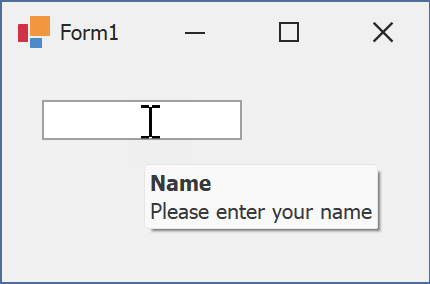
The following code snippet specifies tooltip text and title for a TextEdit editor:
public Form1() {
  InitializeComponent();
  textEdit1.ShowToolTips = true;
  textEdit1.ToolTipTitle = "Name";
  textEdit1.ToolTip = "Please enter your name";
}
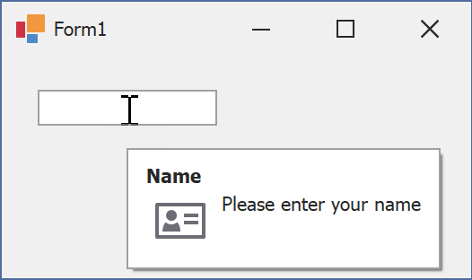
Assign an Image to Regular Tooltips
Use the control’s ToolTipIconType property to assign a predefined icon. The ToolTipController.IconSize property specifies icon size.
Assign a custom image as follows:
- Create a ToolTipController and assign it to the control’s ToolTipController property.
- Create an image collection and assign it to the ToolTipController.ImageList property.
- Handle the ToolTipController.BeforeShow event. Use the e.ImageOptions parameter to assign a raster or vector image to the tooltip.
Note
The ToolTipIconType property has priority over e.ImageOptions. If you assign a custom image, set ToolTipIconType to None.
The following code snippet assigns a custom image to the TextEdit tooltip:
Note
textEdit1, toolTipController1, and svgImageCollection1 were created at runtime.
public Form1() {
  InitializeComponent();
  textEdit1.ShowToolTips = true;
  textEdit1.ToolTipTitle = "Name";
  textEdit1.ToolTip = "Please enter your name";
  textEdit1.ToolTipController = toolTipController1;
  toolTipController1.ImageList = svgImageCollection1;
  toolTipController1.BeforeShow += ToolTipController1_BeforeShow;
}

private void ToolTipController1_BeforeShow(object sender, ToolTipControllerShowEventArgs e) {
  ToolTipController controller = sender as ToolTipController;
  if (e.ToolTip == textEdit1.ToolTip)
    e.ImageOptions.SvgImage = (controller.ImageList as SvgImageCollection)["personalCard"];
}

Display a Super Tooltip
Use the control’s SuperTip property to assign a super tooltip. If you wish to use HTML tags in a super tooltip, enable the SuperToolTip.AllowHtmlText property.
Setting the ToolTipController.ToolTipType property to SuperTip converts existing regular tooltips to super tooltips.
Tip
Read the following help topic for information on how to customize super tooltips: Hints and Tooltips.
Example: Update the Progress from a Separate Thread
This example performs a file copy operation in a background thread and indicates the progress of the operation on the main form. The ProgressBarControl is used to communicate operation state and supply feedback to end users.
Example
In the code fragment below, a DeleteFiles method removes all files contained within the directory specified by the source parameter. The ProgressBarControl is used to display the progress of file delete operations. The RepositoryItemProgressBar.Minimum and RepositoryItemProgressBar.Maximum properties are used to specify a range for the progress bar that is equivalent to the number of files to be removed. The code also uses the RepositoryItemProgressBar.Step property with the ProgressBarControl.PerformStep method, to increment the position of the progress bar as soon as a file is removed.
using System.IO;
using DevExpress.XtraEditors.Controls;
// ...
private void DeleteFiles(string source){
   if (Directory.Exists(source)){
      string[] fileEntries = Directory.GetFiles(source);
      // Initializing progress bar properties
      progressBarControl1.Properties.Step = 1;
      progressBarControl1.Properties.PercentView = true;
      progressBarControl1.Properties.Maximum = fileEntries.Length;
      progressBarControl1.Properties.Minimum = 0;
      // Removing the list of files found in the specified directory
      foreach(string fileName in fileEntries){
         File.Delete(fileName);
         progressBarControl1.PerformStep();
         progressBarControl1.Update();
      }
   }
}
// ...
DeleteFiles("d:\\Temp");