DateEdit Class
A drop-down date editor that displays and edits date/time values.
Namespace: DevExpress.XtraEditors
Assembly: DevExpress.XtraEditors.v26.1.dll
Declaration
[DefaultBindingPropertyEx("DateTime")]
public class DateEdit :
    PopupBaseEdit,
IDateRangeCollectionOwnerRemarks
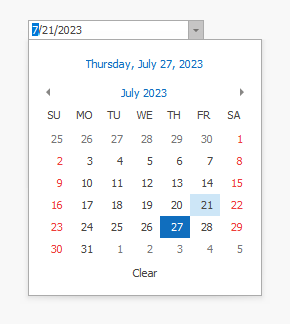
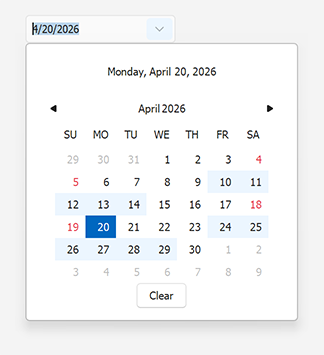
The DateEdit control allows users to enter date/time values by typing in the edit box or selecting a date from the drop-down calendar.
The following code snippet creates a standalone DateEdit control and sets its initial value:
using DevExpress.XtraEditors;
using System;
using System.Drawing;

DateEdit dateEdit = new DateEdit() {
    Location = new Point(50, 50),
    DateTime = DateTime.Today
};
this.Controls.Add(dateEdit);
Edit Value
Use one of the following properties to specify the edit value:
| Property | Type | Notes |
|---|---|---|
| EditValue | System.Object |
Use for data binding. |
| DateTime | System.DateTime |
Cannot be bound to a data source. |
| DateOnly | System.DateOnly |
Cannot be bound to a data source. |
DateTime, DateOnly, and EditValue properties are synchronized.
Handle one of the following events to respond to value changes:
Bind to a Data Source
Bind the EditValue property to a DateTime data field in an underlying data source.
The following code snippet binds EditValue to the OrderDate field of a BindingSource:
dateEdit.DataBindings.Add(new System.Windows.Forms.Binding(
    "EditValue", ordersBindingSource, "OrderDate", true));
If the DateEdit control is bound to a string field, convert values explicitly to prevent culture-specific misinterpretation of day and month portions:
dateEdit.EditValue = DateTime.ParseExact(
    dataString,
    "MM-dd-yyyy",
    CultureInfo.InvariantCulture
);
Calendar Views and Styles
Use the DateEdit.Properties.CalendarView property to specify a calendar style:
| Calendar Style | Description |
|---|---|
| Fluent | Windows 10 Calendar. Supports Acrylic and Reveal Highlight effects. |
| Vista | Windows Vista-inspired Calendar |
| ClassicNew | Outlook 2016-inspired Calendar |
| Classic | Classic Calendar |
| TouchUI | Touch-friendly Calendar |
In Vista view, use the VistaCalendarViewStyle property to specify available views grouped by date:
using DevExpress.XtraEditors;

dateEdit.Properties.Mask.EditMask = "Y";
dateEdit.Properties.Mask.UseMaskAsDisplayFormat = true;
dateEdit.Properties.VistaCalendarViewStyle = VistaCalendarViewStyle.YearView;

Settings and Events
Use the Properties property to customize the editor. Common settings include:
| Property | Description |
|---|---|
| ShowToday | Gets or sets whether to display the Today button in the dropdown calendar (in Classic and Vista modes). |
| ShowClear | Gets or sets whether the dropdown calendar contains the Clear button (this button is not supported in CalendarView.TouchUI mode). |
| AllowNullInput | Gets or sets whether end users can reset the editor’s value to null with the keyboard. |
| CalendarTimeEditing | Gets or sets whether an end-user can edit the time portion of a date value in the dropdown calendar. |
| MinDate / MaxDate | Specify the allowed date range. |

Handle the following events to customize calendar appearance and restrict date selection:
| Event | Description |
|---|---|
| DrawItem | Customize day cell appearance. |
| DisableCalendarDate DisabledDateProvider |
Disable specific dates in the drop-down calendar. |
Masked Input
The DateEdit control uses the DateTime mask (default behavior). Use the DateEdit.Properties.EditMask property to customize mask settings.
Tip
Set the DateEdit.Properties.Mask.MaskType property to DateTimeAdvancingCaret to automatically skip date separators as users type.
Note
Date/time masks support the following calendars:
- Gregorian
- Korean
- Taiwan
- Thai Buddhist
Date Range Selection
Set the SelectionMode property to CalendarSelectionMode.Multiple to allow users to select multiple dates. Use the SelectedRanges property to obtain selected date ranges.
using DevExpress.XtraEditors;

dateEdit.Properties.SelectionMode = CalendarSelectionMode.Multiple;
DateRangeCollection selectedDates = dateEdit.SelectedRanges;
Enter Date-Time Values
Refer to the following help topic for information about date-time editors: How to: Enter date-time values.