RatingControl Class
The control to rate specific content.
Namespace: DevExpress.XtraEditors
Assembly: DevExpress.XtraEditors.v26.1.dll
Declaration
Remarks
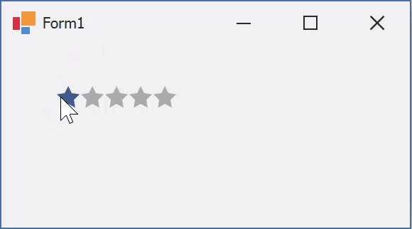
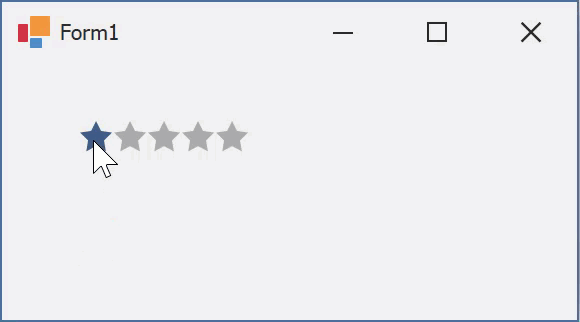
The RatingControl control displays images with three possible states - normal, hovered, and checked. End users can click an image to check all images starting from the first, up to the clicked image. The RatingControl displays five stars that allow your user to rate content based on the number of selected icons.

You can use your own custom icons assigned to the RepositoryItemRatingControl.Glyph, RepositoryItemRatingControl.HoverGlyph, and RepositoryItemRatingControl.CheckedGlyph properties. The figure below illustrates a RatingControl with custom images.

The RepositoryItemRatingControl.FillPrecision property allows you to specify whether partially checked glyphs are enabled. This property is initially set to Full (the default setting), which means that clicking anywhere within an icon will select the entire icon. The Half value specifies that icons can be half-selected. Finally, the Exact value allows your users to select an item up to the exact position where it was clicked. For instance, the following figure illustrates a RatingControl that displays 3.68 stars.

To set the number of icons within the RatingControl, use the RepositoryItemRatingControl.ItemCount property. The number of icons checked initially can be set by using the RatingControl.Rating property (or by setting the editor’s edit value using the BaseEdit.EditValue property). These properties can take fractional values if the RepositoryItemRatingControl.FillPrecision property allows this behavior.
You can also use the RepositoryItemRatingControl.ShowText property to display text assigned to the RatingControl.Text property. To arrange this text, use the RepositoryItemRatingControl.TextToRatingIndent and RepositoryItemRatingControl.TextLocation properties.
The figure below illustrates a RatingControl in different Skins, including bonus skins.

Tooltips
The RatingControl supports regular and super tooltips.
Default Behavior
The RatingControl displays a regular tooltip with the rating scale value.

The ShowToolTips option controls whether to show tooltips on hover.
Customize Regular Tooltip Text
Use the following RatingControl API to specify tooltip text and title:
API | Description |
|---|---|
Specifies tooltip text. You can use line breaks in regular tooltips. | |
Specifies whether to parse HTML tags in text. | |
Specifies the tooltip title. | |
Handle this event to customize the tooltip based on the rating value. |
The following code snippet specifies tooltip text and title and changes the text based on the rating value:
public Form1() {
  ratingControl1.ToolTip = "Please leave your feedback";
  ratingControl1.ToolTipTitle = "How was your experience?";
  ratingControl1.BeforeShowToolTip += RatingControl1_BeforeShowToolTip;
}
void RatingControl1_BeforeShowToolTip(object sender, DevExpress.XtraEditors.Repository.RatingToolTipEventArgs e) {
  switch(e.Value) {
  case 1:
    e.Text = "Very bad";
    break;
  case 2:
    e.Text = "Bad";
    break;
  }
}
Assign an Image to Regular Tooltips
Use the RatingControl‘s ToolTipIconType property to specify a predefined icon. The ToolTipController.IconSize property specifies icon size.
Assign a custom image as follows:
- Create a ToolTipController and assign it to the RatingControl.ToolTipController property.
- Create an image collection and assign it to the ToolTipController.ImageList property.
- Handle the ToolTipController.BeforeShow event. Use the e.ImageOptions parameter to assign a raster or vector image to the tooltip.
Note
The ToolTipIconType property has priority over e.ImageOptions. If you assign a custom image, set ToolTipIconType to None.
The following code snippet assigns a custom image to a tooltip:
Note
ratingControl1, toolTipController1, and svgImageCollection1 were created at runtime.
public Form1() {
  ratingControl1.ToolTipController = toolTipController1;
  toolTipController1.ImageList = svgImageCollection1;
  toolTipController1.BeforeShow += ToolTipController1_BeforeShow;
}
void ToolTipController1_BeforeShow(object sender, DevExpress.Utils.ToolTipControllerShowEventArgs e) {
  ToolTipController controller = sender as ToolTipController;
  if (e.SelectedControl == ratingControl1)
  e.ImageOptions.SvgImage = (controller.ImageList as SvgImageCollection)["3stars"];
}
Display a Super Tooltip
Use the control’s SuperTip property to assign a super tooltip. If you wish to use HTML tags in a super tooltip, enable the SuperToolTip.AllowHtmlText property.
Setting the ToolTipController.ToolTipType property to SuperTip converts existing regular tooltips to super tooltips.

Tip
Read the following help topic for information on how to customize super tooltips: Hints and Tooltips.