BarCodeControl Class
Displays a bar code.
Namespace: DevExpress.XtraEditors
Assembly: DevExpress.XtraEditors.v24.2.dll
NuGet Package: DevExpress.Win.Navigation
#Declaration
public class BarCodeControl :
BaseStyleControl
#Remarks
The BarCodeControl supports multiple bar code types. The following images illustrate some of them.
QR Code | EAN 8 | PDF417 |
---|---|---|
![]() |
![]() |
![]() |
The bar code type is specified by the BarCodeControl.Symbology property.
At design time within Visual Studio, you can set this property using the Properties window.
After selecting a bar code type, you can expand the Symbology property to access additional customization options.
To specify the symbology in code, create a specific BarCodeGeneratorBase descendant and assign it to the Symbology property of the BarCodeControl.
A bar code generator object provides access to additional customization properties specific to the selected bar code type.
Some of the main bar code options are described below.
- The bar code is generated from the BarCodeControl‘s Text. To prevent the text from being displayed next to the bar code, use the BarCodeControl.ShowText property.
- To define the orientation of a bar code and its text, use the BarCodeControl.Orientation property.
To specify the width of bars within a bar code, do one of the following.
- Define a specific bar width by using the BarCodeControl.Module property.
- Enable the BarCodeControl.AutoModule property to automatically calculate the bar width according to the BarCodeControl‘s dimensions.
Note
To learn how to ensure a correct rendering and scanning of a bar code, see Bar Code Recognition Specifics.
To specify the alignment of a bar code and/or its text, use the following properties.
#Tooltips
DevExpress controls support regular and super tooltips. Enable the ShowToolTips option to display tooltips when the mouse pointer hovers over the control.
Customize Regular Tooltip Text
Use the following properties of the target control to specify regular tooltip text and title:
API | Description |
---|---|
Specifies tooltip text. You can use line breaks in regular tooltips. | |
Specifies whether to parse HTML tags in text. | |
Specifies the tooltip title. If you do not specify tooltip text, the tooltip is not displayed even if you specify the title. |
The following code snippet specifies tooltip text and title for a TextEdit
editor:
public Form1() {
InitializeComponent();
textEdit1.ShowToolTips = true;
textEdit1.ToolTipTitle = "Name";
textEdit1.ToolTip = "Please enter your name";
}
Assign an Image to Regular Tooltips
Use the control’s ToolTipIconType property to assign a predefined icon. The ToolTipController.IconSize property specifies icon size.
Assign a custom image as follows:
- Create a ToolTipController and assign it to the control’s ToolTipController property.
- Create an image collection and assign it to the ToolTipController.ImageList property.
- Handle the ToolTipController.BeforeShow event. Use the e.ImageOptions parameter to assign a raster or vector image to the tooltip.
Note
The Tool
property has priority over e.
. If you assign a custom image, set Tool
to None
.
The following code snippet assigns a custom image to the TextEdit
tooltip:
Note
text
, tool
, and svg
were created at runtime.
public Form1() {
InitializeComponent();
textEdit1.ShowToolTips = true;
textEdit1.ToolTipTitle = "Name";
textEdit1.ToolTip = "Please enter your name";
textEdit1.ToolTipController = toolTipController1;
toolTipController1.ImageList = svgImageCollection1;
toolTipController1.BeforeShow += ToolTipController1_BeforeShow;
}
private void ToolTipController1_BeforeShow(object sender, ToolTipControllerShowEventArgs e) {
ToolTipController controller = sender as ToolTipController;
if (e.ToolTip == textEdit1.ToolTip)
e.ImageOptions.SvgImage = (controller.ImageList as SvgImageCollection)["personalCard"];
}
Display a Super Tooltip
Use the control’s SuperTip property to assign a super tooltip. If you wish to use HTML tags in a super tooltip, enable the SuperToolTip.AllowHtmlText property.
Setting the ToolTipController.ToolTipType property to SuperTip converts existing regular tooltips to super tooltips.
Tip
Read the following help topic for information on how to customize super tooltips: Hints and Tooltips.
#Example
This example illustrates how to use BarCodeControl
to display a QR code.
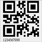
using DevExpress.XtraPrinting.BarCode;
using DevExpress.XtraEditors;
BarCodeControl barCodeControl1 = new BarCodeControl();
barCodeControl1.Parent = this;
barCodeControl1.Size = new System.Drawing.Size(150, 150);
barCodeControl1.AutoModule = true;
barCodeControl1.Text = "1234567890";
QRCodeGenerator symb = new QRCodeGenerator();
barCodeControl1.Symbology = symb;
// Adjust the QR barcode's specific properties.
symb.CompactionMode = QRCodeCompactionMode.AlphaNumeric;
symb.ErrorCorrectionLevel = QRCodeErrorCorrectionLevel.H;
symb.Version = QRCodeVersion.AutoVersion;