CheckedComboBoxEdit Class
A combo box editor that displays check boxes in a drop-down list and allows users to select multiple items.
Namespace: DevExpress.XtraEditors
Assembly: DevExpress.XtraEditors.v26.1.dll
Declaration
Remarks
The DevExpress WinForms Checked ComboBox Edit allows users to select multiple items from a drop-down list. The editor displays selected values in its text area and supports data binding, item customization, and integration with DevExpress data-aware controls (for example, Data Grid, TreeList, etc.).
Add Items Manually
Open the editor’s smart tag menu and click Edit Items.

In code, modify the Items collection:
checkedComboBoxEdit1.Properties.Items.Clear();

checkedComboBoxEdit1.Properties.Items.Add("One", "Item with string value");
checkedComboBoxEdit1.Properties.Items.Add(2, "Item with integer value");
checkedComboBoxEdit1.Properties.Items.Add(true, "Item with boolean value");
Bind to a Data Source
Set the following properties to populate CheckedComboBoxEdit from an external data source:
| Property | Description |
|---|---|
| DataSource | Specifies the data source (for example, a data table, BindingSource, or DbContext). |
| DisplayMember | Specifies a data field with item captions. |
| ValueMember | Specifies a data field with item values. |
At design time, open the smart tag menu and enable Use data bound items.

Refer to the following help topic for additional information: Data Binding Common Concepts.
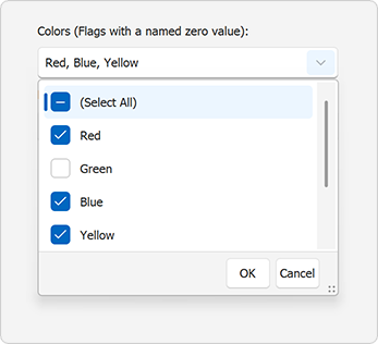
Populate with Bit Fields
Use the SetFlags(Type) method to generate items from a flags enumeration:
public partial class Form1 : Form {
    public Form1() {
        InitializeComponent();
        checkedComboBoxEdit1.Properties.SetFlags(typeof(MultiHue));
    }
}

[Flags]
public enum MultiHue
{
    None = 0,
    Black = 1,
    Red = 2,
    Green = 4,
    Blue = 8
};
CheckedComboBoxEdit does not support combined flags (values that combine two or more simple flags). Remove such items from the Items collection after calling SetFlags:
using DevExpress.XtraEditors.Repository;

[Flags]
enum MyColors {
    None = 0x00,
    Black = 0x01,
    White = 0x02,
    Blue = 0x04,
    Yellow = 0x08,
    Green = Blue | Yellow // Combined flag
}

public partial class Form1 : Form {
    public Form1() {
        InitializeComponent();

        // Populate the Items collection with flags.
        checkedComboBoxEdit1.Properties.SetFlags(typeof(MyColors));
        // Remove items that correspond to combined flags.
        removeCombinedFlags(checkedComboBoxEdit1.Properties);
        // Specify the edit value.
        checkedComboBoxEdit1.SetEditValue(MyColors.Black | MyColors.Green);
    }

    // Remove items that correspond to bitwise combinations of simple flags.
    void removeCombinedFlags(RepositoryItemCheckedComboBoxEdit ri) {
        for (int i = ri.Items.Count - 1; i > 0; i--) {
            Enum val1 = ri.Items[i].Value as Enum;
            for (int j = i - 1; j >= 0; j--) {
                Enum val2 = ri.Items[j].Value as Enum;
                if (val1.HasFlag(val2)) {
                    ri.Items.RemoveAt(i);
                    break;
                }
            }
        }
    }
}
Item Settings
Items (CheckedListBoxItem) expose the following key properties:
| Property | Description |
|---|---|
| CheckState | Gets or sets the item’s state. |
| Description | Gets or sets the item’s display text. |
| Enabled | Gets or set whether an end-user can change the item’s state. |
| Value | Gets or sets the item’s value. |
Check Items
Do one of the following to check or uncheck items:
Use SetEditValue(Object) for a standalone
CheckedComboBoxEdit.// Regular items, the EditValueType is CSV checkedComboBoxEdit1.SetEditValue("One, 2, True"); // Regular items, the EditValueType is List checkedComboBoxEdit1.SetEditValue(new List<object>() { "One", 2, true }); // Flags checkedComboBoxEdit2.SetEditValue(MultiHue.Black | MultiHue.Blue | MultiHue.Red);Note
Direct assignment to
EditValueis not supported.Set CheckState when you create or update items manually.
checkedComboBoxEdit1.Properties.Items.Add(1, "Checked Item", System.Windows.Forms.CheckState.Checked, true); checkedComboBoxEdit1.Properties.Items.Add(2, "Unchecked Item", System.Windows.Forms.CheckState.Unchecked, true); // or checkedComboBoxEdit1.Properties.Items[2].CheckState = System.Windows.Forms.CheckState.Checked;Use the CheckAll() method to check all items.
Limit the Maximum Number of Checked Items
CheckedComboBoxEdit allows users to check any number of items (default behavior). To limit the number of checked items, handle the Popup event.
The following code snippet allows the user to check a maximum of three items:
bool subscribe = true;
List<CheckedListBoxItem> checkedItems = new List<CheckedListBoxItem>();

void checkedComboBoxEdit1_Popup(object sender, EventArgs e)
{
    if (subscribe)
    {
        CheckedListBoxControl list = (sender as IPopupControl).PopupWindow.Controls.OfType<PopupContainerControl>().First().Controls.OfType<CheckedListBoxControl>().First();
        list.ItemCheck += list_ItemCheck;
        subscribe = false;
    }
}

void list_ItemCheck(object sender, DevExpress.XtraEditors.Controls.ItemCheckEventArgs e)
{
    // Retrieve the embedded CheckedListBoxControl
    CheckedListBoxControl list = sender as CheckedListBoxControl;

    if (e.State == CheckState.Checked)
    {
        // If an item was checked, add it to the checked items collection
        checkedItems.Add(list.Items[e.Index]);
        // If the checked items collection size exceeds the maximum capacity, disable other items
        if (checkedItems.Count >= 3)
            foreach (CheckedListBoxItem item in list.Items)
            {
                if (checkedItems.Contains(item)) item.CheckState = CheckState.Checked;
                else item.Enabled = false;
            }
    }
    else
    {
        // If an item is unchecked, activate all items
        checkedItems.Remove(list.Items[e.Index]);
        foreach (CheckedListBoxItem item in list.Items)
            item.Enabled = true;
    }
}
Tip
For single item selection, use ComboBoxEdit or LookUpEdit.
Get Checked Items
To obtain checked items, do one of the following:
- Call the GetCheckedItems() method
- Read the EditValue property value
For non-flag items, the EditValue property returns a string that contains selected values separated by SeparatorChar and a space.
checkedComboBoxEdit1.Properties.SeparatorChar = ';';
checkedComboBoxEdit1.Properties.Items.Add("One", "Item with string value", System.Windows.Forms.CheckState.Checked, true);
checkedComboBoxEdit1.Properties.Items.Add(2, "Item with integer value", System.Windows.Forms.CheckState.Checked, true);
checkedComboBoxEdit1.Properties.Items.Add(true, "Item with boolean value", System.Windows.Forms.CheckState.Checked, true);

// checkedComboBoxEdit1.EditValue returns the "One; 2; True" string
For flag-based editors, EditValue returns an object of the corresponding flag enumeration type:
public partial class Form1 : Form {
    public Form1() {
        InitializeComponent();
        checkedComboBoxEdit1.Properties.SetFlags(typeof(MultiHue));
        checkedComboBoxEdit1.CheckAll();
    }
}

[Flags]
public enum MultiHue
{
    None = 0,
    Black = 1,
    Red = 2,
    Green = 4,
    Blue = 8
};

// checkedComboBoxEdit1.EditValue returns the "Black | Red | Green | Blue" object of the MultiHue type.
Set EditValueType to EditValueTypeCollection.List to return System.Collections.Generic.List<object> instead of a string for non-flag items:
checkedComboBoxEdit1.Properties.EditValueType = EditValueTypeCollection.List;
checkedComboBoxEdit1.Properties.Items.Add("One", "String Item", System.Windows.Forms.CheckState.Checked, true);
checkedComboBoxEdit1.Properties.Items.Add(2, "Int Item", System.Windows.Forms.CheckState.Checked, true);
checkedComboBoxEdit1.Properties.Items.Add(true, "Boolean Item", System.Windows.Forms.CheckState.Checked, true);

// (checkedComboBoxEdit1.EditValue as System.Collections.Generic.List<Object>)[0] returns the "One" string
// (checkedComboBoxEdit1.EditValue as System.Collections.Generic.List<Object>)[1] returns 2
// (checkedComboBoxEdit1.EditValue as System.Collections.Generic.List<Object>)[2] returns true
Additional Settings
| Property | Description |
|---|---|
| DropDownRows | Specifies the maximum drop-down height for visible items. |
| PopupFormSize | Specifies the drop-down size. When set, the editor ignores DropDownRows. |
| SelectAllItemCaption | Specifies the caption of the Select All item. |
| SelectAllItemVisible | Specifies whether the Select All item is visible. |
Examples
Create a Checked Combo Box Editor
The following code snippet creates a CheckedComboBoxEdit:
using DevExpress.XtraEditors;

public partial class Form1 : Form {
    public Form1() {
        InitializeComponent();

        CheckedComboBoxEdit editor = new CheckedComboBoxEdit();
        editor.Location = new System.Drawing.Point(12, 12);
        editor.Width = 200;

        editor.Properties.Items.Add("One", "First Item");
        editor.Properties.Items.Add("Two", "Second Item");
        editor.Properties.Items.Add("Three", "Third Item");

        Controls.Add(editor);
    }
}
Create an In-place Checked Combo Box Editor
The following code snippet creates a CheckedComboBoxEdit and uses the editor within the Data Grid control to edit cell values in the Department column. The Data Grid control is created at design time.
using DevExpress.XtraEditors;
using DevExpress.XtraEditors.Repository;
using DevExpress.XtraGrid.Views.Grid;
using System.ComponentModel;

namespace DXApplication {
    public partial class Form1 : XtraForm {
        BindingList<DataItemProject> dataItems;
        RepositoryItemCheckedComboBoxEdit repositoryItem;
        public Form1() {
            InitializeComponent();
            dataItems = new BindingList<DataItemProject>() {
                new DataItemProject() { Id = 1, Departments = "Design", ProjectName = "Project 1" },
                new DataItemProject() { Id = 2, Departments = "Development, Testing", ProjectName = "Project 2" }
            };

            this.Load += Form1_Load;
        }

        void Form1_Load(object sender, System.EventArgs e) {
            // Bind the grid to data.
            gridControl1.DataSource = dataItems;

            // Ensure the grid and its views/columns are created before accessing `MainView` and columns.
            gridControl1.ForceInitialize();

            var view = gridControl1.MainView as GridView;

            if (view == null)
                return;

            // Create an in-place editor.
            repositoryItem = new RepositoryItemCheckedComboBoxEdit();
            repositoryItem.Items.Add("Design", "Design");
            repositoryItem.Items.Add("Development", "Development");
            repositoryItem.Items.Add("Testing", "Testing");

            // Register the repository item.
            gridControl1.RepositoryItems.Add(repositoryItem);

            // Assign the editor to the 'Departments' column.
            view.Columns["Departments"].ColumnEdit = repositoryItem;
        }
    }

    public class DataItemProject {
        public int Id { get; set; }
        public string Departments { get; set; }
        public string ProjectName { get; set; }
    }
}
Display a Super Tooltip for Selected Items
The following example assigns a ToolTipController component to the CheckedComboBoxEdit control and handles the GetActiveObjectInfo event to display a custom super tooltip for selected values displayed in the edit box.
The following screenshot illustrates the result:
