LabelControl Class
The label that supports formatted text, images, multi-line text strings and HTML formatting.
Namespace: DevExpress.XtraEditors
Assembly: DevExpress.XtraEditors.v26.1.dll
Declaration
public class LabelControl :
    BaseStyleControl,
    IMouseWheelSupportIgnore,
    ISupportCommandBinding,
    ISupportsAutoSize,
    ISupportsBaselineAlignment,
    ISupportImageDragDrop,
    IImageDropInfo,
IAccessibleLabelRemarks
Labels are used to provide descriptive text or other helpful information. Use the Text property to specify the label’s text. You can provide either plain or formatted text (see LabelControl.AllowHtmlString).

A LabelControl can display an image (vector or raster). Use the ImageOptions property to specify state images (normal, hovered, disabled).
The alignment of an image relative to the label’s text is specified by the LabelControl.ImageAlignToText property.

If the LabelControl.ImageAlignToText property is set to ImageAlignToText.None, the alignment of an image within the label is specified by the label’s appearance settings.
When the LabelControl.LineVisible property is set to true, a LabelControl displays a line in its empty space.

The properties that affect the line display include:
The line is displayed when the label’s width/height exceeds the width/height of its text. In some cases, you may need to manipulate the LabelControl.AutoSizeMode property to resize a label to custom dimensions.
A LabelControl is in the tab order of a form, but does not receive focus (the next control in the tab order receives focus). For instance, if the LabelControl.UseMnemonic property is set to true, and a mnemonic character - the first character after an ampersand (&) - is specified in the label’s Text property, when a user presses ALT+ the mnemonic key, focus moves to the next control in the tab order. This feature provides keyboard navigation for a form.
A LabelControl can display a hyperlink. To do so, set the LabelControl.AllowHtmlString property to true and format the required text with the <href></href> tag, as shown below.
myLabelControl.AllowHtmlString = true;
myLabelControl.Text = "Visit our <href="www.devexpress.com">Web-site</href>";
When an end-user clicks the hyperlink, the LabelControl.HyperlinkClick event occurs. Handle it to perform specific operations, depending on the link.
To format text using HTML syntax in cells in container controls (e.g., Data Grid, Tree List, etc.), use the RepositoryItemHypertextLabel in-place editor.
Tooltips
DevExpress controls support regular and super tooltips. Enable the ShowToolTips option to display tooltips when the mouse pointer hovers over the control.
Customize Regular Tooltip Text
Use the following properties of the target control to specify regular tooltip text and title:
API | Description |
|---|---|
Specifies tooltip text. You can use line breaks in regular tooltips. | |
Specifies whether to parse HTML tags in text. | |
Specifies the tooltip title. If you do not specify tooltip text, the tooltip is not displayed even if you specify the title. |
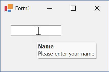
The following code snippet specifies tooltip text and title for a TextEdit editor:
public Form1() {
  InitializeComponent();
  textEdit1.ShowToolTips = true;
  textEdit1.ToolTipTitle = "Name";
  textEdit1.ToolTip = "Please enter your name";
}
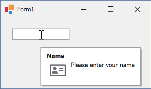
Assign an Image to Regular Tooltips
Use the control’s ToolTipIconType property to assign a predefined icon. The ToolTipController.IconSize property specifies icon size.
Assign a custom image as follows:
- Create a ToolTipController and assign it to the control’s ToolTipController property.
- Create an image collection and assign it to the ToolTipController.ImageList property.
- Handle the ToolTipController.BeforeShow event. Use the e.ImageOptions parameter to assign a raster or vector image to the tooltip.
Note
The ToolTipIconType property has priority over e.ImageOptions. If you assign a custom image, set ToolTipIconType to None.
The following code snippet assigns a custom image to the TextEdit tooltip:
Note
textEdit1, toolTipController1, and svgImageCollection1 were created at runtime.
public Form1() {
  InitializeComponent();
  textEdit1.ShowToolTips = true;
  textEdit1.ToolTipTitle = "Name";
  textEdit1.ToolTip = "Please enter your name";
  textEdit1.ToolTipController = toolTipController1;
  toolTipController1.ImageList = svgImageCollection1;
  toolTipController1.BeforeShow += ToolTipController1_BeforeShow;
}

private void ToolTipController1_BeforeShow(object sender, ToolTipControllerShowEventArgs e) {
  ToolTipController controller = sender as ToolTipController;
  if (e.ToolTip == textEdit1.ToolTip)
    e.ImageOptions.SvgImage = (controller.ImageList as SvgImageCollection)["personalCard"];
}

Display a Super Tooltip
Use the control’s SuperTip property to assign a super tooltip. If you wish to use HTML tags in a super tooltip, enable the SuperToolTip.AllowHtmlText property.
Setting the ToolTipController.ToolTipType property to SuperTip converts existing regular tooltips to super tooltips.
Tip
Read the following help topic for information on how to customize super tooltips: Hints and Tooltips.