TextEdit Class
A single-line text editor.
Namespace: DevExpress.XtraEditors
Assembly: DevExpress.XtraEditors.v26.1.dll
Declaration
[DefaultBindingPropertyEx("Text")]
public class TextEdit :
    BaseEdit,
    ITextEditControllerProvider,
    IValidationHintCornerRadiusProvider,
    IDXMenuSupport,
    IMouseWheelSupport,
    ISupportsBaselineAlignment,
    ISupportsAutoSize,
    IDirectXClientProviderEx,
    IDirectXClientProvider,
    ITextEditControllerOwner,
    IChildAccessibleInfoProvider,
ISupportsAdvancedModeRelated API Members
The following members return TextEdit objects:
Remarks
The TextEdit.Properties property allows access to the RepositoryItemTextEdit object - a repository item that stores editor settings.
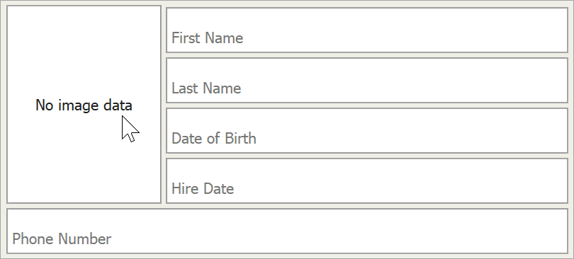
The image below shows a text edit:

Tip
Use the MemoEdit control to display and edit multi-line text.
TextEdit API
The following table enumerates main TextEdit API:
Description | API |
|---|---|
Editor text | |
Character casing (normal, uppercase, or lowercase) | |
Maximum text length | |
Default text shown when the editor is empty | RepositoryItem.NullText |
Methods that manage the caret’s position and text selection | TextEdit.SelectionStart |
Clipboard operations | |
Shortcuts | LEFT or UP arrow - moves the caret forward |
Context Menu |
Editors derived from the TextEdit class have the same features. You can modify the TextEditStyle property (for instance, RepositoryItemButtonEdit.TextEditStyle) to disable or hide the text box and prevent users from entering values.
Tip
If you need to work with values other than strings, you can use input masks or data-specific editors (for example, SpinEdit for numeric values, DateEdit for DateTime values, etc.). DevExpress data editors are fully customizable. You can hide UI buttons and dropdowns to make them look like a TextEdit.
Advanced Mode
All editors derived from the TextEdit class (except for RepositoryItemHypertextLabel and HyperLinkEdit) can operate in Advanced Mode. In this mode editors use a custom DevExpress text box instead of the standard Windows Forms masked box. This custom text box supports unique features, such as embedded editor labels and custom caret animations.
Read the following topic for more information about Advanced Mode: UseAdvancedMode.
Important
In Advanced Mode or when the WXI Skin is applied, use the Appearance.BackColor property to specify the editor’s background color. Other appearance settings that specify the background color of the editor in different states are ignored (for example, the AppearanceReadOnly.BackColor, AppearanceFocused.BackColor, AppearanceDisabled.BackColor).