RangeControl Class
Supports range selection for any data.
Namespace: DevExpress.XtraEditors
Assembly: DevExpress.XtraEditors.v26.1.dll
Declaration
public class RangeControl :
    BaseStyleControl,
    ISupportXtraAnimation,
    IRangeControl,
    IMouseWheelSupport,
ISupportInitializeRelated API Members
The following members return RangeControl objects:
Remarks
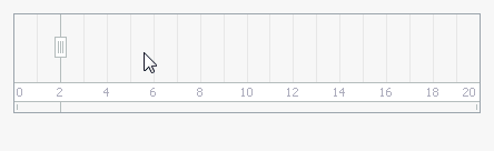
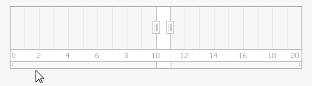
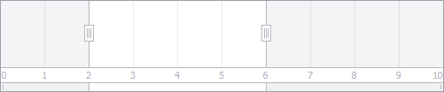
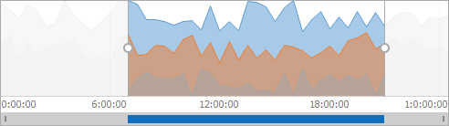
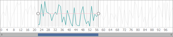
The Range Control allows end-users to select ranges of data using mouse and fingers (when using touch screens).
In addition to simple scrolling, you can zoom data in and out:
Clients
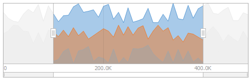
Data for the Range Control is provided by a Range Control Client, which must be associated with the Range Control by using the RangeControl.Client property. The client also visualizes data in the Range Control’s viewport in a specific manner. Embedded into the Range Control, the client automatically gains support for range selection and zooming.
The following Range Control Clients are available out of the box.
NumericRangeControlClient - A RangeControl‘s client that supports numeric (integer, double, decimal or float) range selection.
NumericChartRangeControlClient - The RangeControl‘s client that renders a lightweight chart with a numeric horizontal axis.
DateTimeRangeControlClient - A RangeControl‘s client that supports date-time range selection.

DateTimeChartRangeControlClient - The RangeControl‘s client that renders a lightweight chart with a date-time horizontal axis.

TimeSpanChartRangeControlClient - The RangeControl‘s client that renders a lightweight chart with a time-span horizontal axis.
- SchedulerControl - When using this client, the Range Control allows end-users to select date ranges for the associated Scheduler Control. See Scheduler Range Control.
- ChartControl - When using this client, the Range Control allows end-users to select ranges for the associated Chart Control. See Integration with a Range Control.
To embed a NumericRangeControlClient, NumericChartRangeControlClient or DateTimeChartRangeControlClient into the Range Control at design time, use the Range Control’s smart tag.
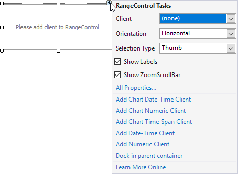
When required, you can implement your own Range Control Client that will display data in a custom manner within the Range Control. See the Custom Range Control Client topic to learn more.
Selection
The current selection can be obtained using the RangeControl.SelectedRange property. When displaying numeric ranges, you can specify the range bounds using the Range Control’s ClientOptions.Minimum and ClientOptions.Maximum properties.
Additional Information
The following topics provide more information on the Range Control: