SparklineEdit Class
Visualizes data in a highly condensed way, allowing end users to understand and compare values from different sources.
Namespace: DevExpress.XtraEditors
Assembly: DevExpress.XtraEditors.v24.2.dll
NuGet Package: DevExpress.Win.Navigation
#Declaration
#Remarks
The sparkline type is defined by the SparklineEdit.Properties.View property, which can contain the following SparklineViewBase class descendants:
- Area (AreaSparklineView)
- Line (LineSparklineView)
- Bar (BarSparklineView)
- Win/Loss (WinLossSparklineView)
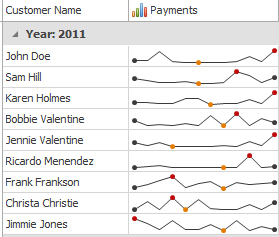
Below is an example of a grid control with Line sparklines displayed in its second column.
#Tooltips
DevExpress controls support regular and super tooltips. Enable the ShowToolTips option to display tooltips when the mouse pointer hovers over the control.
Customize Regular Tooltip Text
Use the following properties of the target control to specify regular tooltip text and title:
API | Description |
---|---|
Specifies tooltip text. You can use line breaks in regular tooltips. | |
Specifies whether to parse HTML tags in text. | |
Specifies the tooltip title. If you do not specify tooltip text, the tooltip is not displayed even if you specify the title. |
The following code snippet specifies tooltip text and title for a TextEdit
editor:
public Form1() {
InitializeComponent();
textEdit1.ShowToolTips = true;
textEdit1.ToolTipTitle = "Name";
textEdit1.ToolTip = "Please enter your name";
}
Assign an Image to Regular Tooltips
Use the control’s ToolTipIconType property to assign a predefined icon. The ToolTipController.IconSize property specifies icon size.
Assign a custom image as follows:
- Create a ToolTipController and assign it to the control’s ToolTipController property.
- Create an image collection and assign it to the ToolTipController.ImageList property.
- Handle the ToolTipController.BeforeShow event. Use the e.ImageOptions parameter to assign a raster or vector image to the tooltip.
Note
The Tool
property has priority over e.
. If you assign a custom image, set Tool
to None
.
The following code snippet assigns a custom image to the TextEdit
tooltip:
Note
text
, tool
, and svg
were created at runtime.
public Form1() {
InitializeComponent();
textEdit1.ShowToolTips = true;
textEdit1.ToolTipTitle = "Name";
textEdit1.ToolTip = "Please enter your name";
textEdit1.ToolTipController = toolTipController1;
toolTipController1.ImageList = svgImageCollection1;
toolTipController1.BeforeShow += ToolTipController1_BeforeShow;
}
private void ToolTipController1_BeforeShow(object sender, ToolTipControllerShowEventArgs e) {
ToolTipController controller = sender as ToolTipController;
if (e.ToolTip == textEdit1.ToolTip)
e.ImageOptions.SvgImage = (controller.ImageList as SvgImageCollection)["personalCard"];
}
Display a Super Tooltip
Use the control’s SuperTip property to assign a super tooltip. If you wish to use HTML tags in a super tooltip, enable the SuperToolTip.AllowHtmlText property.
Setting the ToolTipController.ToolTipType property to SuperTip converts existing regular tooltips to super tooltips.
Tip
Read the following help topic for information on how to customize super tooltips: Hints and Tooltips.
#Example
This example demonstrates how to create a sparkline control, fill it with data, choose the way to represent this data, and customize the sparkline appearance.
To do this, you should create a SparklineEdit
object and assign the datasource object to its BaseEdit.EditValue property. Then, you need to set the appropriate view instance to the SparklineEdit.Properties.View property and customize view properties to meet your requirements.
Note that in this sample, the AreaSparklineView class is used to display area sparklines. To display other sparklines types, use the BarSparklineView, LineSparklineView or WinLossSparklineView classes instead.
using System;
using System.Drawing;
using System.Windows.Forms;
using DevExpress.Sparkline;
using DevExpress.XtraEditors;
private SparklineEdit CreateSparkline() {
// Create a Sparkline editor and set its dock style.
SparklineEdit sparkline = new SparklineEdit();
sparkline.Dock = DockStyle.Fill;
sparkline.EditValue = CreateData();
// Create an Area view and assign it to the sparkline.
AreaSparklineView view = new AreaSparklineView();
sparkline.Properties.View = view;
// Customize area appearance.
view.Color = Color.Aqua;
view.AreaOpacity = 50;
// Show markers.
view.HighlightStartPoint = true;
view.HighlightEndPoint = true;
view.HighlightMaxPoint = true;
view.HighlightMinPoint = true;
view.HighlightNegativePoints = true;
view.SetSizeForAllMarkers(10);
return sparkline;
}
private double[] CreateData() {
return new double[] { 2, 4, 5, 1, -1, -2, -1, 2, 4, 5, 6, 3, 5, 4, 8, -1, 6 };
}