StepProgressBar Class
Visualizes a linear process and highlights its current stage.
Namespace: DevExpress.XtraEditors
Assembly: DevExpress.XtraEditors.v26.1.dll
Declaration
public class StepProgressBar :
    BaseStyleControl,
    IStepProgressBarDirectXOwner,
    ISupportXtraAnimation,
    ISupportInitialize,
    IStepProgressBarAppearanceOwner,
    ITouchScrollBarOwner,
    IMouseWheelSupport,
    IStepProgressBarCustomDraw,
    IStepProgressBarItemOptionsOwner,
IImageListOwnerRemarks
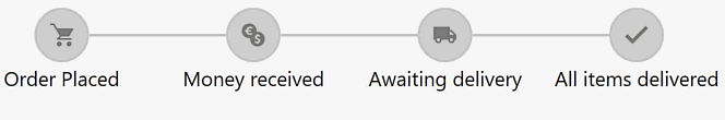
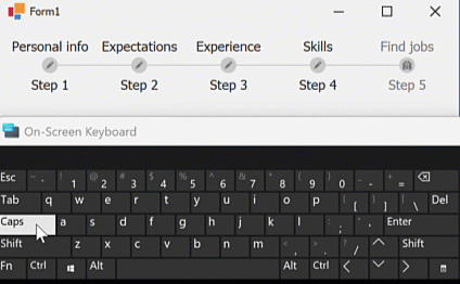
A StepProgressBar is a sequence of connected items. Each StepProgressBar item has two states (active and inactive) with different appearance settings.
The control supports vertical and horizontal orientations. Enable the InversedProgressDirection property to flip the orientation.
StepProgressBar items are objects of the StepProgressBarItem class stored in the StepProgressBar.Items collection. Each item has an indicator (a centered circular icon) and two identical content blocks.
Item Indicator
An indicator consists of an outline, a central area that can be filled with the outline color, and an optional image in the center.

Outline Settings
Use the following API to customize the outline:
API | Description |
|---|---|
Specifies line thickness. | |
| Specify active/inactive state outline colors for all StepProgressBar items. These settings also affect connectors (lines that link adjacent items). |
| Specify common active/inactive state colors for individual StepProgressBar items. |
Specifies the outline diameter. You can access this setting at two levels:
|
Image Settings
Use ActiveStateImageOptions and InactiveStateImageOptions properties to assign images to active and inactive item states. These properties are accessible at two levels, as shown in the following code snippet:
// Specify a global image displayed by all active items
stepProgressBar1.ItemOptions.Indicator.ActiveStateImageOptions.SvgImage = svgImageCollection1[0];
// Override the image for an individual item
stepProgressBarItem1.Options.Indicator.ActiveStateImageOptions.SvgImage = svgImageCollection[1];
Indicator Draw Modes
StepProgressBarIndicatorOptions.ActiveStateDrawMode and StepProgressBarIndicatorOptions.InactiveStateDrawMode properties allow you to choose from the following indicator styles:

- Full/Default
- An indicator outline is visible, and the central indicator area is filled with the outline color.
- Outline
- An indicator outline is visible, and the central indicator area is empty.
- None
- Neither the indicator outline nor the central area is visible. If assigned, the indicator icon is visible.
Similar to other indicator options, you can access these settings at the level of the control and individual StepProgressBar items.
stepProgressBar1.ItemOptions.Indicator.ActiveStateDrawMode = IndicatorDrawMode.Full;
stepProgressBarItem1.Options.Indicator.ActiveStateDrawMode = IndicatorDrawMode.Outline;
Content Blocks
Content blocks are objects of the StepProgressBarItemContentBlock class displayed on both sides of indicators.

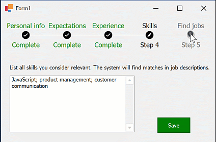
Content blocks can display the following elements:
- Caption (the StepProgressBarItemContentBlock.Caption property)
- Description (the StepProgressBarItemContentBlock.Description property)
- Images for active and inactive item states (StepProgressBarItemContentBlock.ActiveStateImageOptions and StepProgressBarItemContentBlock.InactiveStateImageOptions properties)

To access these settings, use StepProgressBarItem.ContentBlock1 and StepProgressBarItem.ContentBlock2 properties.
stepProgressBarItem.ContentBlock1.Caption = "Set up notifications";
stepProgressBarItem.ContentBlock2.Description = "Done";
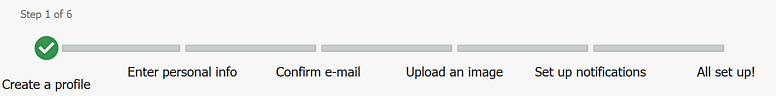
To change content block spacing, use StepProgressBar.DistanceBetweenContentBlockElements (1) and StepProgressBar.IndicatorToContentBlockDistance (2) properties.

Appearance
The following table lists API that specify the appearance of content block captions and descriptions:
API | Description |
|---|---|
StepProgressBarAppearance.FirstContentBlockAppearance / StepProgressBarAppearance.SecondContentBlockAppearance | Provide access to appearance options at the StepProgressBar level. |
| Provides access to appearance options at the StepProgressBarItem level (options apply to both content blocks). |
Appearance accessible in StepProgressBarItem.ContentBlock1 and StepProgressBarItem.ContentBlock2 | Provides access to appearance options of an individual content block. |
// Customize the first content block's caption font color for all StepProgressBar items in different states
// You can customize the description in the same way
stepProgressBar1.Appearances.FirstContentBlockAppearance.CaptionActive.ForeColor = Color.Black;
stepProgressBar1.Appearances.FirstContentBlockAppearance.CaptionInactive.ForeColor = Color.Gray;
stepProgressBar1.Appearances.FirstContentBlockAppearance.CaptionDisabled.ForeColor = Color.Gray;
// Customize the caption font color for an individual StepProgressBar item,
// which is applied to both content blocks
stepProgressBarItem1.Appearance.ContentBlockAppearance.CaptionActive.ForeColor = Color.Red;
stepProgressBarItem1.Appearance.ContentBlockAppearance.CaptionInactive.ForeColor = Color.Violet;
stepProgressBarItem1.Appearance.ContentBlockAppearance.CaptionDisabled.ForeColor = Color.Yellow;
// Customize an individual content block
stepProgressBarItem1.ContentBlock1.Appearance.Caption.ForeColor = Color.Beige;
Connectors
Connectors are lines that link adjacent StepProgressBar items. The following table lists the main connector settings:
API | Description |
|---|---|
Specifies whether the control should draw connectors. | |
Specifies the width of all connectors. | |
Specifies the distance (in pixels) between the end of connector lines, and the item indicator outline. This property is available at both control (
|

The connector length depends on IndentBetweenItems and LayoutMode properties. Note that IndentBetweenItems specifies the distance between items, not item indicators.

Layout Modes
The LayoutMode property specifies how the StepProgressBar distributes its items across the client area.
Compact (Default) Layout Mode
If the StepProgressBar has more space than required, the distance between its items equals the IndentBetweenItems property value. Items are placed according to the StepProgressBar.ContentAlignment property.

When the StepProgressBar size is reduced, connectors are shortened, and content blocks are clipped. No scroll bar is available in this case.

Fixed Layout Mode
In this mode, the distance between items is always equal to the IndentBetweenItems property value.

Connectors are not shortened when the StepProgressBar size is reduced. If there is not enough space to show all items, a scroll bar appears. Use the StepProgressBar.ScrollMode property to select the scrollbar style.

Call the StepProgressBar.ScrollToItem(StepProgressBarItem) method to jump to the specified item.
FullSize Layout Mode
In “FullSize” mode, the StepProgressBar aligns its first item to the left edge, the last item to the right edge, and evenly distributes the other items.

A similar alignment pattern applies when the StepProgressBar cannot display all its items. Connectors are shortened, content blocks are clipped, and a scroll bar is not displayed.

Select Items
When you select a StepProgressBar item, the control selects all previous items. Use the following API to select items:
API | Description |
|---|---|
Set this property to | |
The -1 value deselects all items. Set this property to an Items collection index to select an item. | |
Selects an item. | |
Set this property to an integer value between 0 and 100 to draw a partially filled item connector.
| |
Select/deselect all items. | |
Select the next/previous item. |

When another item is selected, the StepProgressBar.SelectedItemChanged event occurs. The following code snippet handles this event to dynamically change item and connector settings.
using DevExpress.XtraEditors;

// ...

spBar1.ConnectorLineThickness = 15;
spBar1.IndentBetweenItems = 50;
spBar1.IndicatorLineThickness = 4;
spBar1.ItemOptions.ConnectorOffset = -20;
spBar1.ItemOptions.Indicator.ActiveStateDrawMode = IndicatorDrawMode.None;
spBar1.ItemOptions.Indicator.InactiveStateDrawMode = IndicatorDrawMode.None;
spBar1.ItemOptions.Indicator.Width = 50;

void spBar1_SelectedItemChanged(object sender, StepProgressBarSelectedItemChangedEventArgs e) {
    StepProgressBar bar = sender as StepProgressBar;
    foreach (StepProgressBarItem item in bar.Items) {
        item.Options.Indicator.ActiveStateImageOptions.SvgImage = null;
        item.Options.Indicator.Width = 50;
        item.Options.ConnectorOffset = -20;
        item.ContentBlock1.Description = null;
    }

    var currentItem = e.SelectedItems.Last();

    if (currentItem != null) {
        currentItem.Options.Indicator.ActiveStateImageOptions.SvgImage = svgImageCollection1[0];
        currentItem.Options.Indicator.Width = 100;
        currentItem.ContentBlock1.Description = "Step " + (bar.SelectedItemIndex + 1).ToString() + " of 6";
        currentItem.Options.ConnectorOffset = 0;
        if (bar.SelectedItemIndex < 3)
            bar.Appearances.CommonActiveColor = Color.IndianRed;
        if (bar.SelectedItemIndex >= 3 && bar.SelectedItemIndex < 5)
            bar.Appearances.CommonActiveColor = Color.Goldenrod;
        if (bar.SelectedItemIndex >= 5)
            bar.Appearances.CommonActiveColor = Color.Green;
    }
}
End User Capabilities (Interactivity)
The StepProgressBar.AllowUserInteraction property specifies whether users can interact with StepProgressBar items as follows:
- Click an item to select it.
- Use arrow keys to move focus between items.
- Press Enter or Space to select an item.
Use the following API to prevent user interaction with an individual StepProgressBar item:
API | Description |
|---|---|
Specifies whether a user can move focus to the StepProgressBar item using the keyboard and select the item on click. This API does not affect item appearance. | |
Specifies whether the step item is enabled. Users cannot select disabled step items. The item’s content blocks are drawn based on |
Handle the StepProgressBar.ItemClick event to respond to item clicks and cancel item selection if needed.
The following code snippet prompts the user to save entered data. If the user chooses to save the data, the selected item does not change:
stepProgressBar1.AllowUserInteraction = true;
// ...
private void StepProgressBar1_ItemClick(object sender, StepProgressBarItemClickEventArgs e) {
    if (IsDataSaved(e.Item)) return;
    if (XtraMessageBox.Show("You have unsaved changes. Would you like to save them?", "Warning", MessageBoxButtons.YesNo) == DialogResult.Yes)
        e.Handled = true;
}
In the following animation, the last StepProgressBar item’s Enabled property is false until the user saves all data:
Tooltips
DevExpress controls support regular and super tooltips. Enable the ShowToolTips option to display tooltips when the mouse pointer hovers over the control.
Customize Regular Tooltip Text
Use the following properties of the target control to specify regular tooltip text and title:
API | Description |
|---|---|
Specifies tooltip text. You can use line breaks in regular tooltips. | |
Specifies whether to parse HTML tags in text. | |
Specifies the tooltip title. If you do not specify tooltip text, the tooltip is not displayed even if you specify the title. |
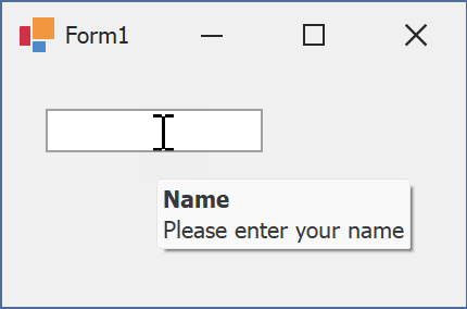
The following code snippet specifies tooltip text and title for a TextEdit editor:
public Form1() {
  InitializeComponent();
  textEdit1.ShowToolTips = true;
  textEdit1.ToolTipTitle = "Name";
  textEdit1.ToolTip = "Please enter your name";
}
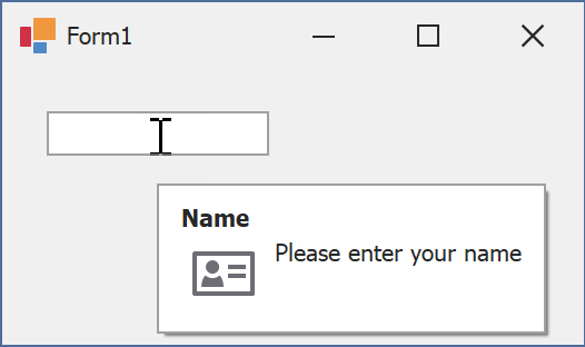
Assign an Image to Regular Tooltips
Use the control’s ToolTipIconType property to assign a predefined icon. The ToolTipController.IconSize property specifies icon size.
Assign a custom image as follows:
- Create a ToolTipController and assign it to the control’s ToolTipController property.
- Create an image collection and assign it to the ToolTipController.ImageList property.
- Handle the ToolTipController.BeforeShow event. Use the e.ImageOptions parameter to assign a raster or vector image to the tooltip.
Note
The ToolTipIconType property has priority over e.ImageOptions. If you assign a custom image, set ToolTipIconType to None.
The following code snippet assigns a custom image to the TextEdit tooltip:
Note
textEdit1, toolTipController1, and svgImageCollection1 were created at runtime.
public Form1() {
  InitializeComponent();
  textEdit1.ShowToolTips = true;
  textEdit1.ToolTipTitle = "Name";
  textEdit1.ToolTip = "Please enter your name";
  textEdit1.ToolTipController = toolTipController1;
  toolTipController1.ImageList = svgImageCollection1;
  toolTipController1.BeforeShow += ToolTipController1_BeforeShow;
}

private void ToolTipController1_BeforeShow(object sender, ToolTipControllerShowEventArgs e) {
  ToolTipController controller = sender as ToolTipController;
  if (e.ToolTip == textEdit1.ToolTip)
    e.ImageOptions.SvgImage = (controller.ImageList as SvgImageCollection)["personalCard"];
}

Display a Super Tooltip
Use the control’s SuperTip property to assign a super tooltip. If you wish to use HTML tags in a super tooltip, enable the SuperToolTip.AllowHtmlText property.
Setting the ToolTipController.ToolTipType property to SuperTip converts existing regular tooltips to super tooltips.
Tip
Read the following help topic for information on how to customize super tooltips: Hints and Tooltips.