ImageListBoxControl Class
The list box control that displays a list of items that a user can select. Can be populated with items from a data source.
Namespace: DevExpress.XtraEditors
Assembly: DevExpress.XtraEditors.v26.1.dll
Declaration
[ImageListBoxControl.ImageListBoxControlCustomBindingProperties]
public class ImageListBoxControl :
    BaseImageListBoxControl,
IBehaviorPropertiesFilterRemarks
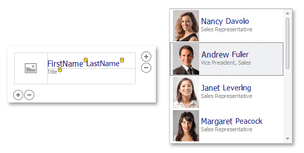
ImageListBoxControl items can be rendered using two paint modes:
Default (basic rendering) - For each item, the control displays one image followed by a text string.

Item Templates (advanced rendering) - This feature helps you paint each listbox item as your needs dictate. Each item can display multiple image and text elements arranged in any manner, and painted using different appearance settings.
See Templated ListBox Items to learn more.
The control’s main members include:
- BaseImageListBoxControl.Items - Allows you to populate the control with items in unbound mode.
- BaseListBoxControl.DataSource - Use this property to populate the control with items from a data source.
- BaseListBoxControl.Templates - This property supports the item templates feature. See Templated ListBox Items to learn more.
- BaseListBoxControl.CustomizeItem - Allows you to customize templated items dynamically.
- BaseListBoxControl.CustomItemTemplate - Allows you to assign custom templates to listbox items.
- BaseListBoxControl.ValueMember - Gets or sets the field name in the bound data source whose contents are assigned to item values.
- BaseListBoxControl.DisplayMember - Gets or sets the name of the data source field that specifies display text for listbox items. This property is not supported when listbox items are rendered based on Item Templates.
- BaseImageListBoxControl.ImageMember - Gets or sets the name of the data source field that provides images for listbox items. This property is not supported when listbox items are rendered based on Item Templates.
- BaseImageListBoxControl.ImageIndexMember - Gets or sets the name of the data source field that provides image indexes for listbox items. This property is not supported when listbox items are rendered based on Item Templates.
- BaseListBoxControl.MultiColumn - Gets or sets whether to arrange items across multiple columns if the ListBox cannot fit all items vertically.
- BaseListBoxControl.SelectionMode - Gets or sets whether a single or multiple items can be selected.
- BaseListBoxControl.ContextButtons - Provides access to the collection of context buttons displayed in the control.
- BaseListBoxControl.SelectedIndexChanged - Allows you to respond to item selection.
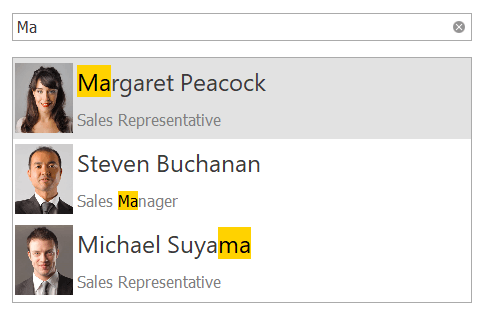
Search and Filtering
You can provide end-users with the ability to filter items in a ImageListBoxControl. For this purpose, attach the ImageListBoxControl to a SearchControl by using the SearchControl.Client property.
When an end-user types a search request into the SearchControl, the ImageListBoxControl automatically filters its items, and highlights the requested string in the filtered items.
Note
If items are formatted using the HTML tags (see BaseListBoxControl.AllowHtmlDraw), the items are filtered, but not highlighted.
Tooltips
DevExpress controls support regular and super tooltips. Enable the ShowToolTips option to display tooltips when the mouse pointer hovers over the control.
Customize Regular Tooltip Text
Use the following properties of the target control to specify regular tooltip text and title:
API | Description |
|---|---|
Specifies tooltip text. You can use line breaks in regular tooltips. | |
Specifies whether to parse HTML tags in text. | |
Specifies the tooltip title. If you do not specify tooltip text, the tooltip is not displayed even if you specify the title. |
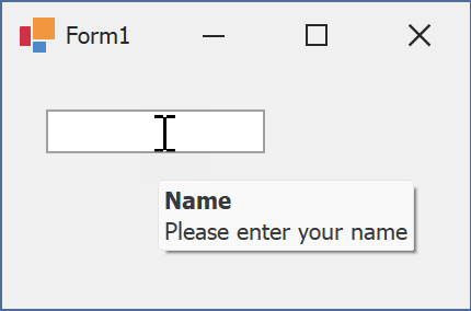
The following code snippet specifies tooltip text and title for a TextEdit editor:
public Form1() {
  InitializeComponent();
  textEdit1.ShowToolTips = true;
  textEdit1.ToolTipTitle = "Name";
  textEdit1.ToolTip = "Please enter your name";
}
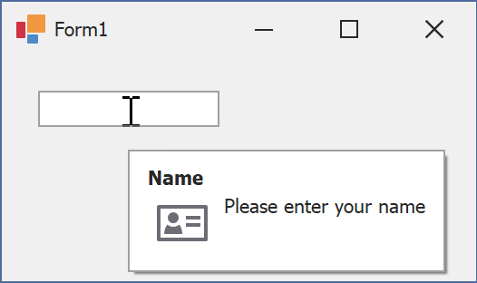
Assign an Image to Regular Tooltips
Use the control’s ToolTipIconType property to assign a predefined icon. The ToolTipController.IconSize property specifies icon size.
Assign a custom image as follows:
- Create a ToolTipController and assign it to the control’s ToolTipController property.
- Create an image collection and assign it to the ToolTipController.ImageList property.
- Handle the ToolTipController.BeforeShow event. Use the e.ImageOptions parameter to assign a raster or vector image to the tooltip.
Note
The ToolTipIconType property has priority over e.ImageOptions. If you assign a custom image, set ToolTipIconType to None.
The following code snippet assigns a custom image to the TextEdit tooltip:
Note
textEdit1, toolTipController1, and svgImageCollection1 were created at runtime.
public Form1() {
  InitializeComponent();
  textEdit1.ShowToolTips = true;
  textEdit1.ToolTipTitle = "Name";
  textEdit1.ToolTip = "Please enter your name";
  textEdit1.ToolTipController = toolTipController1;
  toolTipController1.ImageList = svgImageCollection1;
  toolTipController1.BeforeShow += ToolTipController1_BeforeShow;
}

private void ToolTipController1_BeforeShow(object sender, ToolTipControllerShowEventArgs e) {
  ToolTipController controller = sender as ToolTipController;
  if (e.ToolTip == textEdit1.ToolTip)
    e.ImageOptions.SvgImage = (controller.ImageList as SvgImageCollection)["personalCard"];
}

Display a Super Tooltip
Use the control’s SuperTip property to assign a super tooltip. If you wish to use HTML tags in a super tooltip, enable the SuperToolTip.AllowHtmlText property.
Setting the ToolTipController.ToolTipType property to SuperTip converts existing regular tooltips to super tooltips.
Tip
Read the following help topic for information on how to customize super tooltips: Hints and Tooltips.