CheckEdit Class
A check box editor.
Namespace: DevExpress.XtraEditors
Assembly: DevExpress.XtraEditors.v26.1.dll
Declaration
Remarks
CheckEdit allows users to switch between checked, unchecked, and indeterminate states. It can display a check box, a radio button, or a custom glyph.
Edit Value
CheckEdit synchronizes its visual state with the CheckEdit.EditValue property. It maps the checked state to true, unchecked state to false, and indeterminate state to null.
Custom Edit Value
Use the following properties to map check states to your data model’s values:
The following code snippet assigns byte values to all three states:
checkEdit1.Properties.ValueChecked = (byte)2;
checkEdit1.Properties.ValueGrayed = (byte)1;
checkEdit1.Properties.ValueUnchecked = (byte)0;
The following code snippet maps checked and unchecked states to custom string values:
checkEdit1.Properties.ValueChecked = "Enabled";
checkEdit1.Properties.ValueUnchecked = "Disabled";
checkEdit1.EditValue = "Enabled";
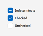
Check States
CheckEdit supports the following check states:
UncheckedCheckedIndeterminate— available when RepositoryItemCheckEdit.AllowGrayed is enabled.
Use the following properties to specify the check state:
| Property | Description |
|---|---|
| CheckState | Specifies the Unchecked, Checked, or Indeterminate state. |
| Checked | Specifies a Boolean value. This property cannot set Indeterminate. |
| EditValue | Stores the underlying value that maps to the current check state. |
Handle the following events to respond to check state changes:
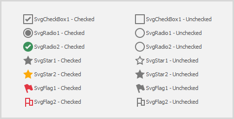
Check Styles
Use the CheckEdit.Properties.CheckBoxOptions.Style property to customize the check box appearance.
Style options include:
| Style | Notes | Screenshot |
|---|---|---|
Default |
The default appearance specified by the current skin. | |
Svg |
Predefined SVG image sets. The default size is 18×18 pixels at 100% DPI. |
 |
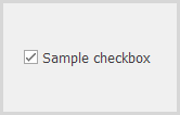
CheckBox |
A standard check box. Use CheckEdit.Properties.NullStyle to specify the image for the indeterminate state. Use CheckedListBoxControl to display a list of selectable check boxes. |
 |
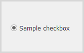
Radio |
A radio button. Use RadioGroupIndex to combine editors into a group. |
 |
Custom |
A custom image specified by ImageOptions. | 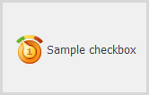 |
Checkbox Alignment
Use the CheckEdit.Properties.GlyphAlignment property to align the checkbox (image) horizontally.
Horizontal alignment options include:
NearFarCenter(hides the caption/text)

Use the CheckEdit.Properties.GlyphVerticalAlignment property to align the checkbox vertically.
Vertical alignment options include:
TopCenterBottom
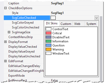
Checkbox SVG Colors
When the Svg style is active, use the following RepositoryItemCheckEdit.CheckBoxOptions properties to customize icon colors:
SvgColorCheckedSvgColorUncheckedSvgColorGrayed
Use DX Skin colors to match the current skin automatically.
Create a Radio Group
Set the CheckStyle property to Radio, and assign the same non-negative RadioGroupIndex value to each editor in the group.
The following code snippet combines two radio-style CheckEdit controls into a group:
using DevExpress.XtraEditors.Controls;


checkEdit1.Properties.CheckStyle = CheckStyles.Radio;
checkEdit1.Properties.RadioGroupIndex = 1;
checkEdit1.Properties.Caption = "Option A";

checkEdit2.Properties.CheckStyle = CheckStyles.Radio;
checkEdit2.Properties.RadioGroupIndex = 1;
checkEdit2.Properties.Caption = "Option B";

checkEdit1.Checked = true;
Tip
Use the RadioGroup control to display a group of mutually exclusive options.