PictureEdit Class
Displays images stored in bitmap, metafile, icon, JPEG, GIF, PNG or SVG format. The built-in editor allows users to perform basic edit operations (crop and straighten, adjust brightness, contrast and saturation, etc.)
Namespace: DevExpress.XtraEditors
Assembly: DevExpress.XtraEditors.v26.1.dll
Declaration
[DefaultBindingPropertyEx("Image")]
public class PictureEdit :
    BaseEdit,
    IPictureMenu,
    IGestureClient,
    IMouseWheelSupport,
    ISupportContextItemsCursor,
IImageEditClientRemarks
The PictureEdit control can display graphics from a bitmap, metafile, icon, JPEG, GIF, PNG or SVG file.
Specify an Image
Use the PictureEdit.Image or PictureEdit.SvgImage property to specify an image.
Use the Properties.PictureStoreMode property to specify whether the PictureEdit stores the image as an Image object or as an array of bytes in the PictureEdit.EditValue property.
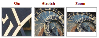
Image Size and Alignment
The Properties.SizeMode and Properties.PictureAlignment options specify how the image is sized and aligned.
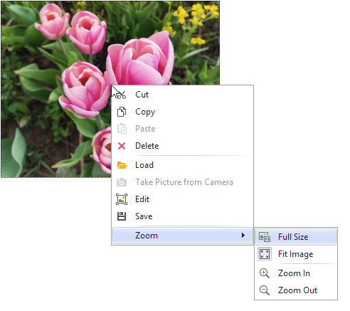
Context Menu and Image Editor
You can use the commands in the PictureEdit’s context menu to perform common operations: cut, copy, paste, delete, edit, load, save and zoom. The following properties control the availability of the menu and its commands:
- Properties.ShowMenu - Specifies if the context menu is displayed when users right-click the image.
- Properties.ShowZoomSubMenu - Specifies whether the context menu contains zoom-related menu commands. When the zoom sub-menu is enabled, a user can also zoom the image with the mouse and keyboard. See Properties.ShowZoomSubMenu for more information.
- Properties.ShowCameraMenuItem - Specifies whether to display a command that allows users to take a snapshot from a webcam.
Properties.ShowEditMenuItem - Displays the Edit command that invokes the Image Editor.
The Image Editor dialog provides basic image edit operations:
- Crop and straighten
- Adjust brightness, contrast and saturation
- Mirror
- Rotate
- etc.
To open the Image Editor from code, use the PictureEdit.ShowImageEditorDialog method.
Handle the PictureEdit.ImageEditorDialogShowing/Properties.ImageEditorDialogShowing event to customize the Image Editor dialog, add custom edit tools and change the settings of existing edit tools (for instance, add custom aspect ratios for crop operations).
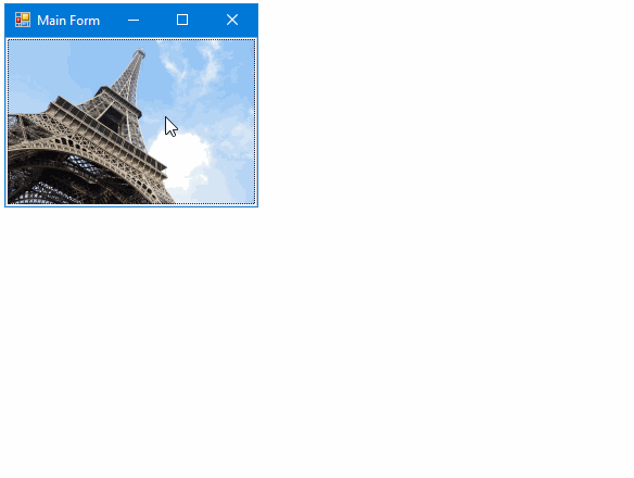
Fit Image in Control Bounds
The Properties.SizeMode property specifies whether and how an image is stretched within the control’s bounds.
In specific instances, you may want to resize the PictureEdit in code so that its image fits the control without padding. In this case, additional space must be reserved to paint the control’s focus rectangle. Otherwise, a few pixels are clipped out from the image. The correct code to resize the PictureEdit and allocate space for the focus rectangle is as follows:
mPictureEdit.ClientSize = new System.Drawing.Size(mPictureEdit.Image.Width + 2, mPictureEdit.Image.Height + 2);
Masks
The Properties.OptionsMask.MaskType setting (accessible from the Properties.OptionsMask object) enables masked mode to mask a part of the image.

Circle, rounded rectangle, and custom shape mask types are available.
Image Preprocessing and Unsupported Formats
The ImageLoading and ImageSaving events fire when a user loads/saves an image via the context menu’s Load and Save commands. You can handle these events to perform the following tasks:
- Pre-process images being loaded/saved.
- Load/save graphics stored in formats not supported by .NET Framework.
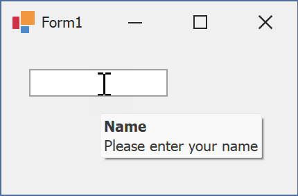
Tooltips
DevExpress controls support regular and super tooltips. Enable the ShowToolTips option to display tooltips when the mouse pointer hovers over the control.
Customize Regular Tooltip Text
Use the following properties of the target control to specify regular tooltip text and title:
API | Description |
|---|---|
Specifies tooltip text. You can use line breaks in regular tooltips. | |
Specifies whether to parse HTML tags in text. | |
Specifies the tooltip title. If you do not specify tooltip text, the tooltip is not displayed even if you specify the title. |
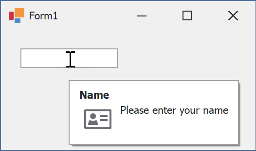
The following code snippet specifies tooltip text and title for a TextEdit editor:
public Form1() {
  InitializeComponent();
  textEdit1.ShowToolTips = true;
  textEdit1.ToolTipTitle = "Name";
  textEdit1.ToolTip = "Please enter your name";
}
Assign an Image to Regular Tooltips
Use the control’s ToolTipIconType property to assign a predefined icon. The ToolTipController.IconSize property specifies icon size.
Assign a custom image as follows:
- Create a ToolTipController and assign it to the control’s ToolTipController property.
- Create an image collection and assign it to the ToolTipController.ImageList property.
- Handle the ToolTipController.BeforeShow event. Use the e.ImageOptions parameter to assign a raster or vector image to the tooltip.
Note
The ToolTipIconType property has priority over e.ImageOptions. If you assign a custom image, set ToolTipIconType to None.
The following code snippet assigns a custom image to the TextEdit tooltip:
Note
textEdit1, toolTipController1, and svgImageCollection1 were created at runtime.
public Form1() {
  InitializeComponent();
  textEdit1.ShowToolTips = true;
  textEdit1.ToolTipTitle = "Name";
  textEdit1.ToolTip = "Please enter your name";
  textEdit1.ToolTipController = toolTipController1;
  toolTipController1.ImageList = svgImageCollection1;
  toolTipController1.BeforeShow += ToolTipController1_BeforeShow;
}

private void ToolTipController1_BeforeShow(object sender, ToolTipControllerShowEventArgs e) {
  ToolTipController controller = sender as ToolTipController;
  if (e.ToolTip == textEdit1.ToolTip)
    e.ImageOptions.SvgImage = (controller.ImageList as SvgImageCollection)["personalCard"];
}

Display a Super Tooltip
Use the control’s SuperTip property to assign a super tooltip. If you wish to use HTML tags in a super tooltip, enable the SuperToolTip.AllowHtmlText property.
Setting the ToolTipController.ToolTipType property to SuperTip converts existing regular tooltips to super tooltips.
Tip
Read the following help topic for information on how to customize super tooltips: Hints and Tooltips.
Example: Drag & Drop Images from Windows Explorer
This example creates a DragDropProvider class and calls its EnableDragDrop method to drag images from Windows Explorer onto the WinForms PictureEdit.