SplitterControl Class
Allows a user to resize controls docked to the splitter’s edges.
Namespace: DevExpress.XtraEditors
Assembly: DevExpress.Utils.v25.2.dll
NuGet Packages: DevExpress.Utils, DevExpress.Wpf.Core
Declaration
public class SplitterControl :
    Splitter,
    ISupportLookAndFeel,
    IXtraSerializable,
    IXtraSerializable2,
ISupportAppearanceObjectPropertiesFilterRemarks
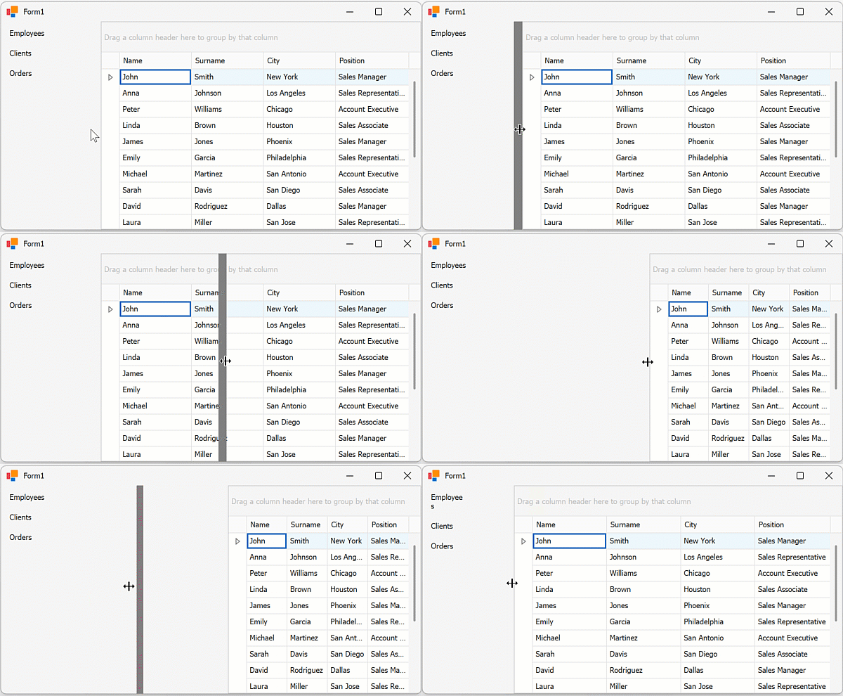
The SplitterControl functions as the Splitter class. A splitter can be placed between two controls to resize the areas occupied by these controls.
The SplitterControl also supports the look and feel mechanism and appearances (accessible through SplitterControl.LookAndFeel and SplitterControl.Appearance properties).

The area to the left or right of the splitter cannot exceed the resized control’s maximum width. To specify a minimum allowed area width, set the splitter’s MinSize and MinExtra properties.
Tip
As an alternative, you can use the SplitContainerControl class. It consists of two panels separated by a splitter.
Add a Vertical Splitter
At Design Time
- Drop the left control on the form and set the control’s
Dockproperty toDockStyle.Left. - Drop a
SplitterControlon the form and set the splitter’sDockproperty toDockStyle.Left. - Drop the right control on the form and set the control’s
Dockproperty toDockStyle.Fill.
In Code
The following code snippet creates a layout with two controls divided by a vertical SplitterControl.
using DevExpress.XtraBars.Navigation;
using DevExpress.XtraEditors;
using DevExpress.XtraGrid;

namespace splitter {
    public partial class Form1 : XtraForm {
        GridControl grid;
        SplitterControl splitter;
        AccordionControl accordion;
        public Form1() {
            InitializeComponent();
            // Create an Accordion and dock it to the left
            accordion = new AccordionControl();
            accordion.Dock = DockStyle.Left;
            var salesItem = accordion.AddItem();
            salesItem.Text = "Sales";
            // Create a Splitter and also dock it to the left
            splitter = new SplitterControl();
            splitter.Dock = DockStyle.Left;
            // Create a Grid and dock it to fill the remaining space
            grid = new GridControl();
            grid.Dock = DockStyle.Fill;
            // Add controls to the form in inverted order (from right to left)
            this.Controls.AddRange(new Control[] { grid, splitter, accordion });
        }
    }
}