ListBoxControl Class
A control that displays a list of items that a user can select. This control can be populated with items from a data source.
Namespace: DevExpress.XtraEditors
Assembly: DevExpress.XtraEditors.v26.1.dll
Declaration
[ListBoxControl.ListBoxControlCustomBindingProperties]
public class ListBoxControl :
    BaseListBoxControl,
IBehaviorPropertiesFilterRemarks
A ListBoxControl displays a list of items and allows a user to select none, one, or multiple items.
Data Source
Use the DataSource property to bind the control to a data source. The control automatically creates items based on the data source.
Example
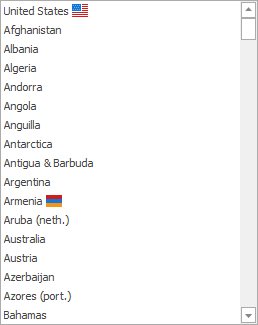
The code below shows how to use a DataTable as a data source.
using DevExpress.XtraEditors;

listBoxControl1.DataSource = GetCountries();
listBoxControl1.DisplayMember = "Name";
listBoxControl1.ValueMember = "PhoneCode";
listBoxControl1.SelectedValueChanged += ListBoxControl1_SelectedValueChanged;

private void ListBoxControl1_SelectedValueChanged(object sender, EventArgs e) {
    var listBoxControl = sender as ListBoxControl;
    XtraMessageBox.Show(listBoxControl.SelectedValue.ToString());
}

DataTable GetCountries() {
    DataTable table = new DataTable();
    DataColumn name = new DataColumn("Name", typeof(string));
    DataColumn phoneCode = new DataColumn("PhoneCode", typeof(int));
    table.Columns.AddRange(new DataColumn[] { name, phoneCode});
    table.Rows.Add(new object[] { "United States", 1 });
    table.Rows.Add(new object[] { "Afghanistan", 93 });
    // ...
    table.Rows.Add(new object[] { "Zimbabwe", 263 });
    return table;
}
String Representation and Value
If objects in the data source expose multiple data fields, use the following properties to specify fields that contain an item’s value and string representation:
- ValueMember - Gets or sets the field name in the bound data source whose contents are assigned to item values.
- DisplayMember - Gets or sets the name of the data source field that specifies display text for listbox items. This property is not supported when listbox items are rendered based on Item Templates.
Example
The code below uses the ValueMember and DisplayMember properties to specify data fields that contain a business object’s value and string representation. If you do not specify these properties, the control uses the business object as a value and the ToString() method to obtain the object’s string representation.
using DevExpress.XtraEditors;

listBoxControl1.DataSource = Country.Countries;
listBoxControl1.DisplayMember = "Name";
listBoxControl1.ValueMember = "PhoneCode";
listBoxControl1.SelectedValueChanged += ListBoxControl1_SelectedValueChanged;

private void ListBoxControl1_SelectedValueChanged(object sender, EventArgs e) {
    var listBoxControl = sender as ListBoxControl;
    XtraMessageBox.Show(listBoxControl.SelectedValue.ToString());
}

public class Country {
    public string Name { get; set; }
    public int PhoneCode { get; set; }

    public override string ToString() {
        return $"{Name}, {PhoneCode}";
    }

    public static Country[] Countries = (new Country[] {
        new Country() { Name = "United States", PhoneCode = 1 },
        new Country() { Name = "Afghanistan", PhoneCode = 93 },
        // ...
        new Country() { Name = "Zimbabwe", PhoneCode = 263 }
    });
}
Unbound Mode
You can use a ListBoxControl if it is not bound to a data source. The Items property allows you to populate the control with items in unbound mode.
Example
The code below uses an array of strings to populate the Items collection.
// Initialize an array of strings.
string[] myColors = {
                        Color.Black.Name,
                        Color.Blue.Name,
                        Color.Brown.Name,
                        Color.Green.Name,
                        Color.Red.Name,
                        Color.Yellow.Name,
                        Color.Orange.Name
                     };
// Check whether a data source is assigned to the ListBoxControl.
if (listBoxControl1.DataSource == null)
   // Add items to the ListBoxControl.
   listBoxControl1.Items.AddRange(myColors);
Item Template
You can create an HTML-CSS template or regular template to render items in the control. An item template allows you to display multiple text and image elements arranged and painted in any manner.

See the following topic for more information: Templated ListBox Controls.
Selection
Use the SelectionMode property to specify whether a user can select none, one, or multiple items. To obtain the selection, use the SelectedIndex, SelectedIndices, SelectedItem, SelectedItems, or SelectedValue property.
The SelectedIndexChanged and SelectedValueChanged events fire when the selection changes.
Example
In this example, a ListBoxControl displays a list of system colors. The following code handles the BaseListBoxControl.SelectedIndexChanged event to change the form’s background color when a user selects a color in the listbox:
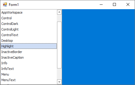
private void Form1_Load(object sender, EventArgs e) {
    Color[] colorArray = {
                   SystemColors.ActiveCaption,
                   SystemColors.ActiveCaptionText,
                   SystemColors.AppWorkspace,
                   SystemColors.Control,
                   SystemColors.ControlDark,
                   SystemColors.ControlLight,
                   SystemColors.ControlText,
                   SystemColors.Desktop,
                   SystemColors.Highlight,
                   SystemColors.InactiveBorder,
                   SystemColors.InactiveCaption,
                   SystemColors.Info,
                   SystemColors.InfoText,
                   SystemColors.Menu,
                   SystemColors.MenuText,
                   SystemColors.ScrollBar,
                   SystemColors.Window,
                   SystemColors.WindowFrame
                };
    listBoxControl1.DataSource = colorArray;
    listBoxControl1.DisplayMember = "Name";
    listBoxControl1.SelectedIndexChanged += ListBoxControl1_SelectedIndexChanged;
}

private void ListBoxControl1_SelectedIndexChanged(object sender, EventArgs e) {
    if (listBoxControl1.SelectedValue != null)
        this.BackColor = (Color)listBoxControl1.SelectedValue;
    else
        this.BackColor = Color.Black;
}
Search and Filtering
You can allow users to filter items in a ListBoxControl. For this purpose, use the SearchControl.Client property to attach the ListBoxControl to a SearchControl.
When a user types a search request into the SearchControl, the ListBoxControl automatically filters its items, and highlights the requested string in the filtered items.
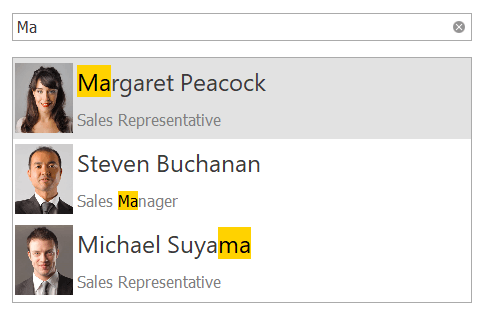
Note
If items are formatted using the HTML tags (see BaseListBoxControl.AllowHtmlDraw), the items are filtered, but not highlighted.
You can use the SearchControl‘s FilterCondition property to specify the comparison operator (Equals, Starts With, and so forth) used to compare the attached ListBoxControl‘s items with the query in the search box.
Context Buttons
Use the ContextButtons collection to specify context buttons displayed in each item. See the following topic for more information: Context Buttons.
Tooltips
DevExpress controls support regular and super tooltips. Enable the ShowToolTips option to display tooltips when the mouse pointer hovers over the control.
Customize Regular Tooltip Text
Use the following properties of the target control to specify regular tooltip text and title:
API | Description |
|---|---|
Specifies tooltip text. You can use line breaks in regular tooltips. | |
Specifies whether to parse HTML tags in text. | |
Specifies the tooltip title. If you do not specify tooltip text, the tooltip is not displayed even if you specify the title. |
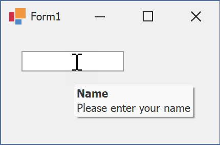
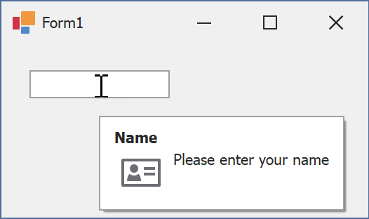
The following code snippet specifies tooltip text and title for a TextEdit editor:
public Form1() {
  InitializeComponent();
  textEdit1.ShowToolTips = true;
  textEdit1.ToolTipTitle = "Name";
  textEdit1.ToolTip = "Please enter your name";
}
Assign an Image to Regular Tooltips
Use the control’s ToolTipIconType property to assign a predefined icon. The ToolTipController.IconSize property specifies icon size.
Assign a custom image as follows:
- Create a ToolTipController and assign it to the control’s ToolTipController property.
- Create an image collection and assign it to the ToolTipController.ImageList property.
- Handle the ToolTipController.BeforeShow event. Use the e.ImageOptions parameter to assign a raster or vector image to the tooltip.
Note
The ToolTipIconType property has priority over e.ImageOptions. If you assign a custom image, set ToolTipIconType to None.
The following code snippet assigns a custom image to the TextEdit tooltip:
Note
textEdit1, toolTipController1, and svgImageCollection1 were created at runtime.
public Form1() {
  InitializeComponent();
  textEdit1.ShowToolTips = true;
  textEdit1.ToolTipTitle = "Name";
  textEdit1.ToolTip = "Please enter your name";
  textEdit1.ToolTipController = toolTipController1;
  toolTipController1.ImageList = svgImageCollection1;
  toolTipController1.BeforeShow += ToolTipController1_BeforeShow;
}

private void ToolTipController1_BeforeShow(object sender, ToolTipControllerShowEventArgs e) {
  ToolTipController controller = sender as ToolTipController;
  if (e.ToolTip == textEdit1.ToolTip)
    e.ImageOptions.SvgImage = (controller.ImageList as SvgImageCollection)["personalCard"];
}

Display a Super Tooltip
Use the control’s SuperTip property to assign a super tooltip. If you wish to use HTML tags in a super tooltip, enable the SuperToolTip.AllowHtmlText property.
Setting the ToolTipController.ToolTipType property to SuperTip converts existing regular tooltips to super tooltips.
Tip
Read the following help topic for information on how to customize super tooltips: Hints and Tooltips.
Example
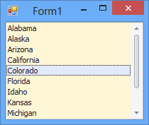
The following sample code demonstrates how to initialize and create a new instance of the ListBoxControl class at runtime.
using DevExpress.XtraEditors;
// ...
// Initialize an array of strings
string[] States = {
                     "Alabama",
                     "Alaska",
                     "Arizona",
                     "California",
                     "Colorado",
                     "Florida",
                     "Idaho",
                     "Kansas",
                     "Michigan",
                     "Nevada",
                     "Texas",
                     "Utah"
                  };
// Initialize and create an instance of the ListBoxControl class
ListBoxControl listBox = new ListBoxControl();
// Define the parent control
listBox.Parent = this;
// Set the listBox's background color
listBox.BackColor = Color.FromArgb(254, 246, 212);
// Dock to all edges and fill the parent container
listBox.Dock = DockStyle.Fill;
// Add items
listBox.Items.AddRange(States);