SimpleButton Class
A button that can display text and image. Supports DevExpress Application Skins.
Namespace: DevExpress.XtraEditors
Assembly: DevExpress.XtraEditors.v26.1.dll
Declaration
public class SimpleButton :
    BaseButton,
    IAnimatedItem,
    ISupportXtraAnimation,
    IDXImageUriClient,
    ISupportImageDragDrop,
IImageDropInfoRelated API Members
The following members return SimpleButton objects:
Remarks
The button’s associated action (the Click event) is invoked when you click the button with the mouse or press the ENTER or SPACE BAR key (if the button has focus).
The following are the main properties of the SimpleButton class:
- SimpleButton.Text — Button text.
- SimpleButton.ImageOptions — Allows you to specify the button’s image and image display options.
- SimpleButton.AllowFocus — Prevents the button from being focused.
BaseButton.PaintStyle — Allows you to choose between default and ‘light’ render modes. The ‘light’ mode is specifically designed to create a group of borderless buttons.

Appearance
The SimpleButton‘s default appearance is specified by the current paint theme (skin).

Appearance settings include:
If a background color is specified, the button automatically adjusts the foreground color to improve readability. The button ignores the foreground color (if specified). This behavior is controlled by the WindowsFormsSettings.AutoCorrectForeColor property. Set this property to DefaultBoolean.False to disable automatic color correction.
Skin Colors
DevExpress Skin Colors are primarily intended to allow you specify background and foreground colors for certain controls and UI elements to visually distinguish them from similar controls/elements (for example, buttons, column headers, tab pages, etc.). Skin colors are retrieved from DevExpress Skins, and are automatically updated when users change the application skin at runtime.

// Use DXSkinColors.FillColors for background colors
btnEnable.Appearance.BackColor = DXSkinColors.FillColors.Success;
// Use DXSkinColors.ForeColors for text colors
btnEnable.Appearance.ForeColor = DXSkinColors.ForeColors.WindowText;
Important
When using DX Skin Colors, you should only specify colors for the ‘normal’ state of the control or UI element. Colors for other states (such as hover, disabled, press) are automatically calculated based on the active/current skin and palette.
Read the following topic for additional information: Skin Colors.
Tooltips
DevExpress controls support regular and super tooltips. Enable the ShowToolTips option to display tooltips when the mouse pointer hovers over the control.
Customize Regular Tooltip Text
Use the following properties of the target control to specify regular tooltip text and title:
API | Description |
|---|---|
Specifies tooltip text. You can use line breaks in regular tooltips. | |
Specifies whether to parse HTML tags in text. | |
Specifies the tooltip title. If you do not specify tooltip text, the tooltip is not displayed even if you specify the title. |
The following code snippet specifies tooltip text and title for a TextEdit editor:
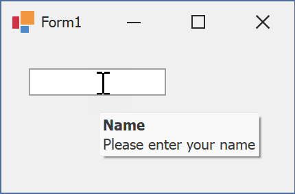
public Form1() {
  InitializeComponent();
  textEdit1.ShowToolTips = true;
  textEdit1.ToolTipTitle = "Name";
  textEdit1.ToolTip = "Please enter your name";
}
Assign an Image to Regular Tooltips
Use the control’s ToolTipIconType property to assign a predefined icon. The ToolTipController.IconSize property specifies icon size.
Assign a custom image as follows:
- Create a ToolTipController and assign it to the control’s ToolTipController property.
- Create an image collection and assign it to the ToolTipController.ImageList property.
- Handle the ToolTipController.BeforeShow event. Use the e.ImageOptions parameter to assign a raster or vector image to the tooltip.
Note
The ToolTipIconType property has priority over e.ImageOptions. If you assign a custom image, set ToolTipIconType to None.
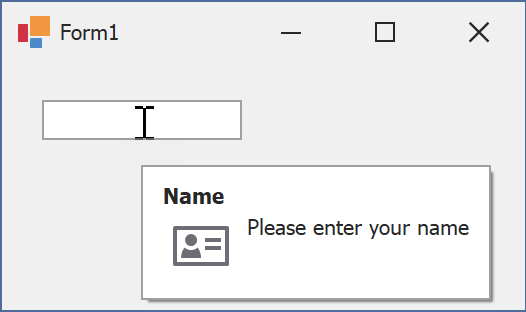
The following code snippet assigns a custom image to the TextEdit tooltip:
Note
textEdit1, toolTipController1, and svgImageCollection1 were created at runtime.
public Form1() {
  InitializeComponent();
  textEdit1.ShowToolTips = true;
  textEdit1.ToolTipTitle = "Name";
  textEdit1.ToolTip = "Please enter your name";
  textEdit1.ToolTipController = toolTipController1;
  toolTipController1.ImageList = svgImageCollection1;
  toolTipController1.BeforeShow += ToolTipController1_BeforeShow;
}

private void ToolTipController1_BeforeShow(object sender, ToolTipControllerShowEventArgs e) {
  ToolTipController controller = sender as ToolTipController;
  if (e.ToolTip == textEdit1.ToolTip)
    e.ImageOptions.SvgImage = (controller.ImageList as SvgImageCollection)["personalCard"];
}

Display a Super Tooltip
Use the control’s SuperTip property to assign a super tooltip. If you wish to use HTML tags in a super tooltip, enable the SuperToolTip.AllowHtmlText property.
Setting the ToolTipController.ToolTipType property to SuperTip converts existing regular tooltips to super tooltips.
Tip
Read the following help topic for information on how to customize super tooltips: Hints and Tooltips.
Example
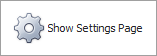
The following code sample creates a SimpleButton at a specific location and subscribes to the button’s Click event. The SimpleButton.AutoSize property is enabled to automatically calculate button size to fit its contents.
using DevExpress.XtraEditors;
// ...
CreateSimpleButton(30, 30);
// ...
private void CreateSimpleButton(int left, int top) {
    SimpleButton simpleButton = new SimpleButton();
    Controls.Add(simpleButton);
    simpleButton.Text = "Show Settings Page";
    simpleButton.ImageOptions.ImageList = imageCollection1;
    simpleButton.ImageOptions.ImageIndex = 0;
    simpleButton.Padding = new Padding(10);
    simpleButton.AutoSize = true;
    simpleButton.Location = new Point(left, top);
    simpleButton.Click += SimpleButton_Click;
}

private void SimpleButton_Click(object sender, EventArgs e) {
    // ...
}