HTML-inspired Text Formatting
- 15 minutes to read
A number of DevExpress controls allow you to use simplified HyperText Markup Language (HTML) tags to format display text strings. This document describes available HTML-inspired tags, and lists all controls that support them.
Note
When the HTML Text Formatting feature is enabled for a certain control or its visual element, its text is painted in left-to-right mode, regardless of the RightToLeft option.
Supported Tags
Tags are enclosed with the ‘<‘ and ‘>‘ symbols, and typically have a corresponding end tag. If a tag is not matched by its ending counterpart, all text that follows the tag will be formatted accordingly.
Note
Note that if you need to use angle brackets (‘<’ and ‘>’) in the text of the controls that support HTML text formatting, you need to use an additional ‘<’ bracket at the beginning. For example, to get “<some text>” you should assign “<<some text>” to the corresponding property.
<br> Tag
Inserts a single line break.

To use this tag, you should enable word wrap with the TextOptions.WordWrap option of a corresponding appearance object.
Control or Control Element | Property that provides access to appearance settings |
|---|---|
GridViewAppearances.HeaderPanel | |
TreeListAppearanceCollection.HeaderPanel | |
Syntax: <br>
Example: First Name<br>Last Name
Note
The <br> tag is removed and not replaced with a space if there was no text wrapping (for example, “Order<br>Description” is transformed to “OrderDescription”).
<color> and <backcolor> Tags
Specify text foreground and background colors.

Syntax: <color=value></color> <backcolor=value></backcolor>
Examples:
- <color=red>Text</color>, <backcolor=red>Text</backcolor>
- <color=0,255,0>Text</color>, <backcolor=0,255,0>Text</backcolor>
- <color=255,0,255,0>Text</color> <backcolor=255,0,255,0>Text</backcolor>
- <color=#0000FF>Text</color>” <backcolor=#0000FF>Text</backcolor>”
The “Color” tag overrides Appearance forecolors. “Backcolor” blends with Appearance back colors if its alpha transparency key is less than 255 (40 in the example below).
simpleButton1.AllowHtmlDraw = DevExpress.Utils.DefaultBoolean.True;
simpleButton1.Appearance.ForeColor = Color.Maroon;
simpleButton1.Text = "Maroon <color=green>Green</color> Maroon";

simpleButton2.AllowHtmlDraw = DevExpress.Utils.DefaultBoolean.True;
simpleButton2.Appearance.BackColor = Color.DimGray;
simpleButton2.Text = "<backcolor=40,255,255,255>Light Gray</backcolor>";
<size> Tag
Specifies the font size.

Syntax: <size=value></size>
Examples:
- <size=10>10pt text</size>
- <size=+4>Larger text</size>
- <size=-4>Smaller text</size>
Text Format Tags (<b>, <i>, <s>, <u>, <r>)
Allow you to create bold, italic, underlined, and strikethrough strings.
The “r” tag applies normal text formatting. This resets any existing bold, italic, underlined, and strikethrough formats, including those applied in a control’s Appearance settings.

Syntax: <b></b>, <i></i>, <s></s>, <u></u>, <r>
Examples:
- <b>Bold text</b>
- <i>Italic text</i>
- <s>Strikethrough text</s>
- <u>Underlined text</u>
- <b>Bold-<u>UnderlinedBold-</u><r>Normal</b>
If the static DevExpress.Utils.Text.StringParser.KeepFontStyle property is false, a text block that has font style HTML tags (font family, font weight, etc.) ignores AppearanceObject font style settings. Otherwise, both font style sets are applied.
simpleButton1.AllowHtmlDraw = DevExpress.Utils.DefaultBoolean.True;
simpleButton1.Appearance.FontStyleDelta = FontStyle.Bold;
simpleButton1.Text = "One <i>Two</i> Three";
// KeepFontStyle = false: "One" and "Three" are bold, "Two" is italic
// KeepFontStyle = true: "One" and "Three" are bold, "Two" is bold and italic

The default KeepFontStyle property value is false for v19.1 and older, and true for v19.2 and newer.
You can insert closing HTML tags to ignore corresponding Appearance settings.
simpleButton1.AllowHtmlDraw = DevExpress.Utils.DefaultBoolean.True;
simpleButton1.Appearance.FontStyleDelta = FontStyle.Italic | FontStyle.Bold;
simpleButton1.Text = "Bold and Italic </b>Only Italic </i>Regular";

simpleButton2.AllowHtmlDraw = DevExpress.Utils.DefaultBoolean.True;
simpleButton2.Appearance.FontStyleDelta = FontStyle.Underline | FontStyle.Bold;
simpleButton2.Text = "Underline and Bold </u>Only Bold";
<sub> and <sup> Tags
Define text that is smaller than neighboring letters, and displayed lower (subscript) or higher (superscript) than the previous character. Note that you cannot change fonts within text blocks that use “sub” and/or “sup” tags.

Syntax: <sub>Text</sub>, <sup>Text</sup>
Examples:
- Subscript: H<sub>2</sub>O
- Double subscript: 2<sub>2<sub>2</sub></sub>
- Superscript: 5<sup>2</sup>=25
- Double superscript: 5<sup>2<sup>2</sup></sup>
<font> Tag
Specifies the font family. Can be combined with Color and Size settings inside a single tag.

Syntax: <font></font>
Examples:
- <font=Helvetica>Helvetica</font>
- <font=’Times New Roman’size=15 color=red>Times New Roman</font>
<image> Tag
Inserts an image from a bound image collection or from project resources. To insert an image from project resources, the image’s name must be preceded with the ‘#’ character. The image referenced from project resources will not appear at design time, but will appear at runtime.
Note
Project resource images can only be loaded from the Entry Assembly (the startup executable). Thus, if you define images in the resources of your additional class library, these images cannot be loaded using the image tag, even from this library code.
If the image’s name is not preceded with ‘#’, it is implied that the image should be loaded by its name from a bound image collection. Use the control’s HtmlImages property to assign an image collection (ImageCollection or SvgImageCollection) to a control.
The following attributes for the image tag are supported:
size— sets the display size of the image.align— specifies the vertical alignment of the image relative to the text. Possible values: top, bottom, and center.
Attributes must be specified after the tag’s value, followed by the “;” character. They must be separated with “;”, and specified without spaces.
Controls and components that accept the image tag and support the HtmlImages property are listed below.
- BaseListBoxControl descendants (ListBoxControl, ImageListBoxControl, CheckedComboBoxEdit) — Support the display of images in items.
- CheckEdit and ToggleSwitch — Support the display of images within text.
- ButtonEdit descendants — Support the display of images in the edit box if the RepositoryItemButtonEdit.TextEditStyle property is set to TextEditStyles.DisableTextEditor and in embedded buttons.
- RepositoryItemHypertextLabel — Supports the display of images in cells in container controls (Data Grid, TreeList, etc.). You can assign the image collection either to the RepositoryItemHypertextLabel.HtmlImages property or to the container control’s HtmlImages property (for instance, Data Grid’s BaseView.HtmlImages).
- GroupControl — Supports the display of images in the control’s caption.
- LabelControl — Supports the display of images within the label text.
- GridControl — Supports the display of images in column headers, band headers, and group rows. To display images in cells, use RepositoryItemHypertextLabel.
- TreeList — Supports the display of images in column and band headers. To display images in cells, use RepositoryItemHypertextLabel.
- PivotGridControl — Supports the display of images in field headers and field values.
- VGridControl — Supports the display of images in row headers. To display images in cells, use RepositoryItemHypertextLabel.
- XtraForm — Supports the display of images in the caption of a form.
- BarManager — Supports the display of images in item captions.
- RibbonControl — Supports the display of images in item captions.
Syntax: <image=value>
Examples:
- <image=UpArrow.png>
- <image=#LeftArrow>
- <image=DownArrow.png;size=20,20;align=top>
<p> Tag
Defines a paragraph. Supports the “align” parameter that allows you to arrange a paragraph’s content. The code below illustrates how to center text and an image inside an XtraMessageBox.
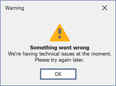
XtraMessageBoxArgs args = new XtraMessageBoxArgs();
args.AllowHtmlText = DefaultBoolean.True;
svgImageCollection1.ImageSize = new Size(48, 48);
args.HtmlImages = svgImageCollection1;
args.Text = "<p align=center><image=warning><br>" +
    "<b>Something went wrong</b><br>" +
    "We're having technical issues at the moment.<br>" +
    "Please try again later.</p>";
args.Caption = "Warning";
args.Buttons = new DialogResult[] { DialogResult.OK };
XtraMessageBox.Show(args);
<href> and <a href=...> Tags
Display a hyperlink. The value string specifies the hyperlink source, and the string between the opening and closing tags is the text to be displayed.

Controls that can display hyperlinks raise the HyperlinkClick event when a user clicks a link.
- LabelControl.HyperlinkClick
- BarItem.HyperlinkClick
- BarManager.HyperlinkClick
- RibbonControl.HyperlinkClick
- RepositoryItemCheckEdit.HyperlinkClick
- ToolTipController.HyperlinkClick
- MapControl.HyperlinkClick
- LayoutControl.HyperlinkClick
- GroupControl.HyperlinkClick
- ContextButtonBase.HyperlinkClick
- XtraMessageBoxArgs.HyperlinkClick
Syntax: <href=value></href> or <a href=value></a>
Example: <href=www.devexpress.com>Our web site</href>, <a href=www.devexpress.com>Our web site</a>
If the value string contains a space, put the string in quotes.
Example: <a href="C:\Program Files\">Program Files</a>
<nbsp> Tag
Inserts a non-breaking space character (0xA0).

Syntax: <nbsp>
Example: First Name<nbsp>Last Name
Supported Controls
All Controls
Element that supports tags | Editor property that turns HTML-formatting on or off |
|---|---|
Tooltips and SuperToolTips | ToolTipController.AllowHtmlText, SuperToolTip.AllowHtmlText, ToolTipItem.AllowHtmlText |
Tooltips for BaseControl descendants - the BaseControl.ToolTip property | |
XtraForm caption - the XtraForm.HtmlText property | n/a |
ContextButton text - the ContextButtonBase.Caption property. | |
ValidationHint texts - the (ValidationHintBaseDefaultProperties.Text and ValidationHintBaseProperties.Text properties |
Charts
You can use HTML tags to specify text for the following elements:
- Chart titles, series titles, pane titles, axis titles, legend titles, and constant line titles. Use the title Text property.
- Text annotations. Use the TextAnnotation.Text and TextAnnotation.Lines properties.
- Crosshair labels. Use the SeriesBase.CrosshairLabelPattern and Indicator.CrosshairLabelPattern properties.
Editors Library
The table below enumerates editors from the DevExpress Editors suite that supports tags.
Element that supports tags | Editor property that turns HTML-formatting on or off |
|---|---|
LabelControl text - the LabelControl.Text property | |
CheckEdit and ToggleSwitch text | |
SimpleButton text - the (SimpleButton.Text property | |
Text strings in ButtonEdit descendants whose RepositoryItemButtonEdit.TextEditStyle property is set to TextEditStyles.DisableTextEditor | |
Button text for ButtonEdit and its descendants | |
ListBoxControl and CheckedListBoxControl items | |
ComboBoxEdit, ImageComboBoxEdit, and CheckedComboBoxEdit items | |
GroupControl text - the GroupControl.Text property | |
RatingControl text - the RatingControl.Text property |
Data Grid
The GridControl supports HTML tags in the following elements:
Element that supports tags | Property that turns HTML-formatting on or off |
|---|---|
View caption - the BaseView.ViewCaption property | n/a |
Column captions - the GridColumn.Caption property | |
Band captions - the GridBand.Caption property | |
Cell text. Note that cells with HTML-formatted values cannot be edited at runtime. There are multiple ways to add HTML tags to cell text strings.
| No dedicated property. Use RepositoryItemHypertextLabel as an in-place editor. If you handle the CustomColumnDisplayText event, disable the column’s AllowEdit option, assign the RepositoryItemTextEdit with the enabled AllowHtmlDraw option to the column’s ColumnEdit property. |
Group row text - handle the GridView.CustomDrawGroupRow event | |
Column captions in the TileView‘s Edit Form — the GridColumn.Caption | |
WinExplorerView items |
Tree List
The TreeList supports HTML tags in the following elements:
Element that supports tags | Property that turns HTML-formatting on or off |
|---|---|
Column captions — the TreeListColumn.Caption property | |
Band captions — the TreeListBand.Caption property | |
Cell text. Note that cells with HTML-formatted values cannot be edited at runtime. There are multiple ways to add HTML tags to cell text strings.
| No dedicated property. Use RepositoryItemHypertextLabel as an in-place editor. If you handle the CustomColumnDisplayText event, disable the column’s AllowEdit option, assign the RepositoryItemTextEdit with the enabled AllowHtmlDraw option to the column’s ColumnEdit property. |
Pivot Grid
The PivotGridControl supports HTML tags in the following elements:
Element that supports tags | Property that turns HTML-formatting on or off |
|---|---|
Field headers text — the PivotGridFieldBase.Caption property | |
Field values text — the PivotGridControl.FieldValueDisplayText event and the PivotFieldDisplayTextEventArgs.DisplayText property. |
Vertical Grid and Property Grid
The PropertyGridControl is the VGridControl control descendant. Both controls have identical elements that support HTML tags.
Element that supports tags | Property that turns HTML-formatting on or off |
|---|---|
Row captions | |
Cell text. Note that cells with HTML-formatted values cannot be edited at runtime. There are multiple ways to add HTML tags to cell text strings.
| No dedicated property. Use RepositoryItemHypertextLabel as an in-place editor. If you handle the CustomRecordDisplayText event, disable the row’s AllowEdit option, assign the RepositoryItemTextEdit with the enabled AllowHtmlDraw option to the rows’s RowEdit property. |
Layout Control
The LayoutControl supports HTML tags in the following elements:
Element that supports tags | Property that turns HTML-formatting on or off |
|---|---|
Item captions - the BaseLayoutItem.Text property | |
Item tooltips | BaseLayoutItemOptionsToolTip.AllowHtmlString |
Ribbon, Bars, and Menus
Element that supports tags | Property that turns HTML-formatting on or off |
|---|---|
Item captions and descriptions - the BarItem.Caption and BarItem.Description properties | |
BackstageViewControl item captions - the BackstageViewItem.Caption property | |
Gallery item and group items - the GalleryItem.Caption and GalleryItemGroup.Caption properties |
Application UI Manager
The DocumentManager supports HTML tags in the following elements:
Element that supports tags | Property that turns HTML-formatting on or off |
|---|---|
Document headers - the BaseDocument.Header property | |
Document captions - the BaseDocument.Caption property | |
Flyout description and caption - the UIActionPropertiesCore.Caption and UIActionPropertiesCore.Description properties | |
Tile elements | |
Content containers overview screens |
Navigation Controls
Element that supports tags | Property that turns HTML-formatting on or off |
|---|---|
OfficeNavigationBar item captions - the NavigationBarItem.Text property | |
WindowsUIButton captions | |
TileControl and TileBar tiles | |
NavBarControl item and group text — the NavElement.Caption property | |
Navigation Frame, Tab Pane, and Navigation Pane pages (both caption and text) | NavigationPageDefaultProperties.AllowHtmlDraw |
AccordionControl element headers — the AccordionControlElementBase.Text property | |
XtraTabControl page captions |
Gauges
Enable the Label.AllowHTMLString property to format label text strings in the GaugeControl.
Scheduler
To display HTML tags inside an appointment’s subject, description, or location, enable the View’s AppointmentDisplayOptions.AllowHtmlText setting and handle the SchedulerControl.InitAppointmentDisplayText event.
Map Control
The MapControl supports HTML tags in the following elements:
Element that supports tags | Property that turns HTML-formatting on or off |
|---|---|
MapCallout text | |
MapCustomElement text |
Dialogs and Wizards
Element that supports tags | Property that turns HTML-formatting on or off |
|---|---|
XtraDialog and XtraMessageBox captions | |
WizardControl page text | |
AlertControl windows’ captions and regular text blocks |
Example 1
The following example shows how to format a LabelControl‘s text using HTML tags. HTML formatting is enabled with the LabelControl.AllowHtmlString property. To respond to end-user clicks on a hyperlink, the LabelControl.HyperlinkClick event is handled. The image below shows the result:
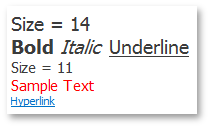
labelControl1.Text = "<size=14>Size = 14<br>" +
                     "<b>Bold</b> <i>Italic</i> <u>Underline</u><br>" +
                     "<size=11>Size = 11<br>" +
                     "<color=255, 0, 0>Sample Text</color></size>" +
                     "<href=www.devexpress.com>Hyperlink</href>";
labelControl1.AllowHtmlString = true;
labelControl1.Appearance.TextOptions.WordWrap = DevExpress.Utils.WordWrap.Wrap;
labelControl1.Appearance.Options.UseTextOptions = true;
labelControl1.AutoSizeMode = DevExpress.XtraEditors.LabelAutoSizeMode.Vertical;
labelControl1.HyperlinkClick += LabelControl1_HyperlinkClick;

private void labelControl1_HyperlinkClick(object sender, DevExpress.Utils.HyperlinkClickEventArgs e) {
    System.Diagnostics.Process.Start(e.Link);
}
Example 2
This example shows how to create a super tooltip with a hyperlink and assign it to a SimpleButton.
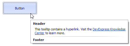
The button’s SuperTip property allows you to specify a super tooltip. Use the ToolTipController.AllowHtmlText, SuperToolTip.AllowHtmlText, or ToolTipItem.AllowHtmlText property to enable HTML tags. Handle the ToolTipController.HyperlinkClick event to respond to a click on the hyperlink.
The SuperToolTip Editor allows you to create super tooltips in the designer. To invoke the editor, click the SuperTip property’s ellipsis button in the Properties window.
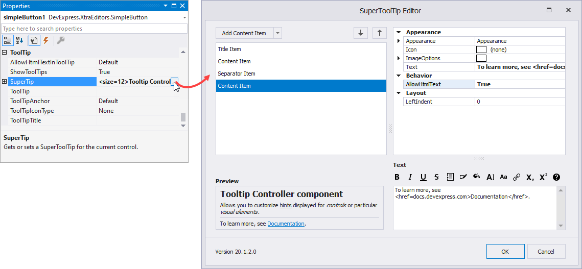
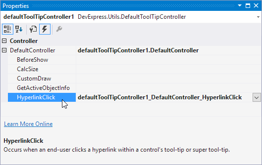
If you create a tooltip in the designer, you still need to handle the HyperlinkClick event in code. Use the Properties window to assign an event handler.
The example below shows how to create a super tooltip in code.
using DevExpress.Utils;
using System.Diagnostics;

private void Form1_Load(object sender, EventArgs e) {
    // Access the controller that manages tooltips for all controls:
    ToolTipController defaultTooltipController = DevExpress.Utils.ToolTipController.DefaultController;

    // Create and customize a SuperToolTip:
    SuperToolTip sTooltip = new SuperToolTip();
    SuperToolTipSetupArgs args = new SuperToolTipSetupArgs();
    args.Title.Text = "Header";
    args.Contents.Text = "This tooltip contains a hyperlink. Visit the <href=http://help.devexpress.com>DevExpress Knowledge Center</href> to learn more.";
    args.ShowFooterSeparator = true;
    args.Footer.Text = "Footer";
    sTooltip.Setup(args);
    // Enable HTML Text Formatting for the created SuperToolTip:
    sTooltip.AllowHtmlText = DefaultBoolean.True;
    //..or enable this feature for all tooltips:
    //defaultTooltipController.AllowHtmlText = true;

    // Respond to clicking hyperlinks in tooltips:
    defaultTooltipController.HyperlinkClick += defaultTooltipController_HyperlinkClick;

    // Assign a SuperToolTip to the button:
    simpleButton1.SuperTip = sTooltip;
}

void defaultTooltipController_HyperlinkClick(object sender, HyperlinkClickEventArgs e) {
    Process process = new Process();
    process.StartInfo.FileName = (e.Link);
    process.StartInfo.Verb = "open";
    process.StartInfo.WindowStyle = ProcessWindowStyle.Normal;
    try {
        process.Start();
    }
    catch { }
}