RepositoryItemCheckEdit.ImageOptions Property
Provides access to options specifying vector or raster glyphs for the check box in the checked, unchecked and indeterminate states.
Namespace: DevExpress.XtraEditors.Repository
Assembly: DevExpress.XtraEditors.v26.1.dll
Declaration
Property Value
| Type | Description |
|---|---|
| DevExpress.Utils.Drawing.CheckImageOptions | A DevExpress.Utils.Drawing.CheckImageOptions object that comprises options specifying vector or raster glyphs for the check box in the checked, unchecked and indeterminate states. |
Remarks
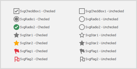
If the CheckBoxOptions.Style property (see RepositoryItemCheckEdit.CheckBoxOptions) is set to Custom, you can use ImageOptions to customize the check box glyph in the unchecked, checked and indeterminate states. To customize glyphs you can:
specify vector glyphs and their size:
- SvgImageUnchecked — Gets or sets a vector glyph for the unchecked state;
- SvgImageChecked — Gets or sets a vector glyph for the checked state;
- SvgImageGrayed — Gets or sets a vector glyph for the indeterminate state;
- SvgImageSize — Gets or sets the size of vector glyphs. The default size is 18x18 pixels on a 100% DPI screen;
specify raster glyphs:
- ImageUnchecked
- ImageChecked
- ImageGrayed
specify an image collection and use image indexes to specify glyphs:
Images
You can use the following image collections:
- SvgImageCollection — Stores vector icons that can scale without losing their quality on high resolution devices;
- ImageCollection — Supports image transparency;
- SharedImageCollection — Supports image transparency. Allows you to share images between controls within multiple forms;
- SvgImageCollection — Stores vector icons that can scale without losing their quality on high resolution devices;
- ImageList;
- ImageIndexUnchecked / ImageKeyUnchecked — Gets or sets the index/name of an image in the Images collection for the unchecked state of the checkbox.
- ImageIndexChecked / ImageKeyChecked — Gets or sets the index/name of an image in the Images collection for the checked state of the checkbox.
- ImageIndexGrayed / ImageKeyGrayed — Gets or sets the index/name of an image in the Images collection for the indeterminate state of the checkbox.
specify URIs of images in the DX Image Gallery:
- ImageUriUnchecked — Gets or sets an image URI for the unchecked state;
- ImageUriChecked — Gets or sets an image URI for the checked state;
- ImageUriGrayed — Gets or sets an image URI for the indeterminate state;
Tip
You can also enable a predefined vector glyph (e.g., thumb, toggle, heart) that is automatically colored and scaled according to the skin, palette and DPI setting. See RepositoryItemCheckEdit.CheckBoxOptions for details.