RepositoryItemCheckEdit.CheckBoxOptions Property
Provides access to options specific to the check box glyph (style, color, size).
Namespace: DevExpress.XtraEditors.Repository
Assembly: DevExpress.XtraEditors.v26.1.dll
Declaration
Property Value
| Type | Description |
|---|---|
| DevExpress.XtraEditors.CheckBoxOptions | A DevExpress.XtraEditors.CheckBoxOptions object that comprises options specific to the check box glyph (style, color, size). |
Remarks
You can specify the following options:
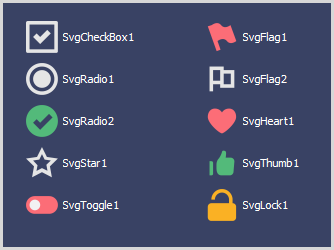
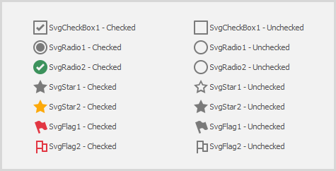
Style — specifies what the check box looks like:
- Default — the style is specified by the
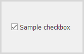
RepositoryItemCheckEdit.CheckStyleproperty; Checkbox — a regular check box;
When this style is applied, you can specify how the check box is rendered in the indeterminate state using the RepositoryItemCheckEdit.NullStyle property.
Radio — a button in a radio group — a group of mutually exclusive options;
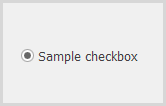
To combine check boxes in a radio group, use the RepositoryItemCheckEdit.RadioGroupIndex property.
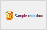
Custom — any custom glyphs specified with RepositoryItemCheckEdit.ImageOptions.
Svg_Glyph_ — a vector glyph scaled without loss of quality according to the current DPI setting;
- Default — the style is specified by the
SvgColorUnchecked, SvgColorChecked, SvgColorGrayed — the colors used to paint vector glyphs in the corresponding states. By default, vector glyphs are colored according to the current skin and palette.
Instead of regular colors (e.g., Red, Green), you can use adaptive colors — colors that change depending on the currently applied skin.
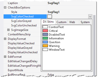
SvgImageSize— the size of vector glyphs. The default glyph size is 18x18 pixels on a 100% DPI screen. Vector glyphs are automatically scaled according to the DPI setting without loss of quality.