RepositoryItemTextEdit.UseAdvancedMode Property
Switches the editor to Advanced Mode. This mode supports new caret and selection animations, emojis, and embedded labels. You can set up properties from the RepositoryItemTextEdit.AdvancedModeOptions group to choose which Advanced Mode features are enabled.
Namespace: DevExpress.XtraEditors.Repository
Assembly: DevExpress.XtraEditors.v25.2.dll
NuGet Package: DevExpress.Win.Navigation
Declaration
[DefaultValue(DefaultBoolean.Default)]
[DXCategory("Appearance")]
public DefaultBoolean UseAdvancedMode { get; set; }Property Value
| Type | Default | Description |
|---|---|---|
| DefaultBoolean | Default | Specifies whether Advanced Mode is on. The Default value is identical to False. |
Available values:
| Name | Description | Return Value |
|---|---|---|
| True | The value is true. |
|
| False | The value is false. |
|
| Default | The value is specified by a global option or a higher-level object. |
|
Remarks
You must set the UseAdvancedMode property before the Form’s handle is created.
public partial class Form1 : DevExpress.XtraEditors.XtraForm {
    public Form1() {
        InitializeComponent();
        textEdit1.Properties.UseAdvancedMode = DevExpress.Utils.DefaultBoolean.True;
        textEdit1.Properties.AdvancedModeOptions.Label = "Product Name";
    }
}

Enable the static WindowsFormsSettings.UseAdvancedTextEdit property to activate Advanced Mode for all TextEdit-based editors in your application.
namespace DXApplication {
   internal static class Program {
      [STAThread]
      static void Main() {
         DevExpress.XtraEditors.WindowsFormsSettings.UseAdvancedTextEdit = DevExpress.Utils.DefaultBoolean.True;
         Application.EnableVisualStyles();
         Application.SetCompatibleTextRenderingDefault(false);
         Application.Run(new Form1());
      }
   }

   public partial class Form1 : DevExpress.XtraEditors.XtraForm {
      public Form1() {
         InitializeComponent();
         textEdit1.Properties.AdvancedModeOptions.Label = "Product Name";
         dateEdit1.Properties.AdvancedModeOptions.Label = "Delivery Date";
      }
   }
}

Features
Advanced Mode activates the following features:
Caret and Selection Animations
The redesigned control painter enables more responsive and smooth animations.

To disable these effects, use AdvancedModeOptions.AllowCaretAnimation and AdvancedModeOptions.AllowSelectionAnimation properties.
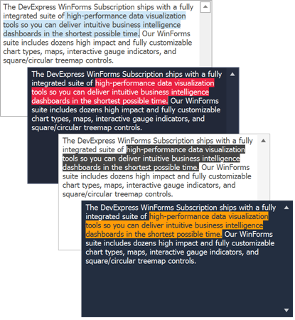
Themed Selection Color
The selection color depends on the current application skin.

Text Autocompletion
The autocomplete functionality displays suggestions to complete words that a user types in a text editor.
Use the AutoCompleteMode property to enable the autocomplete functionality. You can choose one of the following options:
Suggest - The editor displays a drop-down list with suggestions when a user types the first word in the edit box.

Append - The editor automatically completes the first entered word in the edit box. The editor uses the first matching suggestion from a source of suggestions.

SuggestAppend - The editor uses a combination of the Append and Suggest options — it automatically completes the first word in the edit box, and displays a drop-down list with suggestions.

SuggestSingleWord - The editor displays a drop-down list with custom suggestions every time a user types a new word in the edit box. The editor automatically sets the AutoCompleteSource option to
CustomSourceinSuggestSingleWordmode. Use the CustomizeAutoCompleteSource event, or AutoCompleteCustomSource collection to specify the custom auto-complete suggestions.Note
Only alphanumeric characters are considered “words”. Special characters (other than the hyphen) are considered “word separators”.

Use the AutoCompleteSource property to specify the source of autocomplete strings. To supply custom autocomplete strings, set the AutoCompleteSource property to CustomSource, then handle the CustomizeAutoCompleteSource event or populate the TextEditAdvancedModeOptions.AutoCompleteCustomSource collection.
You can use ShowAutoCompletePopup() and CloseAutoCompletePopup() methods to control the visibility of the drop-down list with autocomplete suggestions.
Embedded Labels
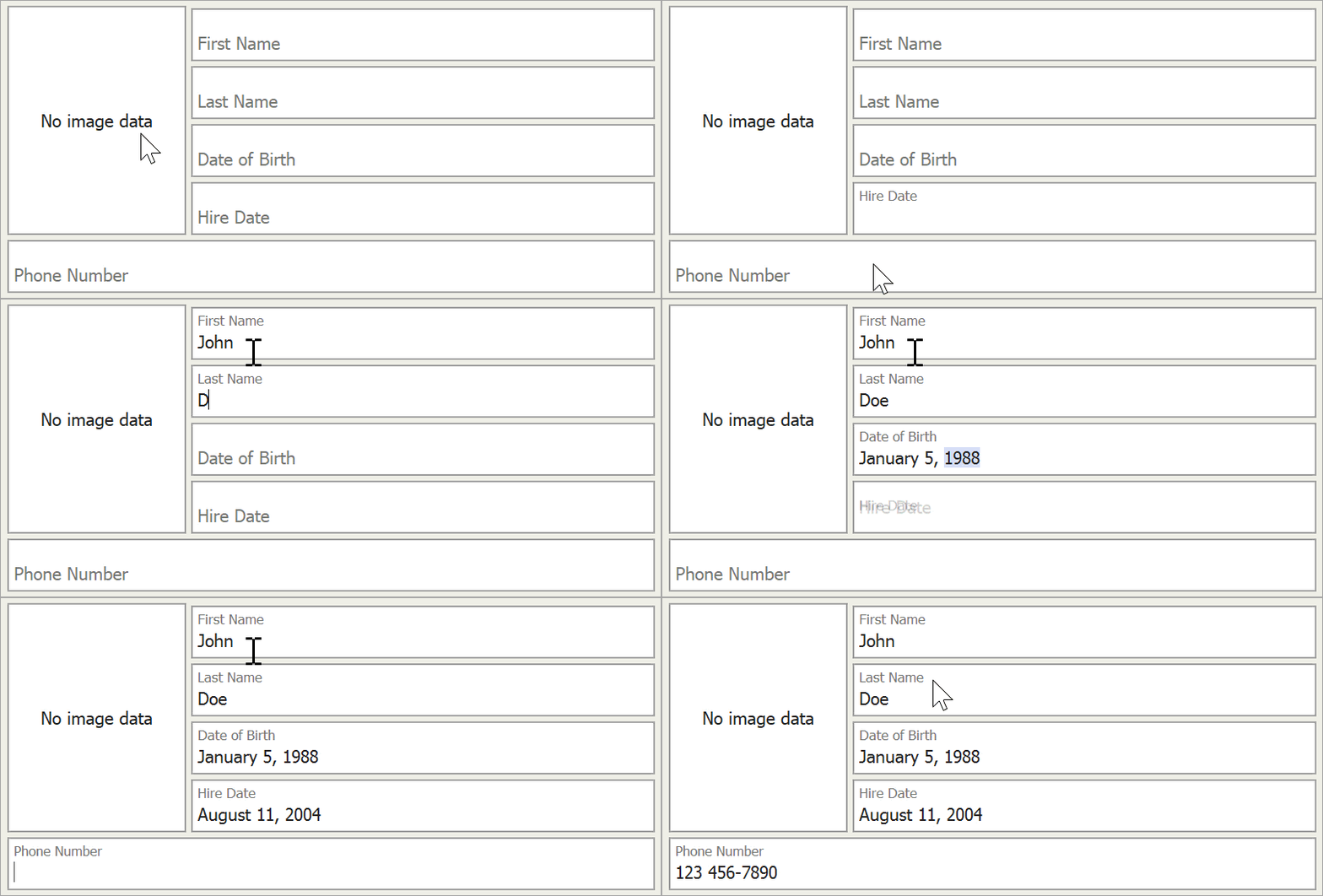
Set the AdvancedModeOptions.Label property to display an editor caption inside the text box. This caption moves upward when the editor is focused.
Use the AdvancedModeOptions.LabelAppearance property to customize appearance settings of the embedded label (caption).

Note that to accommodate both an embedded label and its input value, the editor increases its height.
Emoji Support
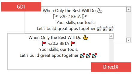
Users can press “Win+.“ to enter emojis from the Windows library. If the AdvancedModeOptions.UseDirectXPaint property is disabled, emojis are grayed out.

Custom Text Highlighting and Painting
You can handle the TextEdit.CustomHighlightText (or RepositoryItemTextEdit.CustomHighlightText) event to highlight or paint specific strings within the control’s text in a custom manner:
- Highlight strings with custom foreground and background colors.
- Add padding for text blocks.
- Specify a painter that draws text using a custom font.
- Specify a painter that replaces strings with custom graphics (for example, icons or emojis).

Disable Keyboard Shortcuts
Set the TextEditAdvancedModeOptions.ShortcutsEnabled property to false to disable all keyboard shortcuts within the editor.
WXI Skin
The WXI vector skin utilizes Advanced Mode to paint rounded editor corners and color accents. Advanced Mode cannot be disabled while this skin is active.
Important
In Advanced Mode or when the WXI Skin is applied, use the Appearance.BackColor property to specify the editor’s background color. Other appearance settings that specify the background color of the editor in different states are ignored (for example, the AppearanceReadOnly.BackColor, AppearanceFocused.BackColor, AppearanceDisabled.BackColor).
Related GitHub Examples
The following code snippet (auto-collected from DevExpress Examples) contains a reference to the UseAdvancedMode property.
Note
The algorithm used to collect these code examples remains a work in progress. Accordingly, the links and snippets below may produce inaccurate results. If you encounter an issue with code examples below, please use the feedback form on this page to report the issue.