BaseButton.PaintStyle Property
Gets or sets the button’s paint style.
Namespace: DevExpress.XtraEditors
Assembly: DevExpress.XtraEditors.v26.1.dll
Declaration
[DefaultValue(PaintStyles.Default)]
[DXCategory("Appearance")]
public PaintStyles PaintStyle { get; set; }Property Value
| Type | Default | Description |
|---|---|---|
| DevExpress.XtraEditors.Controls.PaintStyles | Default | The button’s paint style. |
Remarks
Use the PaintStyle property to switch between the Default and Light render modes.
Default - A button renders its background in all states (normal, hovered, pressed and focused).
Light - A button renders its background only when hovered, pressed or selected. This mode is specifically designed so you can create a group of borderless buttons.

Example
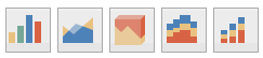
The following example arranges SimpleButtons in a StackPanel and enables the Light button paint style.

Note
The svgImageCollection1 was created and populated at design time.
for (int i = 0; i < 4; i++) {
    SimpleButton btn = new SimpleButton();
    btn.Size = new Size(42, 42);
    btn.PaintStyle = DevExpress.XtraEditors.Controls.PaintStyles.Light;
    btn.Text = "";
    btn.ImageOptions.Location = ImageLocation.MiddleCenter;
    btn.ImageOptions.SvgImage = svgImageCollection1[$"chart{i}"];
    stackPanel1.Controls.Add(btn);
}
To prevent a SimpleButton from being focused, use the SimpleButton.AllowFocus property.