WinForms Skins and Color Palettes
- 14 minutes to read
DevExpress WinForms skins (themes) define the visual appearance of an entire Windows Forms application. A skin applies consistent styling for Forms, dialogs, message boxes, and all DevExpress UI controls. Vector skins also provide configurable color palettes (swatches) that allow you to adjust color schemes without modifying layouts or a control’s code.
This help topic explains how to:
- Apply DevExpress skins and vector palettes at design time or runtime
- Enable modern, bonus, or custom skins
- Allow users to switch skins and palettes at runtime
- Track Windows light/dark mode and system accent colors
- Customize skins or create custom skins, and much more.
Skins
The DevExpress WinForms Subscription includes a comprehensive set of modern vector skins and legacy (bonus) skins. Modern skins are optimized for current Windows versions and support vector palettes, DPI scaling, and accessibility features.

WXI (Windows 11)

Basic

The Bezier

Office 2019 Colorful

Office 2019 Black

Office 2019 White

Office 2019 Dark

High Contrast

Visual Studio 2013 Blue

Visual Studio 2013 Dark
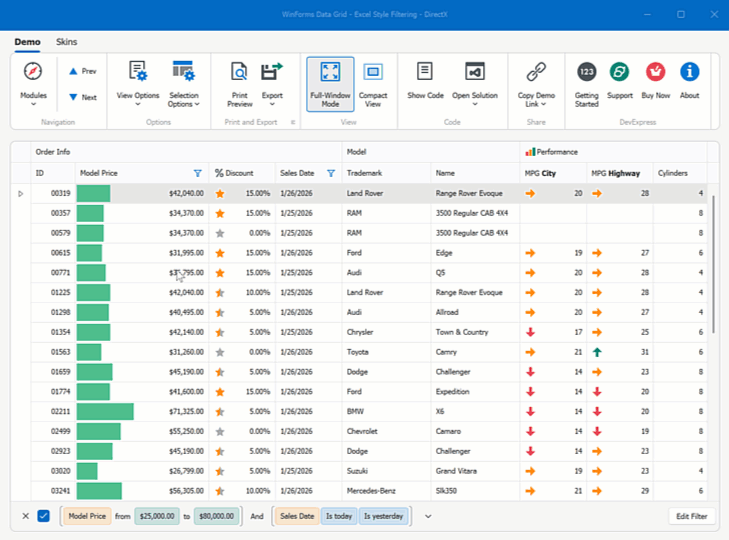
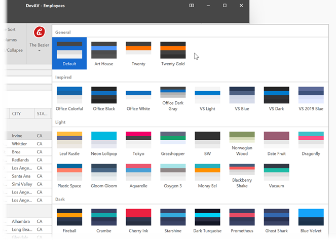
To review available skins, run any DevExpress WinForms Demo application and open the built-in skin selector:
Apply a Skin
Modern skins are available automatically when you create a project with the Cross-IDE Template Kit or add any DevExpress control to a Form.
For blank projects:
- Add the
DevExpress.Utilsassembly or NuGet package. - For .NET 8 or later, install the
DevExpress.Win.DesignNuGet package.
Select an Application Skin at Design Time
Open DevExpress Project Settings and select the application skin:
Apply an Application Skin at Runtime
Call the UserLookAndFeel.SetSkinStyle method at application startup:
using DevExpress.LookAndFeel;
using System;
using System.Windows.Forms;

internal static class Program {
    [STAThread]
    static void Main() {
        Application.EnableVisualStyles();
        Application.SetCompatibleTextRenderingDefault(false);

        // Apply the WXI vector skin.
        UserLookAndFeel.Default.SetSkinStyle(SkinStyle.WXI);

        Application.Run(new Form1());
    }
}
See the following help topic for additional information: Perform Actions on Application Startup.
Note
A vector palette applies to the entire Windows Forms application. DevExpress does not support different palettes on different Forms.
Apply Bonus or Custom Skins
Bonus Skins
Bonus skins ship in a separate assembly/package:
- .NET Framework:
DevExpress.BonusSkins.26.1.dll - .NET 8 or later:
DevExpress.Win.BonusSkins.26.1.nupkg
Register bonus skins during application startup, and apply them like modern skins. Check the corresponding setting on the Project Settings Page, or call the Register method:
using DevExpress.UserSkins;

static class Program {
    [STAThread]
    static void Main() {
        // Register bonus skins before look-and-feel initialization.
        BonusSkins.Register();

        Application.EnableVisualStyles();
        Application.SetCompatibleTextRenderingDefault(false);

        // Apply the bonus skin.
        UserLookAndFeel.Default.SetSkinStyle(SkinStyle.Pumpkin);

        Application.Run(new Form1());
    }
}
Custom Skins
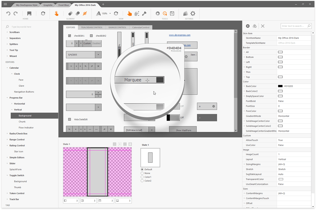
The DevExpress WinForms installation ships with the Skin Editor that allows you to create, edit, and distribute custom skins.
To use a custom skin in your WinForms project, follow these steps:
- Reference the assembly that contains the custom skin.
Register and apply the custom skin.
using System;
using System.Windows.Forms;
using DevExpress.Skins;
using DevExpress.LookAndFeel;
using System.Reflection;
using System.ComponentModel;
using DevExpress.XtraEditors;

namespace CustomSkinTest {
    static class Program {
        [STAThread]
        static void Main() {
            // If your custom skin is derived from a template skin that resides in the BonusSkins library, ensure that you register the template skin first using the BonusSkins.Register method.
            // DevExpress.UserSkins.BonusSkins.Register();
            Assembly asm = typeof(DevExpress.UserSkins.MyCustomSkins).Assembly;
            WindowsFormsSettings.RegisterUserSkins(asm);

            UserLookAndFeel.Default.SkinName = "My Custom Skin";

            Application.Run(new XtraForm());
        }
    }
}
See the following help topics for additional information:
Allow Users to Select Skins at Runtime
Use ready-to-use Skin Bar Items to allow users to switch between skins and palettes at runtime. You can display these items in:
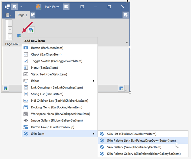
Display a Skin Gallery
The following code snippet displays a skin gallery in the Ribbon UI:
using DevExpress.XtraBars;

// Create and add a skin gallery to a Ribbon page group.
SkinRibbonGalleryBarItem skinGallery = new SkinRibbonGalleryBarItem();
ribbonPageGroup2.ItemLinks.Add(skinGallery);
Display a Drop-Down Skin Selector
using DevExpress.XtraBars;
using DevExpress.XtraBars.Helpers;

// Add a skin selector to the Toolbar Form's title.
SkinDropDownButtonItem skinSelector = new SkinDropDownButtonItem() {
    Alignment = BarItemLinkAlignment.Right  // Align selector to the right.
};

// Initialize the drop-down with DevExpress skins.
SkinHelper.InitDropDownSkinGallery(skinSelector);

// Add the skin selector to the Toolbar Form's title links.
toolbarFormControl1.TitleItemLinks.Add(skinSelector);
Customize Skin Gallery Items
Handle the SkinHelper.CreateGalleryItem event to rename skin items or specify custom icons:
using DevExpress.XtraBars;
using DevExpress.XtraBars.Helpers;

SkinHelper.CreateGalleryItem += (s, e) => {
    if (e.ItemName.Equals("DevExpress Style")) {
         e.GalleryItem.Caption = "Moonlight";
        e.GalleryItem.Image = e.UseLargeIcons ? MyCustomLargeIcon : MyCustomSmallIcon;
        e.GalleryItem.HoverImage = MyCustomLargeIcon;
    }
};
Note
Subscribe once during application initialization. Avoid repeated subscriptions when recreating UI.
See the following help topic for additional information:
- Display and Customize Toolbar Skin Selectors
- Display and Customize Ribbon Skin Selectors
- Create a Custom Skin Selector
- Localize Skin Selectors
Warning
Skin metrics (padding, margins, etc.) vary between skins. Avoid pixel-perfect layouts because switching skins may affect control sizes or clip content.
Skin Palettes
Vector skins support multiple palettes that modify the color scheme of the active skin. You can apply a palette at design time in the Project Settings Page or at runtime.
Note
DevExpress does not support different palettes on different Forms.
Use the SetSkinStyle(SkinSvgPalette) method to apply a color palette:
using DevExpress.LookAndFeel;

UserLookAndFeel.Default.SetSkinStyle(SkinSvgPalette.Bezier.Tokyo);
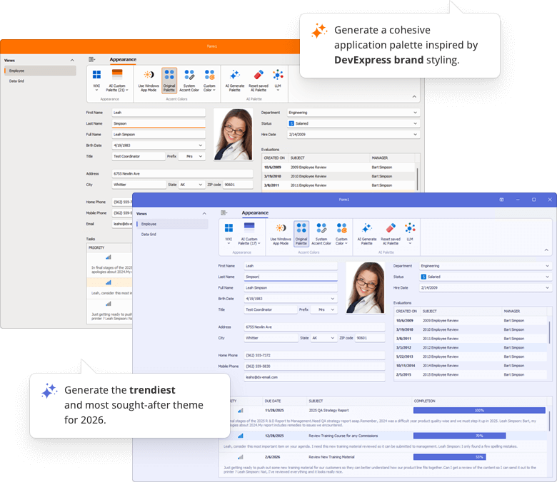
Generate Skin Palettes with AI
Note
The Demo application uses rate-limited AI services. You may experience performance-related delays. To remove artificial limits, connect to your own AI service or model.
The DevExpress Generate Skin Palettes with AI demo application uses AI to create custom skin palettes to personalize an application’s appearance on the fly. Users can generate, save, and delete AI-created palettes between application sessions.
Track Windows Light/Dark Mode
Use the WindowsFormsSettings.TrackWindowsAppMode setting to follow the Windows Default App Mode and restrict palette selection accordingly.

// Call before Application.Run.
WindowsFormsSettings.TrackWindowsAppMode = DevExpress.Utils.DefaultBoolean.True;
Important
This feature works only with the WXI, Basic, and The Bezier skins.
Use System or Custom Accent Colors
Track the Windows Accent Color
Enable the WindowsFormsSettings.TrackWindowsAccentColor option to apply the system accent color to vector skins (except the “High Contrast” skin).

using DevExpress.XtraEditors;
using DevExpress.Utils;

// Call before Application.Run.
WindowsFormsSettings.TrackWindowsAccentColor = DefaultBoolean.True;
Specify a Custom Accent Color
Custom accent colors override the system accent color.
Use the SetAccentColor method to specify a custom accent color.

using DevExpress.XtraEditors;
using System.Drawing;

WindowsFormsSettings.SetAccentColor(Color.FromArgb(16, 124, 65));
Note
“The Bezier” skin supports the second accent color. Other skins do not support the second accent color.
Use the SetAccentColor2 method to specify the second accent color.
Reset Accent Colors
The following code snippet resets primary and secondary accent colors:
DevExpress.XtraEditors.WindowsFormsSettings.SetAccentColor(System.Drawing.Color.Empty);
DevExpress.XtraEditors.WindowsFormsSettings.SetAccentColor2(System.Drawing.Color.Empty);
Note
The accent color is not automatically reset when you disable the WindowsFormsSettings.TrackWindowsAccentColor setting. You should call the SetAccentColor(System.Drawing.Color.Empty) method to reset the accent color.
See the following help topic for information on how to display pre-designed Ribbon UI commands that correspond to advanced skin settings: Ribbon Skin Selectors.

Highlight Individual Controls
You can use DevExpress skin colors to set up custom background, border, and foreground colors to highlight individual controls. Skin colors adapt automatically when users change the application skin.

// Apply skin-aware background and text colors.
btnEnable.Appearance.BackColor = DXSkinColors.FillColors.Success;
btnEnable.Appearance.ForeColor = DXSkinColors.ForeColors.WindowText;
Important
When using DX Skin Colors, you should only specify colors for the ‘normal’ state of the control or UI element. Colors for other states (such as hover, disabled, press) are automatically calculated based on the active/current skin and palette.
High Contrast Skin
The High Contrast vector skin is designed for accessible applications. Its availability and appearance depend on Windows High Contrast settings (the “Personalize → High contrast settings“ menu in Windows).
When Windows High Contrast mode is enabled, the application does the following:
- Forces the High Contrast skin
- Ignores any skin changes applied in code
Disable the WindowsFormsSettings.TrackSystemHighContrastMode option to prevent your application from tracking Windows high contrast mode.
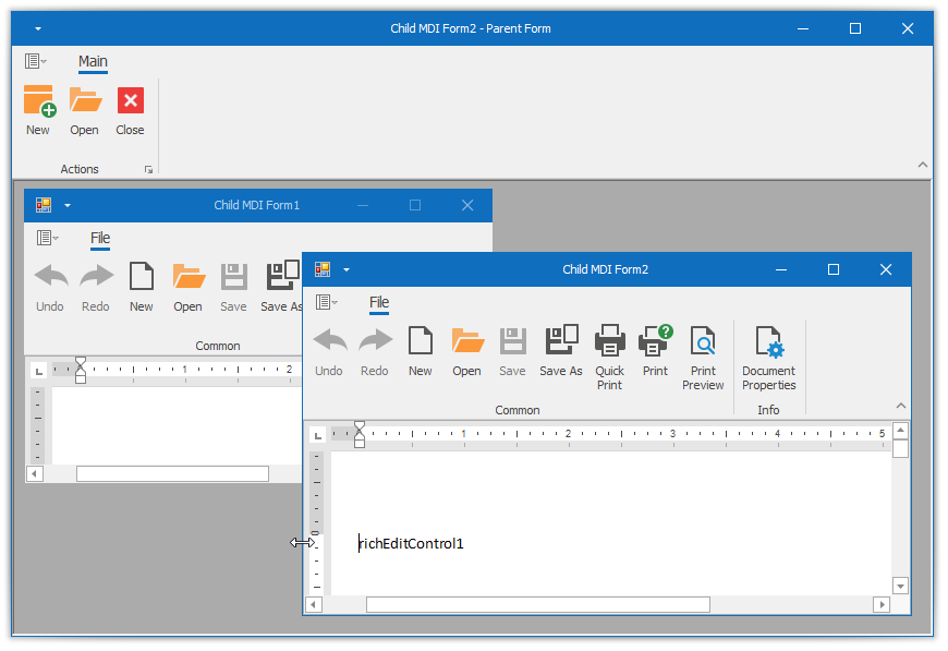
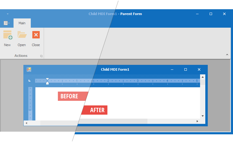
Advanced UI Scenarios (MDI, Borderless Forms)
Enable Skins for MDI Forms
Call the EnableMdiFormSkins() method during application startup.

using DevExpress.XtraEditors;

// Call before Application.Run.
WindowsFormsSettings.EnableMdiFormSkins();
Form Resize Area and Border Width
DevExpress flat skins (for example, “Office 2019 Colorful”) use thin form borders. Thin borders make form resizing harder.
Forms normally allow resizing through the border and the shadow area (this behavior improves usability).
Forms do not display shadows in the following cases:
- The XtraForm.FormBorderEffect property is disabled.
- The form is a child MDI form.
- The application runs in a Remote Desktop session.
When shadows are unavailable, increase the border width to expand the resize area.
Use the following settings:
| Property Name | Description |
|---|---|
| WindowsFormsSettings.FormThickBorder | Enables thick borders for all forms. |
| WindowsFormsSettings.MdiFormThickBorder | Enables thick borders for MDI child forms. |
| WindowsFormsSettings.ThickBorderWidth | Specifies the border width. |
Tip
Remote Connection Optimization mode enables thick borders automatically.
Disable the FormThickBorder property to preserve borders set in skin settings when this mode is active.
Best Practices
- Avoid pixel-perfect layouts. Skins define different metrics.
- Use DevExpress skin colors instead of system colors.
- Apply skins before creating Forms.
- Persist skin and palette selection across application sessions.
FAQ
How to Obtain Names of the Currently Active Skin and Palette
Read values of ActiveSkinName and ActiveSvgPaletteName properties.
// Get the name of the currently applied skin.
var skinName = UserLookAndFeel.Default.ActiveSkinName;

// Get the name of the active palette for the current skin.
var paletteName = UserLookAndFeel.Default.ActiveSvgPaletteName;
How to Identify Whether a Skin or Palette Was Changed
Handle the static UserLookAndFeel.StyleChanged event. This event occurs every time a user applies a different skin or palette.
How to Obtain a Color from the Vector Skin Palette
Use the following code to retrieve a specific color value from the active vector skin palette:
var commonSkin = CommonSkins.GetSkin(UserLookAndFeel.Default);

// Get the default SVG palette for the current skin.
SvgPalette svgPalette = commonSkin.SvgPalettes[Skin.DefaultSkinPaletteName] as SvgPalette;

// Retrieve the value of the "Key Paint" palette color.
Color keyPaintColor = svgPalette["Key Paint"].Value;
How to Re-Apply the Last Active Skin When an Application Restarts
The Windows Forms Application Settings feature allows you to store user preferences, including the active skin and palette, and restore them when the application restarts.
Open the App.config file and add the following user settings:
| Application Property Name | Type | Value | Note |
|---|---|---|---|
SkinName |
String | Default | |
Palette |
String | Default | |
CompactMode |
Boolean | False | Specifies whether to apply the regular or compact version of the WXI skin. |
<?xml version='1.0' encoding='utf-8'?>
<configuration>
  <configSections>
    ...
  </configSections>
  <applicationSettings>
    ...
  </applicationSettings>
  <startup>
    ...
  </startup>
  <userSettings>
    <DXWinApplication.Properties.Settings>
      <setting name="SkinName" serializeAs="String">
        <value>Default</value>
      </setting>
      <setting name="Palette" serializeAs="String">
        <value>Default</value>
      </setting>
      <setting name="CompactMode" serializeAs="String">
        <value>False</value>
      </setting>
    </DXWinApplication.Properties.Settings>
  </userSettings>
</configuration>
When the application closes, save the current skin and palette values to Application Settings. When the application starts, use the UserLookAndFeel.SetSkinStyle method to restore saved values.
using DevExpress.LookAndFeel;

private void Form1_FormClosing(object sender, FormClosingEventArgs e) {
    var settings = Properties.Settings.Default;

    // Persist the active skin, palette, and UI mode.
    settings.SkinName = UserLookAndFeel.Default.SkinName;
    settings.Palette = UserLookAndFeel.Default.ActiveSvgPaletteName;
    settings.CompactMode = UserLookAndFeel.Default.CompactUIModeForced;
    settings.Save();
}

protected override void OnShown(EventArgs e) {
    base.OnShown(e);

    var settings = Properties.Settings.Default;
    if (!string.IsNullOrEmpty(settings.SkinName)) {
        // Restore compact or regular UI mode.
        if (settings.CompactMode)
            UserLookAndFeel.ForceCompactUIMode(true, false);

        // Restore the skin and optional palette.
        if (!string.IsNullOrEmpty(settings.Palette))
            UserLookAndFeel.Default.SetSkinStyle(settings.SkinName, settings.Palette);
        else
            UserLookAndFeel.Default.SetSkinStyle(settings.SkinName, "DefaultSkinPalette");
    }
}
Additional examples:
- Save/restore the active skin and palette between application sessions
- Save the name of the active skin and restore it the next time you run the application
How to Modify Skin Palettes in Code
See the following help topic for a complete code example: Create New and Modify Existing Vector Skin Palettes.
How to Identify Whether the Regular or Compact Version of the WXI Skin is Active
Read the UserLookAndFeel.Default.CompactUIModeForced property value.
How to Distinguish Light from Dark Skins
DevExpress skins and palettes fall into two categories: dark and light. To identify the active category, call the DevExpress.Utils.Frames.FrameHelper.IsDarkSkin method.
using DevExpress.Utils.Frames;
//...
if (FrameHelper.IsDarkSkin(this.GetActiveLookAndFeel())) {
    // Dark skin or palette
}
else {
    // Light skin or palette
}
Note
The IsDarkSkin method evaluates the “Paint High” palette color. As a result, some visually dark skins (for example, Office 2019 Dark Gray) may be classified as light.
You can implement a custom helper method to handle such cases explicitly:
bool IsDarkSkinEx() {
    var res = FrameHelper.IsDarkSkin(this.GetActiveLookAndFeel());
    return res || UserLookAndFeel.Default.SkinName == "Office 2019 Dark Gray";
}
How to Apply Skins to DevExpress Forms without Title Bars
To hide a Form’s title bar, disable the Form’s ControlBox and icon, and hide the Form caption.
// Hide the form caption and system buttons.
this.Text = null;
this.IconOptions.ShowIcon = false;
this.ControlBox = false;
Forms without title bars are not skinned by default. Override the GetAllowSkin method to enable skinning explicitly:
// Enable skinning for a borderless form.
protected override bool GetAllowSkin() {
    return true;
}